杭州恩宝办公园区


項目地点:浙江省杭州市
项目类型:商业办公
设计时间:2017年
建成时间:2020年
项目规模:28,025平方米
设计单位:gad杰地设计
项目总监:张凯俭
项目主创:宋一村
建筑:康鹏飞、祖丰楠、周逸
结构:李保忠、赵改改,吴瑛瑶
给排水:刘亚辉、张斌
暖通:张言军、潘尤贵
电气:王扬、陆柏庆、杨美萍、劳晓镜
景观设计:杭州园林设计院股份有限公司
业主:杭州宝嘉乐网络科技有限公司
摄影师:陈曦
Project Location: Hangzhou, Zhejiang Province
Project Type: Commercial Office
Design Time: 2017
Completion Time: 2020
Project Scale: 28,025 m2
Design Unit: gad
Project Director: KaijianZhang
Project Creator in Chief: YicunSong
Architecture: PengfeiKang, FengnanZu, YiZhou
Structure: BaozhongLi, GaigaiZhao, YingyaoWu
Water Supply and Drainage: YahuiLiu, BinZhang
HVAC: YanjunZhang, Yougui Pan
Electrical: YangWang, Baiqing Lu, MeipingYang, XiaojingLao
Landscape Design: Hangzhou Landscape Design Institute Co., Ltd.
Client: Hangzhou Baojiale Internet Technology Co., Ltd.
Photographs: Xi Chen
秩序与自由
依托于杭州城西互联网产业的发展,场所营造主要从场地特殊性与未来特定的使用状态出发。园区地块背面邻水,周边由低密度住宅区包围,场地现状导向了清晰的设计逻辑:建筑必定不是作为一个巨大的集中性体量闯入。同时考虑到办公用户以年轻的IT从业人员为主,他们将在这里度过每天近三分之二的时间,空间的多样性与趣味性不可或缺。
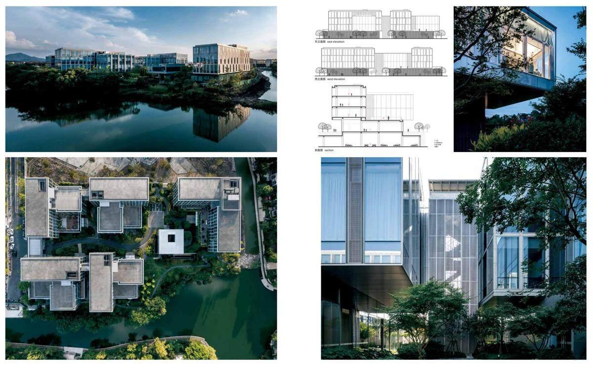
设计借鉴了“半宅半园”的传统空间类型,由五组相对独立的矩形体量单元通过横向与纵向组合,形成半开放的围合关系。在面对相对规整的基地与较高的容积率要求时,这不仅体现出经济性与合理性,也在重叠与交叉中创造了一院一境的办公氛围。在矩形体量下方,另外置入扁平的正方形体量,在共通中包含错落变化,可灵活应对后期功能设定的调整。
为向使用者提供有别于传统模式的办公体验,功能布局将各区域交互融合,更从流线上强调了行为的可能性。L形围合体量的差异化层高处理,形成多处可停留可休憩的空中花园,并将远景引入场地内。
建筑体量下方的灰空间将相对独立的院落串联起来,使用者可穿梭其间。在场地西北部的临河处,被托举的餐厅自然形成下沉庭院,将是场地内的空间聚点。
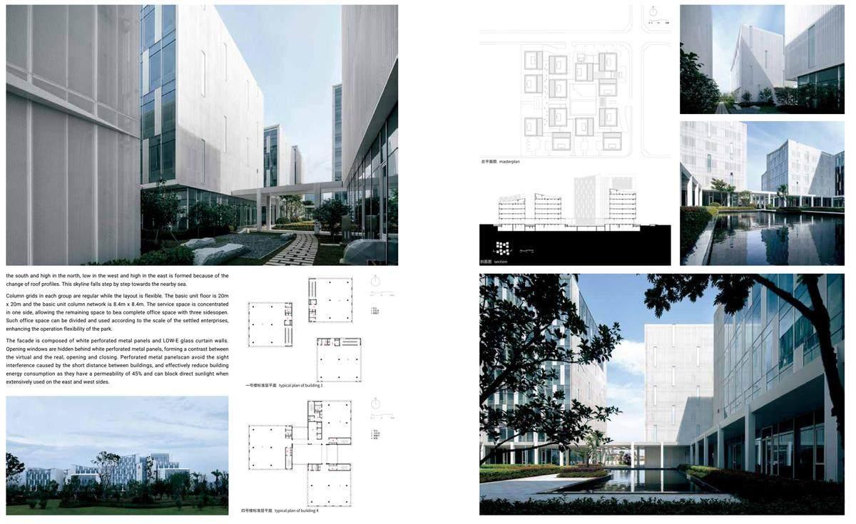
园区外观呈现出透明开放的状态,同样隐含了创作过程中的秩序性。外立面采用了玻璃及颜色相近的石材、铝材,以材料的光影和肌理效果来塑造每组建筑的个性。
天光、云影、绿树等自然元素的引入过渡了室内外空间,在形式背后增添了办公之余的氛围表现。
Order and Freedom
Because of the development of the Internet industry in the west of Hangzhou, the construction of this park mainly focuses on the specificity of the site and its specific use status in the future. The park plot is adjacent to the water on the back and surrounded by low-density residential areas, which lead to the design logic thatbuildingscannot be designed intoa huge centralized intruder. At the same time, space here should be diversified and fun becausemost users are young IT workers who will spend nearly two-thirds of their time here.
The design uses the traditional space type of "half house and half garden" for reference: five groups of relatively independent rectangular volume units are combined horizontally and vertically to form a semi-open enclosure. Given the regular ground and high plot ratio requirements, this design not only is economical and rational, but also creates different atmospheres indifferent office courtyards through overlap and intersection. Below rectangular volumes are flat square volumes, which bring changes in commonalities and allow such space to be flexibly adjusted if there is any function change in the future.
In order to provide users with an office experience that is different from the traditional model, different functional areas are integrated, improving theconvenience ofmovements in different areas.The differentiated floor height of the L-shaped enclosurevolume forms several hanging gardens where users can stay and rest, and introduces distant views into the site.
The gray space below the building volume connects the relatively independent courtyards, and users can walkamong them. On the riverfront in the northwest of the site, the lifted restaurant forms a sunken courtyard, which will be aspace gathering point in the site.
The appearance of the park is transparent and open, implying the orderliness during design and creation. The facade is made of glass, stone and aluminum materials of similar colors, shaping the individuality of each group of buildingsthrough shadow and texture of such materials.
The introduction of natural elements such as daylight, cloud shadows, and green trees helps the transition of indoor and outdoor spaces, adding an atmosphere beyond the office atmosphere.

