洛格罗尼奥古城墙改造
建设单位:安达卢西亚公共土地公司
项目地点:西班牙安达卢西亚自治区马拉加市
设计单位:乌拉吉建筑师事务所
场地面积:2 000 平方米
建筑面积:(第一部分) 1 250 平方米,(第二部分) 213 平方米
摄影:Eduardo Sánchez,Pedro Pegenaute
Client:Public Land Company of Andalusia
Location:Logroño,La Rioja,Spain
Architect:Ulargui Arquitectos
Site Area:2,000 m²
Building Area:(First part) 1,250 m²,(Second part) 213 m2
Photography:Eduardo Sánchez,Pedro Pegenaute
洛格罗尼奥城中遗留的一段城墙,城门和城垛始建于16 世纪上半叶。这座重要军事城防建筑以其坚固的质量和精细的建造细节成为洛格罗尼奥历史繁荣时期的重要象征之一。我们进行的恢复和改造项目旨在将这个几乎被遗忘的历史遗产转变为展览空间,重新被市民使用。Xxxxxxx对于看作是所进行的有关两个时代的操作。
一方面,我们对城墙的修复是建立在科学的介入方法上(包括根据考古学研究对损毁部分进行修复和重建),旨在重现其古老的形式。而新的展览空间则是一个独立安装的预制部分,其形式源自当代的设计语汇。这两个来自不同时代各异的形式在工程的最后阶段,以 “脚尖对脚尖”的方式结合在一起。
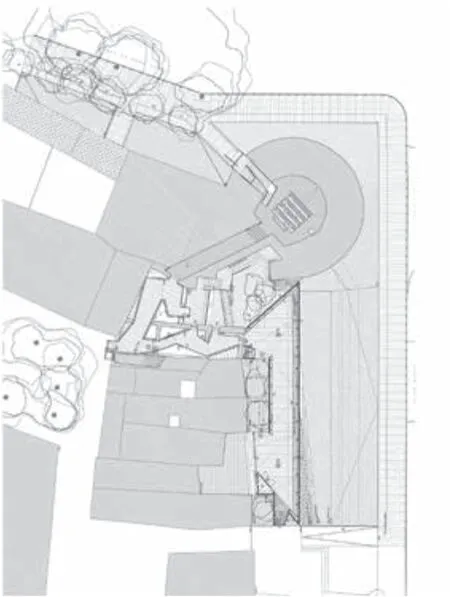
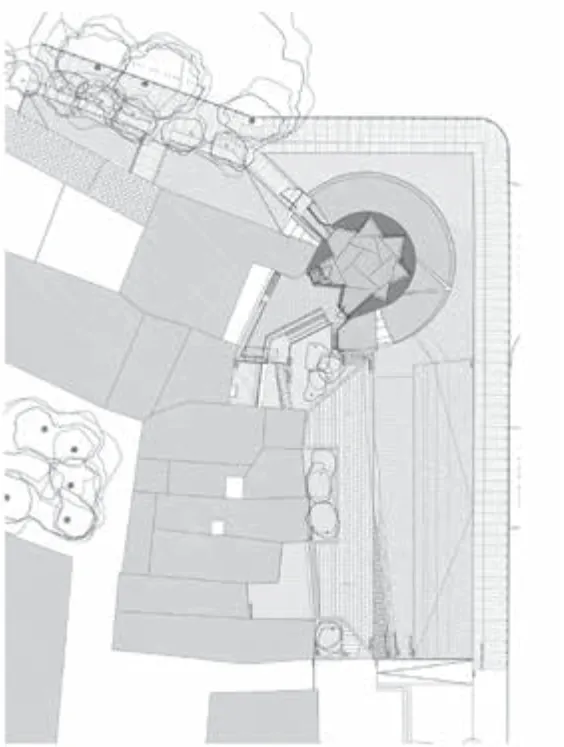
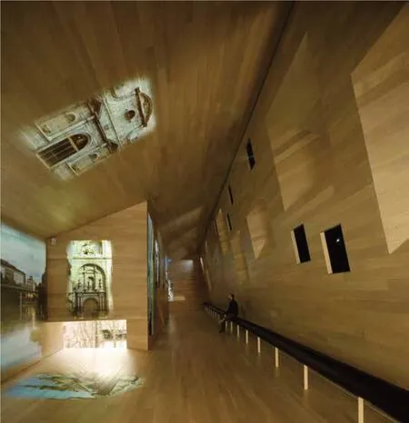
对于古城墙的改造工作有两部分构成。第一部分包括修复转角处的城垛和一侧的旧城墙,并在另一侧原城墙位置使用轻质石材建造一段新的城墙建筑。新城墙的体量和形式根据现在的城市肌理进行了调整,重新定义了城墙立面。新建筑内部是一个不对称空间,材料和空间几何的连续性塑造了一个大型多媒体展厅。投影仪将画面投射在地板,墙壁和天花板上。
第二部分包括一个镶嵌在城垛之中的独立展厅。多角形的平面使展厅与旧城墙之间形成了多个小庭院,它们向展厅引入自然光的同时,也使室内的观众可以从各个角度观察城墙。该展厅与之前的城墙展厅使用的不同材料说明了它们不同的身份:城墙展厅为了唤起曾经记忆所以需要石材的 “稳定性”,而多边形展厅强调的是一个放置在历史建筑残骸之上的独立物体,在它周围的楼梯,长凳和走道将室内外连接成为一条连续的展览路径。
Consolidated in the first part of the 16th century,this fragment of Wall,Cube and Door,constitutes as a whole the most important military construction carried out for the defense of the city and,due to the quality of its execution and the care in its details ornamental,makes present the period of greatest prosperity in the history of Logroño.The small actions that we have carried out try to enable this symbolic space left in oblivion as a container for exhibitions.An intervention that we have understood as a work in two stages.
On the one hand,the monument has been rehabilitated without renouncing the usual intervention process (with its archaeological studies,treatment of pathologies and reconstruction of damaged parts)following its own temporal process.The exhibition adaptation,however,has been understood as a set of prefabricated elements that have been installed independently,collecting in their form the final data from scientific studies.From the encounter between these two times and geometry,two pavilions have emerged that have been introduced at the last moment,almost on tiptoe.
The first recovers the original physical configuration of the walled system,with its Cube in the corner and with the two canvases,the existing one and the newly created one,on each side.It is a light stone construction that aims at the same time to blend in and show a distance with the pre-existing.A building “all façade”that adjusts in its subsequent volume to the conditions of good urbanity.Its interior is an asymmetrical space where the material and geometric continuity allows the creation of a large multimedia room that projects content on the floor,walls and ceiling.
The second is a small lead construction inserted inside the Cube and whose configuration through oblique planes allows simultaneously enjoying natural light and a direct relationship with the wall through small patios.The material differentiation with the first expresses its different condition:if the first seeks to evoke past memory and therefore needs the “stability”of the stone,the second is nothing more than an object resting on the remains,which like stairs,benches and walkways turn the complex into an exhibition tour.


总平面图 Site Plan


实体模型 Entity model


地面层平面 Ground Plan

屋顶层平面 Roof Plan


