东大邱交通枢纽韩国东大邱
业主:东大邱运输公司、新世界公司
项目规模:16.73万平方米
类型:市政+文化、综合用途、商业、交通
合作设计单位:Haeahn Architecture(记录建筑设计单位)
摄影:Brian Chung (p89),Tim Franco (p89, 90, 91, 92)Tim Griffith (p92)
Client: Dongdaegu Transportation, Shinsegae Company
Size: 167,300 SM
Program: Civic + Cultural, Mixed-Use, Retail, Transportation
Team: Haeahn Architecture (Architect of Record)
Photography: Brian Chung (p89), Tim Franco (p89, 90, 91, 92),Tim Griffith (p92)
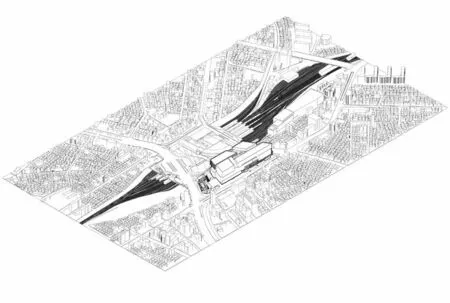
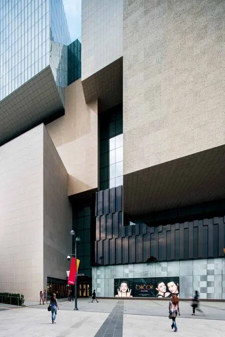
车站将一系列交通功能整合至一座独立门户。它包含了相互咬合的体量和各种形态的材料。
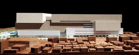
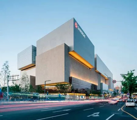
业主要求KPF设计一座高效联通的建筑,沿新建的购物、餐饮和活动设施整合地铁、公共汽车和高速铁路,打造大邱社区的市民中心。最终设计包含12个相互连接并悬挑的矩形体量,视觉上实现了动态协调。这些体量代表了运动前的静止时刻,体现了强有力的极简主义实现方法,平衡了长短比例。例如,所有逃生楼梯均隐藏于面板后方,尽管这一设计处理会带来运营上的障碍。这种整体结构也呼应了业主对东大邱交通枢纽的愿景,可以体现其商业品牌的重要性。虽然没有展示新世界商业身份的华丽装饰,但其拥有博物馆般的品质特征,彰显了其目的地功能。
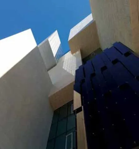
建筑的材料表达遵循这个巧妙的体量解决方案。虽然商业中心通常采用透明设计,在玻璃墙内展示商店品牌,但这一枢纽采用的不透明立面却展示出各类石材和玻璃材质。业主新世界仅仅要求使用花岗岩材料—这为韩国建筑语言中的常见材料,经常在佛教寺庙中应用。因此,设计应用了不同饰面,以代表不同的内部功能—抛光、粗凿和亚光饰面变得更亮或更暗、光泽更强或更弱。在米色花岗岩和半透明玻璃之间,设计团队营造出一种平衡构图,除对角线外,没有任何相同的饰面相互接触。然而,当以三维形式呈现时,在悬挑结构底部应用花岗岩会存在结构上的风险。因此,KPF为了解决了这一问题,尝试了一系列轻质的材料,以模拟和立面类似的视觉效果,使每一个体块从各个面看起来都是一个实体。
This station combines a range of transport programs into a single gateway composed of massing interlocks and diverse material gestures.
The client challenged KPF to craft a building that would provide efficient connectivity and function as a civic center within the Daegu community, integrating subway, buses, and high-speed rail, alongside new amenities for shopping, dining, and event-going. The final design includes twelve rectangular volumes, connected and cantilevered, which appear visually dynamic in concert. They represent the moment of stillness before motion and embody a powerful approach to minimalism, balancing short and long proportions . For instance, all egress stairs are tucked behind the veneer, demonstrating an operational roadblock posed by commitment to this design methodology. Yet this monolithic structure also echoes the client’s desire for Dongdaegu Transportation Hub to represent the importance of its retail brand. Though devoid of decorative flourish that might denote Shinsegae’s commercial identity,its disposition evokes a museum-like quality that suggests its role as a destination.
The building’s material expression follows this clever massing solution. While typical retail centers are transparent, branded by the stores containeds within their glass walls, the hub’s opaque facades present varied textures of stone and glass. Shinsegae requested using a single granite species,which is common to Korea’s architectural language and traditionally used at Buddhist temples.Multiple finishes denote different internal programs – polished, chiselled and honed blocks become lighter or darker, sheen or matte. Between these shades of beige granite and translucent glass,the design team fashioned a balanced composition in which none of the same finishes touch one another except diagonally. However, when rendered in three dimensions, the granite’s application to the bottom of the cantilevered blocks posed a structural hazard. KPF solved this by testing lighter materials that could be painted to mimic the visual effect of each block being a solid object.
