罗吉尔广场,布鲁塞尔,比利时
泽维尔·德·盖特·建筑事务所
客户:Region of Brussels Capital
建筑设计:泽维尔·德·盖特·建筑事务所
竞赛阶段设计团队:Xaveer De Geyter,Wesley Aelbrecht,Pieter Coelis,Sara Noel Costa de Araujo,Piet Crevits,Yannis Igodt,Laurent Liefooghe,Dagmar Pelger,Frédéric Rasier
方案执行设计团队:Xaveer De Geyter,Tom Bonnevalle,Karel Bruyland,Sara Noel Costa de Araujo,Matthias van Rossen,with Raphaël Cornelis,Ingrid Huyghe,Cristian Panaîté,Marie-Pierre Vandeputte
顾问:Ney & Partners(结构),Studiebureau Boydens(机电),Michel Desvigne Paysagiste(景观),Tritel(通讯)
面积:45,000m2(广场9000m2,地铁7000m2,大道29,000m2)
项目时间:2006-2019
绘图:泽维尔·德·盖特·建筑事务所
摄影:Francisco Guillan y Suarez,Matthias van Rossen
Client:Region of Brussels Capital
Architects:Xaveer De Geyter Architects Design Team of Competition Phrase:Xaveer De Geyter,Wesley Aelbrecht,Pieter Coelis,Sara Noel Costa de Araujo,Piet Crevits,Yannis Igodt,Laurent Liefooghe,Dagmar Pelger,Frédéric Rasier
Design Team of Implementation:Xaveer De Geyter,Tom Bonnevalle,Karel Bruyland,Sara Noel Costa de Araujo,Matthias van Rossen,with Raphaël Cornelis,Ingrid Huyghe,Cristian Panaîté,Marie-Pierre Vandeputte
Consultants:Ney & Partners (structure),Studiebureau Boydens (mechanical),Michel Desvigne Paysagiste (landscape),Tritel (mobility)
Surface:45,000 m2(Square:9000 m2,
Metro:7000 m2,Boulevard:29,000 m2)
Project Period:2006-2019
Drawings:Xaveer De Geyter Architects
Photos:Francisco Guillan y Suarez,Matthias van Rossen
该项目关注公共空间中的公共交通。罗吉尔广场曾是火车北站的一个前广场,由于基础设施的原因,车站向北迁移。尽管如此,该地区仍然是重要的枢纽:广场下方建有一个重要的地铁站,地上部分成为公交线路的交汇处。然而,这种以垂直人流量为特征的新境况没能转化为明确的空间特质。
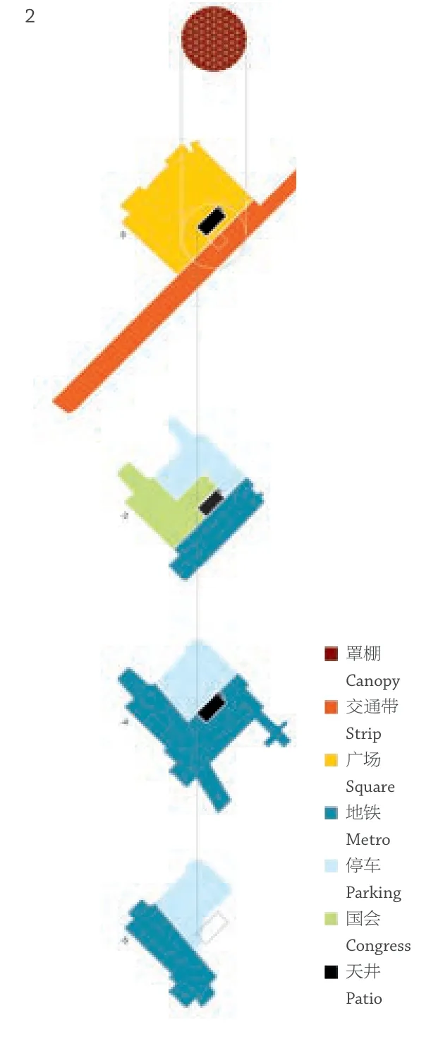
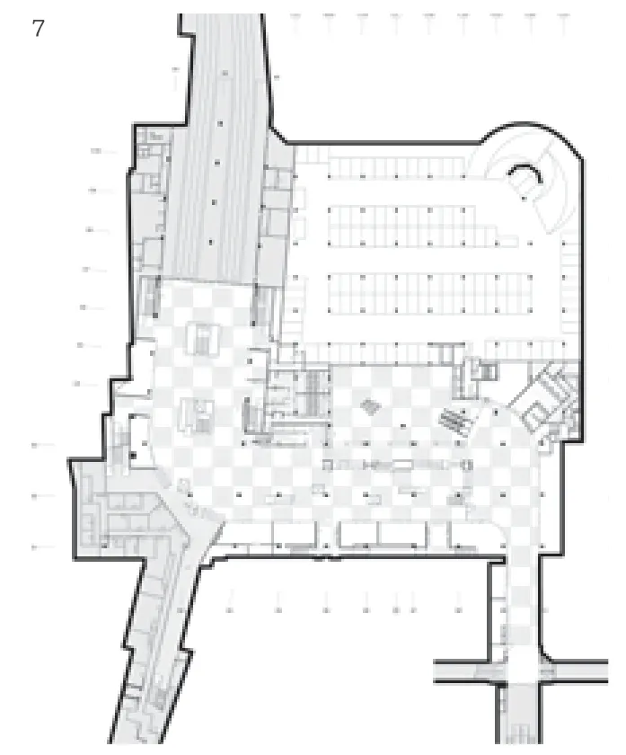
从地下基础设施中切分出的中庭是该项目的核心元素,它为地铁层和地下活动空间引入了阳光。此外,它还是一个连接处,进入地下和现有停车场的通道集中在中庭内部和周围。楼梯、自动扶梯、电梯和人行天桥构成的三维枢纽成为项目的核心。
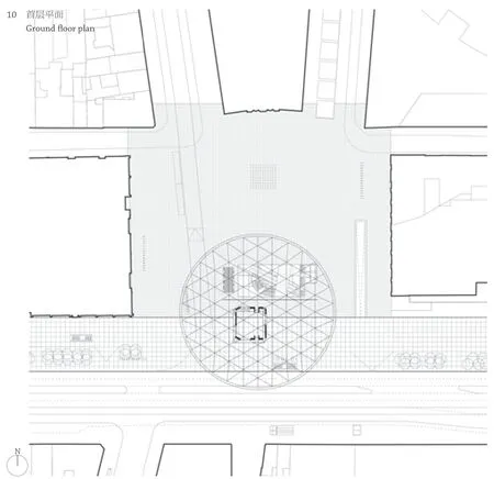
我们重组了地下层将人流引向中庭,引入了新的商店,并重新设计了与街对面的购物中心相连的地下通道。沿着大道北立面引入了一条步行街。只有出租车和公共汽车允许进入广场,大大减少了机动车的影响。虽然广场本身仍然开敞空旷,但我们在狭长地带设置了露台、街道小品和小树丛。狭长地带铺设着镶有鹅卵石的白色混凝土板,广场则铺着深色玄武岩。
我们在广场和林荫大道之间设置了一个大的圆形罩棚,覆盖着庭院和公共汽车站。其中央基座可作为咖啡馆。钢结构的罩棚位于4根原有的柱子上,这些柱子也支撑着地铁空间。基座体块基于现有柱网的平面,六边形的天花板融入在屋顶的三角形结构中。我们调整了平面,使罩棚置于广场的中心。屋顶用一块ETFE 板覆盖,而不透明的三角形则由白色PVC 箔片制成。□(天妮 译)
评审评语
This project is about public transport in public space.Rogier Square used to be a square in front of the North railway station,until it was relocated further up north due to infrastructural reasons.The area nonetheless remained an important hub:a major subway station was built under the square,while above the ground it became an intersection for bus lines.This new condition characterized by vertical fluxes,however,failed to be translated into a qualitative space.
A patio that is carved out of the subterranean infrastructure is the central element of the project.It brings daylight to the subway levels and to an underground event hall.It is nonetheless a connector as well.Access to the underground and to an existing parking garage is concentrated inside and around the patio.A 3D composition of stairs,escalators,elevators and a pedestrian bridge becomes the heart of the project.
The underground levels are reorganised.They are reoriented towards the patio,new shops are introduced and an underground link with a shopping mall on the other side of the street is redesigned.
A pedestrian strip is introduced along the north façade of the boulevard.The impact of cars is drastically reduced.Only taxis and buses are allowed on the square.While the square itself remains rather empty,the strip is accommodated with terraces,street furniture and small groups of trees.The strip is laid with white concrete panels incrusted with pebbles,the square with dark basalt stone.

1 总平面Site plan

2 功能示意Programme diagrams

3 外景Exterior view

4-6 街景Street views

7 地下二层平面B2 floor plan

8 地下四层平面B4 floor plan

9 罩棚托架构造分解Composition of the canopy support part

10 首层平面Ground floor plan
布鲁塞尔罗吉尔广场曾是火车北站前广场,后来车站北迁,所以广场的主要交通的功能发生变化,不过地下仍有地铁站、地面有汽车换乘站,交通功能仍在。改造前,虽然地上、地下有扶梯联系,但是广场环境消极。改造设计在广场中挖出一个地下庭院,将天光引入地下空间,结合形成立体的竖向交通枢纽,成为项目的核心。围绕地下中庭重新组织商店、形成街道;地面沿北侧的建筑界面前开辟简洁亲切的步行区,形成广场与大街的过渡。设计利用巨大的圆形罩棚将广场与大街之间联系在一起,从城市角度突出了广场的标识性。罩棚是利用4 根已有柱子支撑的,从光线和要素上将上下空间串联起来。
In between the square and the boulevard a large circular canopy is installed that covers both the patio and the bus stop.It has a central pedestal that is used as a coffee shop.The canopy is a steel structure resting on 4 pre-existing columns that also support the underground trains.The pedestal,a volume with a rectangular ground plan based on the existing column grid,and a hexagonal ceiling integrated in the triangular structure of the roof,is shifted in plan in order to position the canopy at the centre of the square.The roof is covered with a single ETFE sheet,while the opaque triangles are made of a white PVC foil.□
Jury Statement
Rogier Square in Brussels used to be a square in front of the North Railway Station.Due to the later relocation of the train station to the north,the main traffic function of the square was changed.However,the metro station in the underground and the bus transfer station above the ground enabled such a function to remain.Before the conversion,although there were escalators connecting ground and underground levels,the environment of the square was still unpleasant.In this transformation design project,an underground patio was excavated out of the square that brought daylight to the subterranean level,forming a three-dimensional vertical traffic hub,which became the heart of the project.The stores were re-organized around the underground patio,shaping the streets,while the ground opened up a simple yet friendly pedestrian area in front of the building on the north side,serving as the transition between the square and the main street.The design employed a large circular canopy to link the square with the main street,highlighting the identity of the square in terms of urban design.The canopy rested on four existing pillars,connecting the upper and lower spaces from the perspective of light and the elements.

11.12 剖面Sections

14-16 内景Interior views

