查尔斯·内格雷媒体图书馆,格拉斯,法国
米凯利·博尼诺,皮埃尔-阿兰·克罗塞特
记忆与再生
栏目主持:阿尔伯托·博洛尼亚,米凯利·博尼诺,乔治亚·塞斯塔罗,皮埃尔-阿兰·克罗塞特
Memory and Regeneration
Column Editors:Alberto Bologna,Michele Bonino,Giorgia Cestaro,Pierre-Alain Croset
米凯利·博尼诺
B.1974,都灵理工大学博士都灵理工大学副教授、中国与其他亚洲国家关系主管
Michele Bonino
B.1974,PHD.,Politecnico di Torino Associate Professor,Rector's Delegate for Relations with China and Asian Countries,Politecnico di Torino
皮埃尔-阿兰·克罗塞特
B.1957,洛桑理工学院硕士米兰理工大学教授
Pierre-Alain Croset
B.1957,MArch.,EPFL Lausanne Professor,Politecnico di Milano
史蒂文·皮科洛 意译英,叶扬 英译中
Translated from Italian by Steve Piccolo,from English by YE Yang

1 城市环境中的图书馆草图Sketch of the library in the urban context
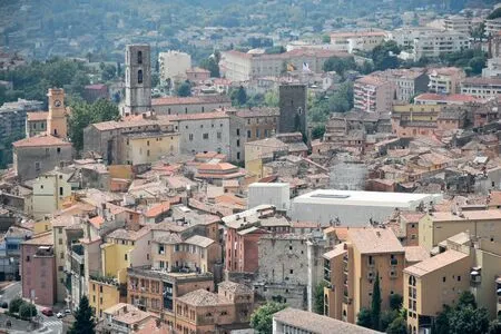
穿过小街和广场,远离历史中心的商业区,向东北走,我们发现自己置身于一个越来越密集的城市空间迷宫之中。山坡愈加陡峭,众多建筑物中,我们突然瞥见一堵由细长的垂直圆柱体构成的外墙。而后,一座新建筑及建筑物下的通道,带着我们走上一段台阶,通往大阶梯式的广场。在此,我们看到一座新建成的建筑,它的立面颇具力量感又几乎是悬浮的:格拉斯,离法国里维埃拉几公里、被称为“世界香水之都”的城市,在它的市中心,由伊夫里·塞雷斯、艾曼纽尔·博杜安和洛朗·博杜安设计的媒体图书馆通过一系列互补的设计策略使中世纪城市的结构得以再生。
凭借其强烈的形式特征,该建筑提出了两种与周围建筑建立关系的方式。一方面,它寻求一种靠近的关系,与沿着查尔斯·内格雷街的几座历史建筑共生互动,其中两座建筑在工程的第一阶段倒塌,迫使它们翻新重建并参与到整个项目中。媒体图书馆借用了这一系列住宅的立面、楼层和屋顶结构,并在其复杂的建筑组织中收为己用。另一方面,媒体图书馆建立了与城市的对话,打开了各个楼层的视野,可直达的高处露台和耸立在历史中心街区屋顶上的塔楼,让我们可以看到远处的大教堂甚至更远的地方以及周围的景观。
除了在3700m2的建筑中组织文化功能外,该项目还包括2700m2的周边公共空间的再生,在城市的空间组织中发挥了重要作用。为制革工业提供水源的福克斯河,围绕着它的源头形成了Rouachier 老区。在建于 1953 年的大容量水槽中,至今仍然可以感受到水的存在。水槽与下坡接壤的石墙改变了原始地形,在历史中心的陡峭地带创造了一系列的台地地形。新建筑在水槽的体积上延伸,很好地利用了莫雷尔广场台地式的城市空隙,将其建筑的各层连接起来,并将它们重新连接到周围狭窄的街道和公共空间的迷宫中。
2 城市环境中的图书馆The library in the urban context
项目建筑师:伊夫里·塞雷斯,艾曼纽尔·博杜安,洛朗·博杜安
Project Architects:Ivry Serres,Emmanuelle Beaudouin and Laurent Beaudouin
摄影:洛朗·博杜安
Photos:Laurent Beaudouin
Walking through small streets and squares,getting away from the more commercial area of the historical centre and heading northeast,we find ourselves in an increasingly dense maze of urban spaces.The slope of the hill becomes steeper,and amidst the buildings we can suddenly glimpse a façade made of slender vertical cylinders.Then a new tower,and a passage below the buildings,invite us to climb a flight of steps leading to a large stepped plaza.Here,we discover the main façade of a recent building,powerful but almost suspended:in the centre of Grasse,a city located a few kilometers from the French Riviera and known as the worldwide perfume capital,the Media Library designed by Ivry Serres,Emmanuelle Beaudouin and Laurent Beaudouin regenerates the medieval urban fabric through a series of complementary strategies.
With its strong formal identity,the building proposes two ways of relating the surrounding construction.On the one hand,it seeks a relationship of proximity,in symbiotic interaction with several historical buildings along Rue Charles Nègre,two of which collapsed during the first phase of the worksite,forcing their renovation and involving them in the overall project.The Media Library borrows façades,levels and roofing structures from this series of residences,and absorbs them in its complex architectural organisation.At the same time,the media library establishes a dialogue at a distance with the city,opening up views and glimpses at various levels,all the way to the upper terrace and the tower that stands out over the rooftops of the historical centre,permitting views in the distance towards the cathedral and beyond,to the surrounding landscape.

3 图书馆的入口层平面,新的体量和修复的老房子之间有明显的区别Plan of the entrance level of the library,with a clear distinction between the new volumes and the restored old houses

4 图书馆上层平面,高于修复的房屋屋顶,连接3层的坡道呈弧形体量Plan of the upper floor of the library,emerging over the roof of the restored houses,with the curved volume of the ramps connecting the three levels
然而,另一方面,设计师面临的问题是,大多数游客不会从入口广场上山,而是走下面的Droite 街/内格雷街,从大教堂区域到达。因此,建筑楼体的朝向非常重要,在广场上甚至看不到它,但在市中心能立即引人注目。该建筑在形式上鼓励重新将Lauve 老街作为城市的中轴线,这是一条上山的长台阶,多年来一直消失在城市空隙中。沿着媒体图书馆的另一面,设计创造出了第二条通道,阶梯连接着内格雷街和Vercueil 广场,展览空间位于这个中间层,并通过架在水槽承重墙的有顶廊道,重新连接到Lauve 老街的台阶上。所有这些城市小径都具有不同的视野,在建筑和城市文脉之间建立关联。在建筑的内部,跨越7 层的路径能让人体验到城市的空间特质,特别是在连接图书馆地上3 层的坡道中:从二层上升到三层,第一段坡道是封闭在墙壁之间,光线从上而下,就像中世纪的小巷,而在最后的弯曲部分,走到坡道尽头,是面向广场的开阔视野,让人豁然开朗,充满惊喜。
建筑师们对格拉斯和新媒体图书馆之间的复杂关系进行了恰当的描述。“这是一个在非常狭窄街道、拱形通廊和开放广场之间展现出张力的城市,是可以沿着上升下降的小路望着山脉全景并穿行其间的城市。我们在建筑中保留了这个城市的风格,因而具有了狭窄和舒展对比的空间、使用了曲线和反曲线、出现了拱形天花板和两个承担纵向结构跨度的大厅。”在以往的建筑中,如普瓦捷的弗朗索瓦·密特朗媒体图书馆(1992-1996)或贝尔福的卢西恩·费弗尔大学图书馆(1996-1999),艾曼纽尔和洛朗·博杜安展示了他们的能力,通过运用开放的现代建筑语汇重建历史城市的环境,同时能唤起地方记忆:一种并非模仿的建筑理念,改变了对传统城市肌理的设想。
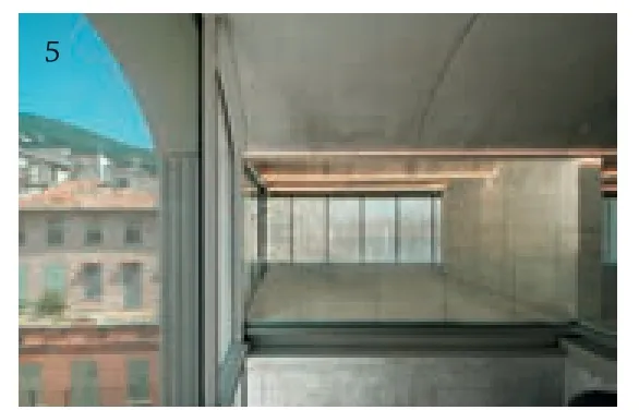
5 图书馆地上两层的中间空隙,面向莫雷尔广场The central void of the two upper floors of the library facing Place Morel

6 纵剖面,图书馆地上两层悬挑在现存的水槽上,面向莫雷尔广场(左 侧),在中间位置的空隙视觉上连接了图书馆地上3层Longitudinal section,The two upper levels of the library are cantilevered over the existing water tank facing Place Morel (to the left).At the center a void connects visually the three levels of the library
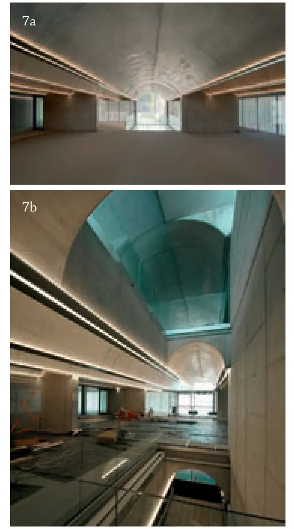
7 结构拱顶将人工光线扩散到阅览室, 中央拱顶有双重宽度和高度,形成纵轴The structural vaults diffuse the artificial light into the reading rooms,the central vault has a double width and height forming the longitudinal axis
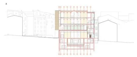
8 横剖面,图书馆的地上3层有预制混凝土拱顶的结构,悬挑在礼堂和展厅所在的地下室上方Cross section.The three upper levels of the library have a structure of prefabricated concrete vaults,cantilevered over the basement occupied by the auditorium and the exhibition gallery
Along with the cultural functions organised in the 3700 m2of the building,the project covers the regeneration of 2700 m2of surrounding public spaces,which play an important role in terms of urban organisation.We are in the old Rouachier district,which took form around the source of the Foux river that fed the leather tanning industry.The presence of water is perceptible today in the large volume of the tank of the aqueduct,built in 1953 and bordered downhill by a stone wall,which has modified the original topography,creating a series of terraces in the steeper zone of the historical centre.The new building extends over the volume of the tank,making good use of the terraced urban void of Place Morel,connecting its various levels and reattaching them to the surrounding maze of narrow streets and public spaces.
On the other hand,however,the designers faced the problem posed by the fact that most of the visitors would not arrive uphill,from that access plaza,but from below,on Rue Droite/Rue Nègre,a street that arrives from the zone of the cathedral:hence the importance of the tower,oriented towards that side,not even visible from the plaza but immediately noticeable from the city center.The form of the building encourages renewed use of the old Rue de la Lauve as a central axis in the city,a long flight of steps going up the hill that had been lost for years in the urban void.A second ascent has been created along the other façade of the media library,with a staircase connecting Rue Nègre and Place Vercueil,with the entrance to the exhibition spaces placed on this intermediate level.From that point a covered passage along the support wall of the water tank permits reconnection to the steps of Rue de la Lauve.All these urban paths reveal different views,in the relationship between the building and the urban context.Also inside the building,the paths across its seven levels take on the quality of an urban experience,especially in the ramp that connects the three upper levels of the library:ascending from the second floor to the third,in the first stretch the ramp appears closed between walls and lit from above,like a medieval alley,while in the final curved portion,at the end of the ascent,the view finally opens towards the plaza with a surprising effect.

9 从莫雷尔广场望向图书馆View from Place Morel

10 从Vercueil广场望向图书馆View from Place Vercueil

11 拱顶结构为图书馆地上两层的承重结构,悬挑在水槽的承重墙上The structural vaults support the two upper floors of the library,cantilevered over the wall of the preexisting water tank
在这座位于格拉斯的建筑中,其立面的特殊材料的建造方法和形式构成,在维持形态连续和体量抽象之间的微妙平衡方面发挥了根本作用。为了呈现传统建筑的体量感,3 位建筑师用白色混凝土代替了石头,最重要的是,他们把立面设计成由间隔很近的细长柱子组成的精致格栅,造就了具有光与影、重与轻的对比而表现力非凡的效果。一方面,外立面的匀质导致人们对媒体图书馆的整体印象是纯粹、抽象的棱柱形,其特点是在水平方向体量和基座分开并无太多变化,建筑末端以弧线结束:与建筑主体分开的弧形坡道朝向坡莫雷尔广场,另一端是作为城市地标、朝向内格雷街的楼体。另一方面,使用圆柱形元素强调了外墙材质的厚重特性与其真实立面透明属性的对比:实际上,在建筑内部,我们透过落地玻璃和犹如自然光过滤器的格栅,构建了对城市的视觉感知。
除了表面上的抽象,外立面以一种精致的方式揭示了它的构造原理,细长的钢檐暗示了内部楼层的存在,与A/B/A/B/A 的交替构图节奏相一致。较小的量度A 为1.48m,与拱形板的高度相对应,较大的量度B 为2.64m,标记出结构拱顶内侧地板的位置。这些间隔之中,圆柱形的部分简单地堆叠和包封在一起,就像古代柱子的断面那样,但两种不同高度的模块(一种是全高的,另一种是其1/2 高)混用使其水平交接线形成自由且不规则的组合交替,避免了规则排列的重复和单一。靠近观察,我们发现小柱子上有垂直条纹——几乎像在暗示古老的多立克柱式序列——且在其直径上有些许的不完美:所有这些都促使观察者感到仿佛置于自然材料面前——如涂成白色的木材或竹子——因此看到一面“生动的”外墙。从与城市的关系到其立面的细节,查尔斯·内格雷媒体博物馆展示出,对于重新发现和加强我们的城市记忆,当代建筑可以做出怎样清晰、复杂且具有决定性意义的贡献。□
This complex relationship between Grasse and its new Media Library is aptly described by the architects:"It is a city that plays on the tensions between very narrow streets,vaulted passages and open squares,a city one can cross along ascents,descents and panoramic viewing points for the mountains.We conserve this spirit in the building,preferring narrow and dilated spaces,curves and counter-curves,vaulted ceilings and two lobbies that vertically span the structure." Already in previous constructions like the Médiathèque François-Mitterrand in Poitiers (1992-1996) or the Bibliothèque Universitaire Lucien Febvre in Belfort (1996-1999),Emmanuelle and Laurent Beaudouin demonstrated their ability to regenerate a historical urban context with the insertion of architecture with an openly contemporary language,yet at the same time capable of evoking the memory of the place:an architecture that is not mimetic,but transfigures the references to traditional urban fabric.
In this building in Grasse,the particular material approach and formal composition of the façades play a fundamental role to achieve this delicate balance between morphological continuity and volumetric abstraction.To suggest the sense of mass of traditional architecture,the three architects have replaced stone with white concrete,and above all they transform the wall into a delicate grille formed by slender columns placed very close together.The result is a façade of extraordinary expressive quality,which plays with the contrast between light and shadow,weight and lightness.On the one hand,the uniformity of the cladding leads to an overall perception of the Media Library as a pure,abstract prismatic form,marked by few variations in the large horizontal cuts that detach the volume from the base,and in the curved ends of the building:towards Place Morel with the ramps that are separated from the main volume,towards Rue Nègre with the corner tower that forms an urban landmark.On the other hand,the fact of using cylindrical parts accentuates the contrast between the apparent heaviness suggested by the material,and the true nature of this façade,which turns out to be very modern in its transparency:from the inside,in fact,we discover full-height glazing and the role of the grille as a filter of natural light that permits visual perception of the city.
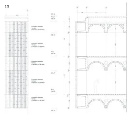
13 剖立面详图,通过细长的钢檐与结构拱顶相连的白色混凝土柱实现Detailed section and elevation of the façade,realised with white concrete columns attached through slim steel cornices to the structural vaults
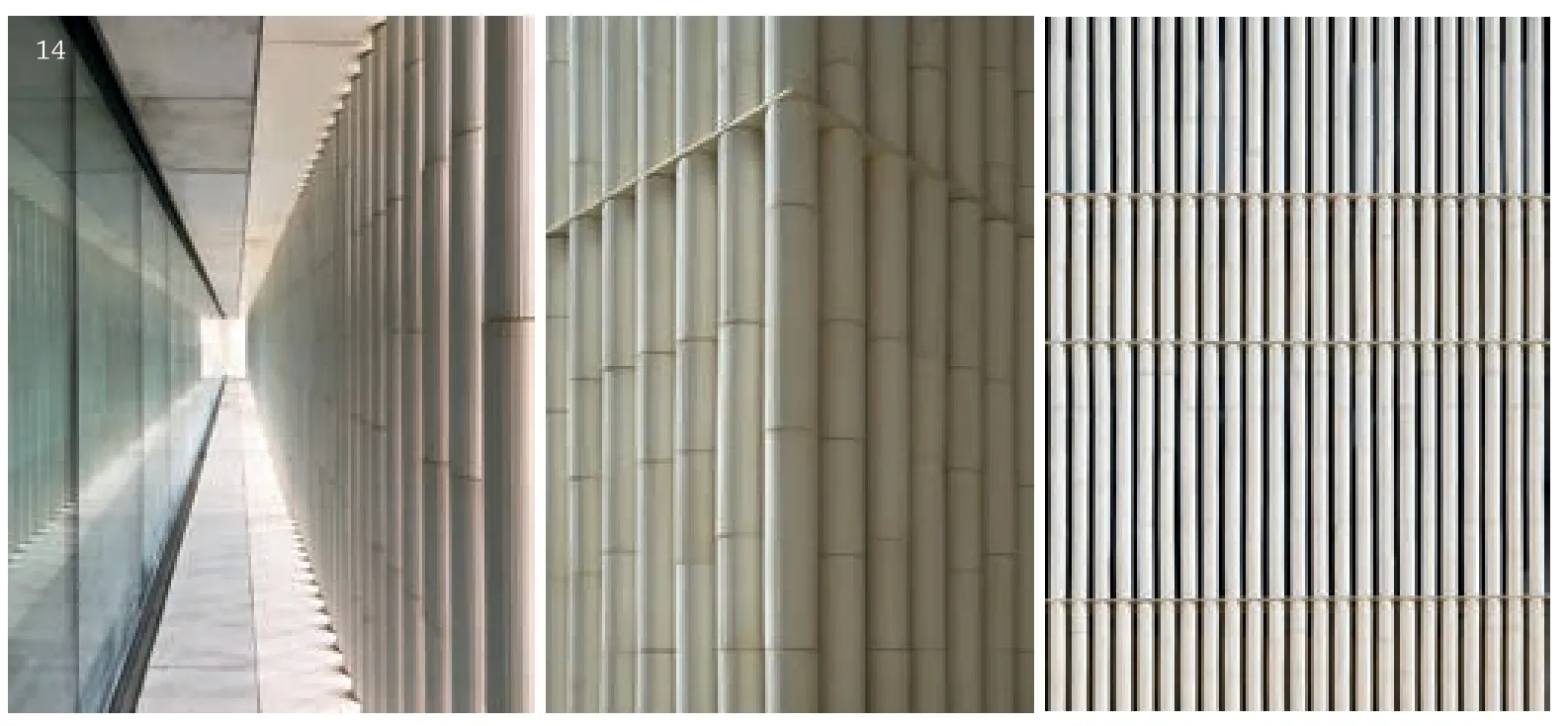
14 外墙的细节Detail of the façade
Apart from its apparent abstraction,the façade reveals its constructive reasoning in a refined way,with slim steel cornices that suggest the presence of the internal floors in keeping with an alternating compositional rhythm of A/B/A/B/A.While the smaller measurement (A) of 1.48 m corresponds to the thickness of the vaulted slabs,the larger one (B) of 2.64 m marks the internal height of the floor at the intrados of the structural vaults.Within these intervals,the cylindrical parts are simply stacked and sealed together as were the segments of antique columns,but the use of modules of two different heights (one whole,the other half its size) makes it possible to obtain a very free and irregular composition with the horizontal joints shifted,thus avoiding the repetitive effect of a regular grid.Moving closer with the gaze,we discover that the small columns are vertically striped– almost as if to suggest an ancient Doric order– and have slight imperfections in their diameter:all this prompts the sensation in the observer of being in the presence of natural materials– like wood or bamboo,painted white– and therefore of seeing a "living" façade.From the relationship with the city to the details of its façade,the Médiathèque Charles Nègre demonstrates how the contribution of contemporary architecture to the rediscovery and enhancement of our urban memory can be articulate and complex,and– in this case– decisive.□

