WeWork威海路中国旗舰店,上海,中国
设计:联图建筑设计
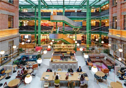
1 中庭/Central atrium
在上海市中心威海路一带的老居民区中,有这样一栋历史建筑:曾经是鸦片工厂,也曾是艺术家聚集地。WeWork的中国旗舰店就坐落在这幢砖楼里。
这栋楼规模颇大,联图建筑设计以此为基础融入了豪华酒店的氛围。
来访者首先要穿过一座老式石拱门,再走过一条粉色的巷道:墙面是粉的,水泥地板也被刷上了粉色。两面粉墙之间,露天悬挂着数个小吊灯,散发出暖黄的灯光,欢乐温馨。
时间在原有的旧式砖混建筑上留下了许多工业风格的印记。在设计中,联图建筑设计试图通过不同方式来诠释与体现这一新与旧的对比冲突。前台位于传统与现代建筑风格的交接处,底座由混凝土筑成,正面使用了有历史感的木质镶板,青铜色金属台面的四角向上方延伸,勾勒出上部的框架,一排小灯垂悬而下。后方整面墙由一排排蓝色小抽屉组成,一块标有“Ring For Service”(需要服务请按铃)字样的灯牌嵌在其中。
整座楼高3层,内庭中空。原有的金属支撑结构被涂上了青绿色,新增的金属架则是黑色,带扶手的保护隔板选用了暗色系杂色欧松板,站在楼上的人想一望楼下情形时,可以安全倚靠。
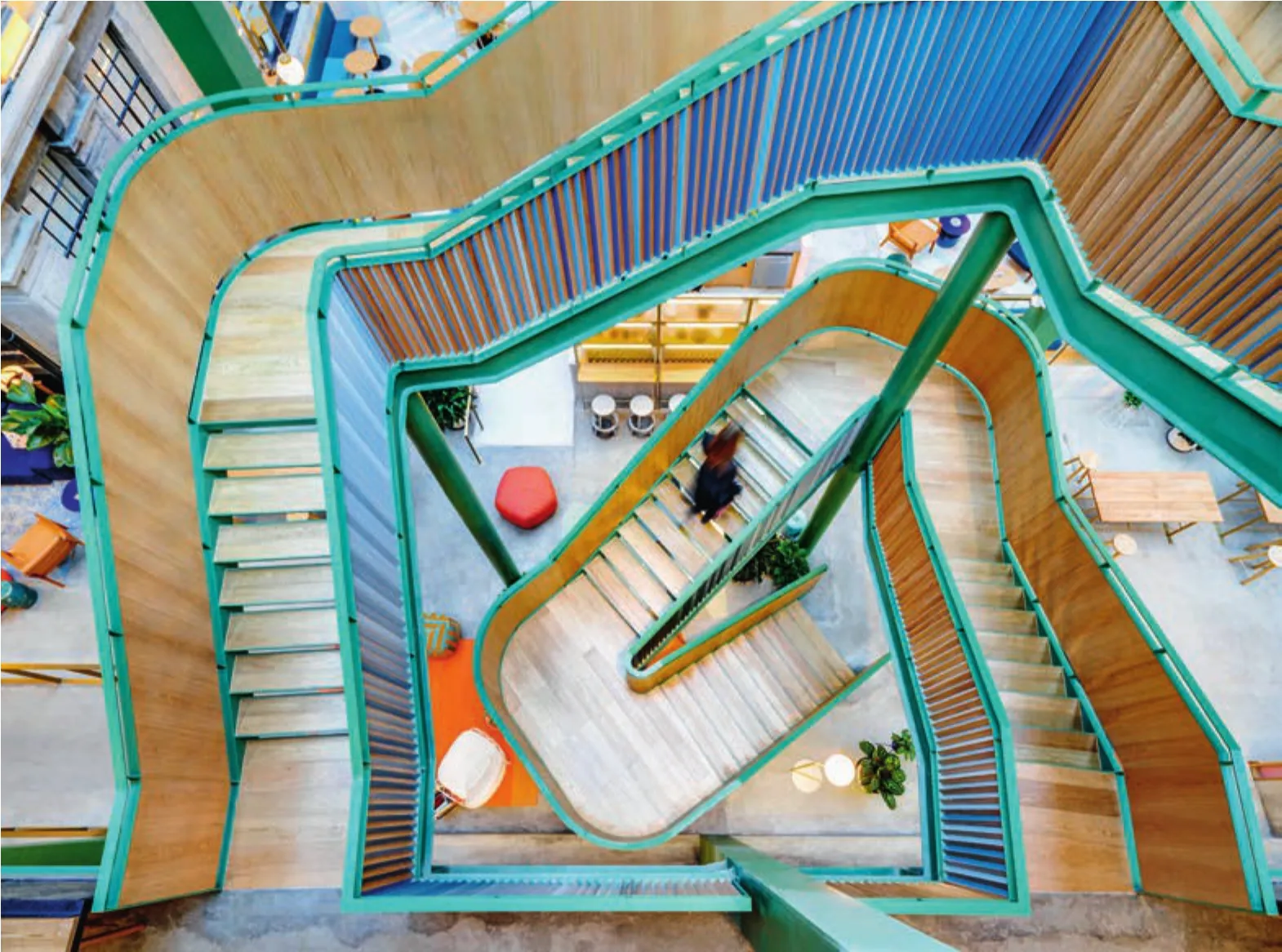
中庭层与层之间由绿色的铁质旋转楼梯相连。楼梯外侧由数块三角橡木板拼成,并在一侧刷上了不同层次的蓝色。拾级而上,楼梯颜色变换,由原木向蓝色过渡。
上楼来到茶水间首先跃入眼帘的是以罂粟花为主题的大幅墙绘,金色调的手绘花朵在墙上蔓延绽放,与过去鸦片工厂的历史相呼应。
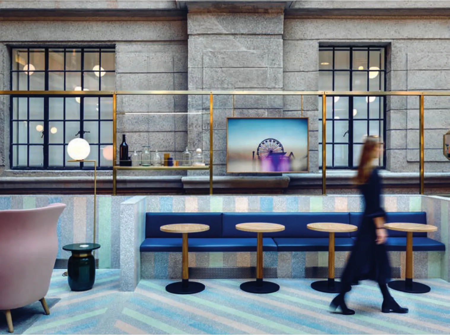
中庭四周的建筑外墙极富历史感。水磨石矮墙界定着空间。蜡笔质感的蓝、绿、粉、灰色色带在墙面和地面并次排列,拼成“硬景观”地毯。矮墙上部与青铜色金属架相连,挂着镜子和艺术品,也用于置物和吊灯的悬挂。
灯光布置别出心裁,在三楼的高度粉色与灰色的线缆互相交错,并以青铜色金属环相连,一盏盏定制吊灯从金属环处垂悬而下。
穿过中庭走进这栋历史建筑的内部来到酒吧间,热带风与怀旧东方风情的碰撞令人产生时空错置感。鹅黄色渐变的手绘墙上,老上海的太太小姐们身着斑马条纹套装、戴着嘻哈佩饰,难以判断她们到底是从1920年代穿越而来,还是一不小心从现代穿越回了过去。橱柜的正面,蓝色与粉色霓虹灯管间隔排布拼出扇形的图样。
楼内的墙纸为特别定制,并且延续了欢乐谐趣的主题概念以及蜡笔色的色调,金色和绿色为主的几何图案也都是手绘而成。
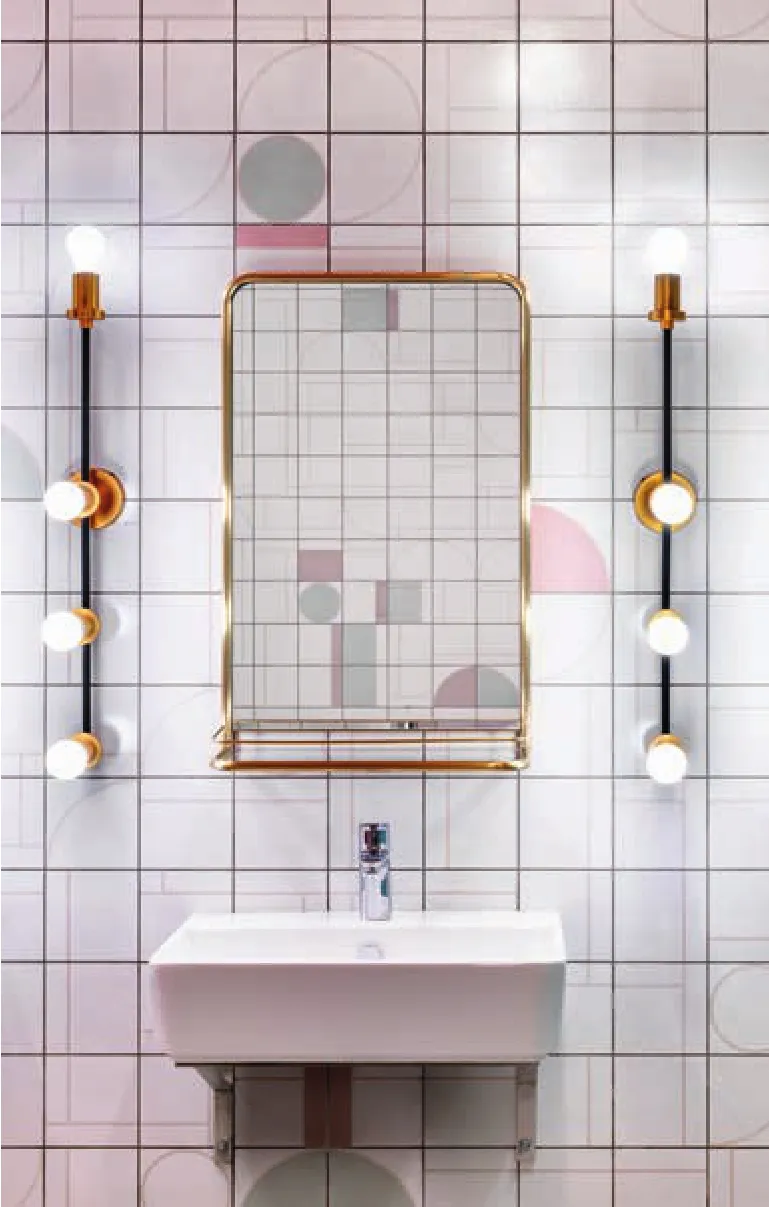
卫生间里,独家定制的墙砖上有粉色与绿色的几何图案块和若隐若现的线条,天花板是灰粉色,隔间和门框是薄荷绿,定制的顶灯与墙镜则营造出一种会客厅般的豪华感。□
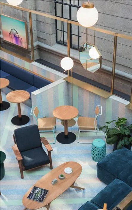
2 中庭一角/Atrium corner
项目信息/Credits and Data
地址/Location: 上海市静安区威海路696号/696 Weihai Rd,Jing'An District, Shanghai
面积/Area: 5500m2
摄影/Photos:雷坛坛/Jonathan Leijonhufvud (fig.1,4-8),Dirk Weiblen (fig.2,3)
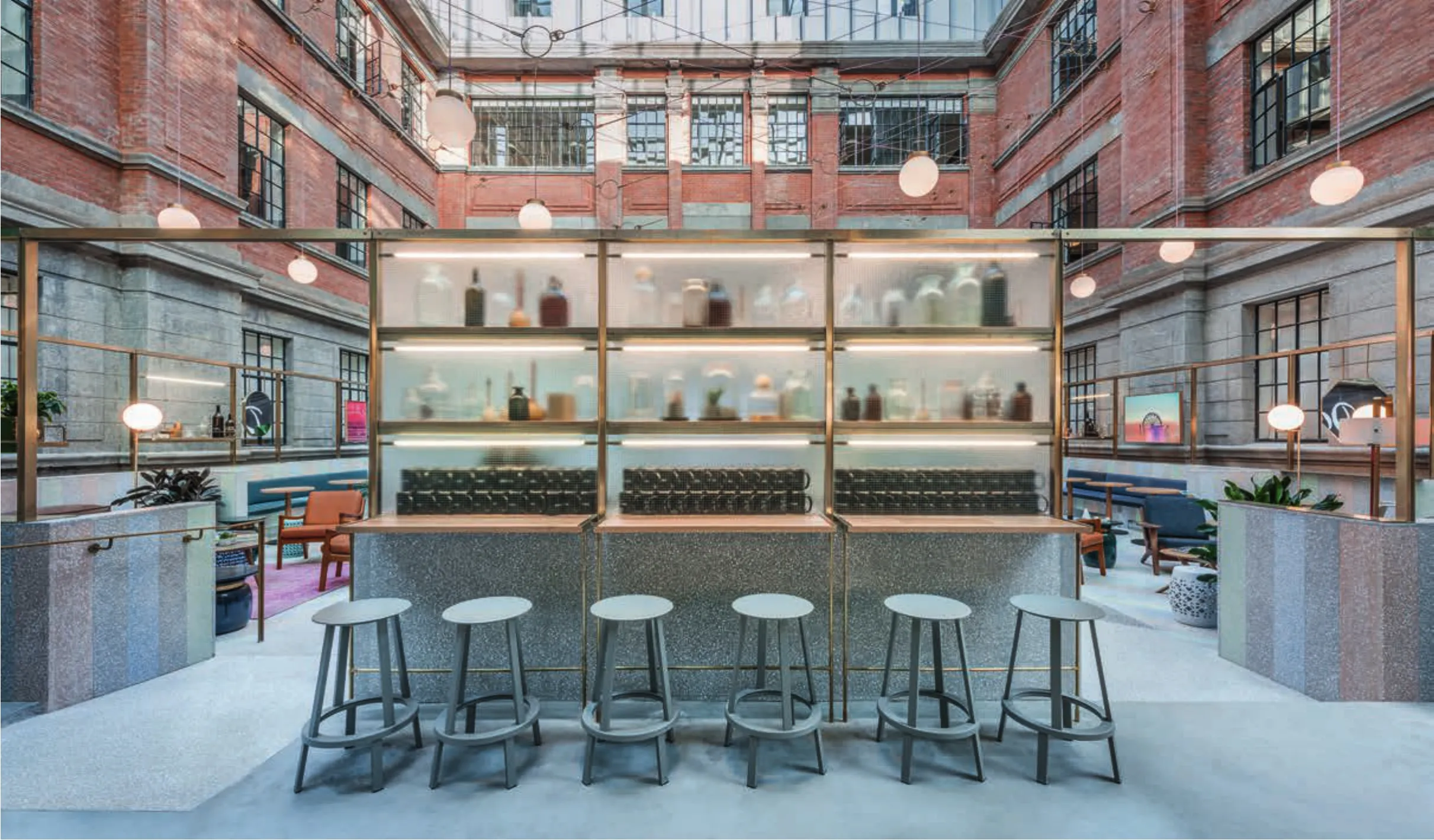
3 矮墙/The curved terrazzo tray
WeWork Weihai Lu is nestled in a turn of the century brick building; a former opium factory and artist residence. This building is surrounded by an old residential district in the heart of Shanghai.
In collaboration with WeWork, Linehouse celebrated the grandeur of the building, encapsulating the feeling of a grand hotel.
Upon arrival, guests pass through an old laneway, framed by a traditional Chinese arch.The lane walls are painted pink and the floor pink concrete. Above, lights are festively suspended between the laneway walls.
The existing site is a combination of a brick historical building with further industrial additions that have been made over the years. The reception is located in this in-between zone of the old and new.Linehouse played with this narrative in the design.The reception counter is clad in heritage wood panelling, surrounded by a concrete base. A bronze metal structure hangs lighting and creates leaners.Behind the reception, guests are greeted with a neon sign "Ring for Service" contained in a cabinet of curiosities, painted in a light blue.
The existing steel structure is painted ivy green,with a new black metal and black stained OSB handrail leaner wrapping the triple height space,allowing guests to be spectators to the activities below.
A green steel staircase weaves through the circulation space connecting all three levels of the front of house. This is clad in triangular pieces of oak wood, with one side painted in hues of blue. The colours alternate as you travel up the stair creating a gradient of tones and shifting views from wood to blue.
The staircase leads to the two pantry areas that play on the opium factory narrative, with large scale poppy wallpapers, hand painted in gold.
The central atrium is surrounded by the heritage façade. A curved terrazzo tray was inserted to define the space, pastel diagonal strips in blue,green, pink and grey wrap the floor and wall,creating a hardscape carpet. A bronze structure is suspended above the terrazzo perimeter wall,hanging mirrors, artwork, shelving and lighting.
A bespoken lighting installation is suspended in the triple height space. Pink and grey cabling traverses the void threaded through circular bronze rings which hang custom glass shades.
Passing through the central atrium space to the back bar located within the heritage building, one is transported to a tropical retro oriental parlour.A gold gradient wallpaper wraps the perimeter wall, with hand painted Shanghai ladies, clothed in zebra attire and adorned in gangster bling, their era blurred between the 1920’s and the present day. A blue and pink neon in the shape of a fan frames the pantry area.
Custom wallpapers continue to play on this festive theme, with geometric and interweaving patterns in pastel tones, these are hand painted over in gold and green.
The bathroom walls are lined with custom printed tiles in pink and green interconnecting lines and shapes. The ceiling is painted a dusty pink,and a mint green lacquer box contains the cubicles,custom bronze light fixtures and mirrors create a parlour-like vanity. □
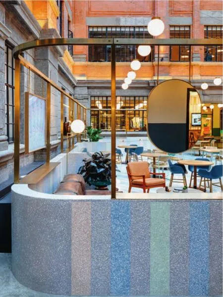
4.5 矮墙/The curved terrazzo tray

6 水吧/Back bar
7 卫生间/Bathroom
WA:在这个项目中,设计起到了什么作用?
联图:这个独特的WeWork项目的设计是以一座已建成建筑为出发点的。我们看到这个空间的设计可以带有高贵与精致的美,建筑原有的恢宏气质蕴含着这样的元素。在设计中,我们延续了建筑的华贵品质,将豪华酒店的感觉注入其中,用奇思妙想与隆重的节日气氛迎接我们的客人和会员。这种豪华酒店的感觉从客人一开始经过片区经理的柜台接受问好就能感受到,柜台周围装饰着传统木镶板,包裹着混凝土基础。
WA:设计中最有创意和最具吸引力的部分是什么?
联图:建筑处于上海的弄堂里,建造于19世纪末和20世纪初。那是上海的“美好年代”,当时上海在时尚与建筑方面混合了东西方的特点,我们从中汲取设计参考,作为一种叙事。我们想创建一个兼具奢华、壮丽与欢庆气氛的空间,所以选择使用了粉彩色系的颜色,手绘着金色与常青藤绿色的壁纸,以青铜金属构架悬挂镜子、灯具照明、置物架与艺术品,弯曲的水磨石矮墙插入中庭之中,图案混合着蓝、绿、粉红与灰色的斜条,包裹着地板与墙壁,创建一种“硬景观”地毯。
WA:设计过程中最大的困难是什么?
联图:在一个对传统建筑的既有材质不敏感的年代,人们对这种建筑的历史立面做了多次加建。对我们来说,挑战是将已经存在的不同的建筑语言联系起来,建立一种协同作用。
我们将原有的钢结构涂刷成常春藤绿色,突出了原有的红砖;插入了两座新的步行桥和一座中心楼梯连接公共空间和两栋建筑物。在中庭区域,原有的栏杆被替换为新的黑色金属和染色的欧松板栏杆,构成了3层高度的空间。
WA:使用者的反馈如何?这个项目是如何改善使用者的工作状态的?
联图:来自上海会员和社区的反馈是非常积极的。WeWork 的设计精神是为合作和社区提供一个平台。因此,每个设计元素都为会员提供了具有适当的设计和功能组合的空间。
建筑的中心是中央中庭,同时也是社区的心脏,鼓励会员互动。它被设计成临时办公桌区域、自由会议区和理想的活动空间。每周,研讨会、商业社交活动甚至瑜伽课都在那里举行。这是一个关键的空间。
这样的设计还允许成员在工作日内有更多的私人时间。由青铜金属构架和蚀刻玻璃限定的角落使会员能远离活跃的中庭,拥有半私密的会议。聊天室设计为可以进行非正式会议的起居室。电话亭则让人拥有更多的隐私。 □(叶扬 译)
WA: What is the role of the design in this project?
Linehouse: The design for this particular WeWork was a departure from previously completed buildings. We saw an opportunity to approach the design of this space with an elevated and refined aesthetic—something that was also reflected in the grand nature of the building. In the design,we celebrated the sublime quality of the building,encapsulating the feeling of a grand hotel,transporting guests and members on an unexpected journey of whimsy, voyeurism and festivity. This notion of a grand hotel is first experienced upon arrival as guests are greeted by the community manager counter, clad in heritage wood paneling,surrounded by a concrete base.
WA: What is the most creative and attractive solution?
Linehouse: The building is located in the"longtangs" of Shanghai built in the late 19th and early 20th centuries. We took reference from this era in the design, using Shanghai’s belle époque,when Shanghai was embracing a mix of East and West in fashion and architecture, as a narrative. We wanted to create a space with a sense of opulence,grandeur and festivity, through the use of a pastel colour palette, wallpapers hand painted in gold and ivy green, the bronze metal structures hanging mirrors, lighting, shelving and artwork, to the curved terrazzo tray inserted in the main atrium composed of pastel diagonal strips in blue, green,pink and grey wrapping the floor and wall, creating a hardscape carpet.
WA: What was the most difficult part in the process of design?
Linehouse: There had been multiple additions made to the historical façade over the years that were not so sensitive to the existing fabric of the heritage building. The challenge was to create a synergy between the different languages that existed and tie them together.
We painted the existing steel structure ivy green, complimenting the existing red brick; we inserted two new bridges and a central staircase to connect public spaces and the two buildings. The existing balustrade in the atrium area was replaced with a new black metal and stained OSB handrail leaner wrapping the triple height space.
WA: What is the feedback from the users? How did this project improve the users' work?
Linehouse: Feedback from the members and community in Shanghai has been very positive.WeWork's design ethos is to provide a platform for collaboration and community. Accordingly, every design element provides members with spaces that have the right mix of design and function.
At the heart of the building is the central atrium, also the heart of the community where members are encouraged to interact. It is designed to be a hot-desking location, casual meeting area,and the ideal event space. On a weekly basis,seminars, networking drinks and even yoga classes are held there. It's been a crucial space.
The design also allows for members to have more private moments in their working day. Nooks made from bronze metal structure and etched glass allows members to have semi-private meetings away from the active atrium. Conversation rooms are designed to be as living rooms for informal meetings. Phone booths allow for more privacy. □

