Kwerk奥斯曼空间与第一旅行空间,巴黎,法国
设计:艾伯特·安杰尔

1 Kwerk奥斯曼空间大厅/The green lobby of Kwerk Haussmann
一切都是从一个办公室的设想开始的。最初的意图是创造一个独特、适应性强、符合人体工学、极具创意的工作空间。
在Kwerk,桌面是可升降的,这就能轻松改变工作姿态或按个人喜好调整工位。设计师艾伯特·安杰尔从办公室的隔墙中看到了解决方案,而它又可以作为实用的储藏空间,节省出大量面积。
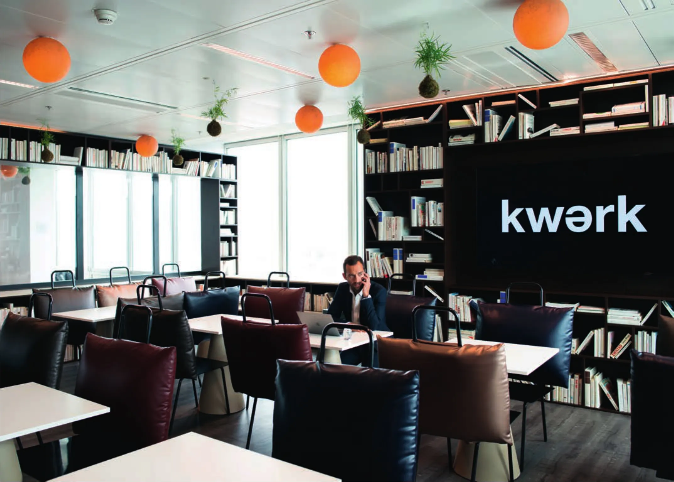
在将工作空间改为展厅的过程中,玻璃展柜成了Kwerk的一大特色。这些与Kwerk办公空间交映成辉的展柜中陈列着刷白的展品,那些为人熟知的物品都来自日常生活和流行文化。随着它们逐渐从我们的生活中消失,并被数字产品或3D打印物取代,在Kwerk,它们成为了统一的藏品。
艾伯特·安杰尔以这种微小的操作向巴黎这座艺术积淀深厚的城市致敬。这些物品陈列在展柜中,成了奇思妙想的无形宝库,永远不会被遗忘。
通透一直是我们设计的指导原则。在这些位置展柜装有二色灯。它们不仅能衍射光线,还可以营造出一种前方无边无垠的感觉。
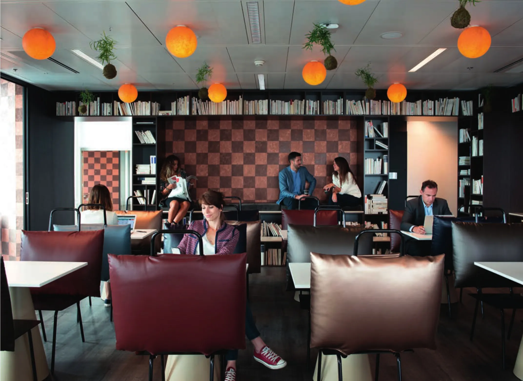
我们的开放平面办公室有齐腰高的软木隔墙。它有助于创造私密的空间,而不破坏Kwerk作品中标志性的活泼与通透。
Kwerk奥斯曼空间:营造绿色大厅
我们从一个大玻璃顶篷出发。它面向大自然,让中庭阳光充盈、空间开阔,使它成为富丽堂皇的大厅。这就是Kwerk奥斯曼空间的特色核心——体现生物多样性、释放心灵的一片净地。
它犹如一个天然的蚕茧。这个顶篷的建筑图案遍布建筑各处,将宾客包裹在艾伯特·安杰尔设计的密林之中。一切都是围绕包容性而建的。在中庭里,立柱成林,百草葱葱,为空间带来了绿化、土壤和水分。这个世界被设计成一个整体、一个建筑生态系统、一个独特的植物群“圣殿”。
一走进这个空间就来到了绿植与土壤的世界。映入眼帘的是展箱中葱郁的苔玉,它们仿佛悬在半空中,在展箱的表面上无数次地折射。一座老式的展柜陈列着一组宝石,每个都代表着一种地下的地质。最后,观众将欣赏到南非艺术家莫豪·莫迪萨肯的巨幅画作。
主厅里摆着两把韦尔桑式躺椅,上面配有巨大的胡桃木扶手。其绿色主题的室内与建筑整体的公共空间相统一。一张磨光柚木的大桌子为来宾和寻求景色变化的成员提供了公用空间。
10层阳台赋予了这座建筑独一无二的U形特征。这个划分出办公室和社交空间的绿植平台是一个让人远离都市生活压力的密闭净地。
It all starts with the idea of an office. The initial intention was to create a workplace that is unique,adaptive, ergonomic and creatively nurturing.
At Kwerk, desks can be raised or lowered to allow users to change their working position with ease or to adjust their workstations according to personal preference. Designer Albert Angel sees the solution in the partitions between offices, which double as practical storage units, freeing up an immense amount of floor-space.
Transforming the workplace into a gallery,vitrines have become a characteristic part of Kwerk.Intersecting and interacting with the office-space of Kwerk, the vitrines are filled with familiar,whitewashed items from daily life and popular culture. As these objects gradually disappear from our lives, replaced by a digital counterpart or by the creation of a 3D printer, at Kwerk they are transformed into a monochromic collection.
In this unique way, Albert Angel pays tribute to Paris as a city of artistic archives. By placing these items in vitrines, they take the form of an intangible library of inspiration and fantasy, one that won't be forgotten.
Transparency remains the guiding principle of our designs, but in these locations the vitrines are fitted with dichroic lamps that diffract light and give just a sense of the infinite beyond.
Our open-plan offices come with a waist-high partition in cork, which helps to create a private space without compromising on the conviviality and transparency that hallmark Kwerk's creations.
Kwerk Haussmann: To a green lobby
We began with a great glass canopy, opening up to the natural world and filling the atrium with light and space, transforming it into a magnificent lobby of luxury and illumination. This is the core of Kwerk Haussmann's identity – a place of biodiversity and spiritual retreat.
A natural cocoon. The canopy's architectural patterns disseminate throughout the building,enveloping members and guests in a kind of forest designed by Albert Angel. Everything is built around inclusivity. In the atrium, pillars stand like tree trunks while hundreds of plants bring greenery,earth and water to the space. This world has been designed to exist as a whole, an architectural ecosystem, a unique "cathedral" of flora.

2 Kwerk奥斯曼空间主厅/The main lobby of Kwerk Haussmann

3 Kwerk奥斯曼空间绿植平台/The jungle terrace of Kwerk Haussmann
Kwerk第一旅行空间:空中大厅
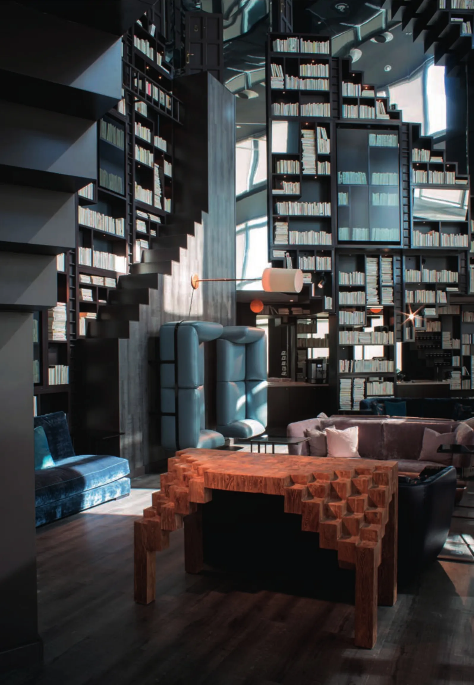
Kwerk弗斯特大厦空中大厅是该项目设计中大胆的点睛之笔。200m2的空中大厅位于11m的高空中,让人感到那是一座巨大的大教堂-图书馆综合体。架上有8000多册全白的图书,营造出空间无比恢宏的幻觉。
荷兰画家毛里茨·科内利斯·埃舍尔的蚀刻版画精心描绘的超现实建筑有一种奇异的视觉效果。艾伯特·安杰尔从他身上汲取灵感,天马行空地发挥建筑幻想,在天花板上挂起一面巨大的镜子,突出无穷无尽的感受。
在图书馆的巨型书架之间,硕大的银幕和视频墙幻化出超现实的奇妙影像,使人穿梭于2D与3D的界限之间。银幕上的影像持续更替变换,或定时或不定时,不断为空间塑造新的特征。
在靠近地面的位置上,图书馆的竖墙上固定着几个柔美的浅色沙发。读者可以兴致勃勃地坐在这些看似违背重力的家具的扶手上,或者坐在大厅里更为寻常、但没那么舒服的水平沙发上,欣赏城市美景或泛舟书海。大厅配有圆形剧场式的座椅,这种剧场效果非常适合举办各种会员活动。
4个神灵面具立在坚固的柱子上,作为Kwerk的卫士守护着这个办公室空间,是庇佑我们的神灵。它们给工作空间带来了幽默与个性,是这个品牌不断升华的神话之中的最新亮点,完美地再现了这一空间神形合一的本质。□(尚晋 译)
On entering the space, you are plunged immediately into a world of greenery and earth, as a display case of leafy Kokedama orbs, seemingly suspended in mid-air, comes into view, their images reflecting ad infinitum off the surface of the case. An old-fashioned cabinet presents an array of gemstones, each one a symbol of the geology beneath. Finally, visitors are greeted by an immense image from the corpus of South African artist Mohau Modisakeng.
The main lobby is framed by two Versant Edition lounge chairs, completed with colossal walnut armrests and the same thematic green interiors that are used throughout the building's communal spaces. A vast table in polished teak,offers a communal space for visitors as well as members looking for a change of scenery.
Ten storeys of balconies and terraces give this building its unique, U-shaped identity. Demarcating office and social spaces, the jungle terrace is an enclosed sanctuary, away from the stress of city life.
Kwerk Tour First: The Sky Lobby
The Sky Lobby at Kwerk Tour First is the bold frontline of the design. Standing at a towering 11 metres in height on a floor space of 200 square metres, the Sky Lobby feels like an immense cathedral-cum-library where some 8000 all-white books populate the shelves, giving the illusion of even greater dimensions to the space.
Drawing inspiration from the Dutch painter Maurits Cornelis Escher, whose etchings and lithographs of minutely-crafted impossibility in architecture play unsettling tricks on the eyes of the viewer, Albert Angel has taken the idea of mindbending construction and run with it. Suspended on a ceiling canvas, a vast mirror redoubles the sense of infinity.

4 Kwerk第一旅行空间大厅/The main lobby of Kwerk Tour First
Nestled among the library's vast bookshelves,giant screens and video display walls conjure images of the fantastical and the impossible, playing on the divide between 2D and 3D. Changing at both regular and irregular intervals, the images onscreen are in a constant state of flux, forming and reforming to give the space a new identity.
Closer to the floor, a few lightly-coloured,feminine sofas are fixed to the library's upright wall. Users can either sit happily on the armrests of these gravity-defying furniture items or on the more ordinary but no less comfortable selection of horizontal sofas in the lobby, admiring the view over the city or of the books. Fitted with amphitheatric seating, the Lobby's capacity for the dramatic naturally lends itself to members' events.
Standing guard over the offices are four sentinels, spiritual masks sitting atop sturdy pillars, who watch over the space in their role as the custodians of Kwerk – our protective spirits.Bringing humour and personality to the workplace,they are the latest characters to join the ranks of the brand's growing mythology, perfectly representing the symbiosis of body and soul that defines our space.□

5-7 办公空间/Working area
项目信息/Credits and Data
Kwerk奥斯曼空间/Kwerk Haussmann
设计团队/Design Team: Elle Kunnos, Phillip Youakim,Minghao Li, Sarah Hunt
建筑面积/Floor Area: 4400m2
设计时间/Design Period: 6周/6 weeks
完成时间/Completion Time: 5个月/5 months
摄影/Photos: Thomas Humery
Kwerk第一旅行空间/Kwerk Tour First
设计团队/Design Team: Elle Kunnos, Phillip Youakim,Minghao Li, Sarah Hunt
建筑面积/Floor Area: 3800m2
设计时间/Design Teriod: 6周/6 weeks
完成时间/Completion Time: 3个月/3 months
摄影/Photos: Thomas Humery

8 神灵面具/Spiritual mask

9 玻璃展柜/Vitrines
WA:在这个项目中,设计起到了什么作用?
艾伯特·安杰尔(AA):我们的协作空间是以设计和健康为中心的。这两方面都是保持良好的工作感受和减少身体压力的组成部分。我们的空间设计是为了唤起情感、激发想象、给予启迪。我们所有的工作空间都以给办公室提供健康为重点。办公室配有气动桌和3种不同的座椅(振椅、跪椅和标准办公椅)。每个办公室都有一体化存储,以避免杂乱;隔墙是玻璃展柜,能给人带来灵感、令人兴奋。
WA:设计中最有创意和最具吸引力的部分是什么?
AA:一切都是!我们的目标是创造一个既启发灵感又实用的工作场所。每个位置都以原建筑类型为基础设计了独特的大厅空间。这些大厅的设计非同寻常。例如在Kwerk第一旅行空间里,我们从荷兰艺术家埃舍尔的灵感出发做了10m高的图书馆。在Kwerk奥斯曼空间里,我们的大厅是有150多种植物的花园。我们的公共区域设计是为了感动人、给人快乐。
WA:设计过程中最大的困难是什么?
AA:施工拖延。
WA:使用者的反馈如何?
AA:使用者喜欢我们的联合办公空间。多种环境的选择让他们很开心:不论是在大厅还是在专用室里工作,还是在小睡间里休憩,或是上瑜伽课,用户绝不会缺少多样化的空间来享受一天的工作。
WA:这个项目是如何改善使用者的工作状态的?
AA:用户表示他们的注意力和创作水平都有所提高,因为Kwerk让他们能兼顾身心的舒适。□ (尚晋 译)
10 Kwerk第一旅行空间大厅/The main lobby of Kwerk Tour First
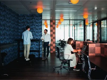
11 办公空间/Working area
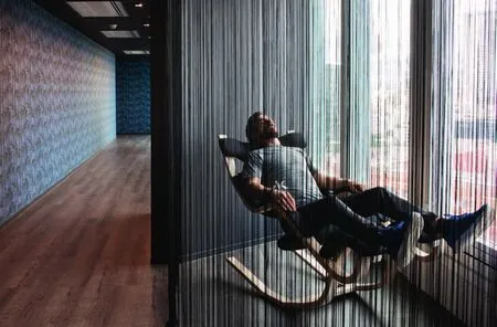
12 休息区/Lounge area
WA: What is the role of the design in this project?
Albert Angel (AA): Our co-working spaces are centred around design and wellness. Both are integral part of feeling good at work and reducing physical stress. Our spaces are designed to ignite emotions, trigger your imagination and inspire.All our working spaces are focused on bringing wellness to the office. Our offices are equipped with pneumatic desks and three different type of seating(wobble stool, knee chair and standard office chair).All our offices feature integrated storage to reduce clutter and our partitions are vitrines to inspire and transport you.
WA: What is the most creative and attractive solution?
AA: Everything! Our goal is to provide a place of work which is inspiring yet functional. Each location features a unique lobby space based on the existing typology of the building. These lobbies are designed to stand out of the ordinary like for example at Kwerk Tour First we have a 10-meter tall library inspired by the Dutch artist M.C. Escher. At Kwerk Haussmann our lobby is a botanical library featuring over 150 different species of plants. Our common areas are designed to woo you and transport you.
WA: What was the most difficult part in the process of design?
AA: Construction delays.
WA: What is the feedback from the users?
AA: Users love our co-working spaces. They enjoy the fact that they have multiple environments to choose from, be it working in the lobby or in the dedicated lounges, or relaxing in the nap room, or doing a yoga class, users are never short of spatial diversity to work and feel good all day.
WA: How did this project improve the users' work?
AA: Users say that their attention and productivity levels has increased because they are able to look after both mind and body thanks to Kwerk.

