诺华上海园区规划与实验楼,上海,中国
诺华上海园区规划与实验楼,上海,中国
Masterplan and the Laboratory Building, Novartis Shanghai Campus, Shanghai,China, 2015
1
评论
刘家琨:旁观永和楼
诺华上海园区是张永和做的规划,规划关键词指向全球化背景下的中国传统,有点特别的是每幢建筑的裙房部分都必须紧贴平接,“像传统老城里的街道上那样,房子连着”;更特别的是一种关于表现分寸的愿望,我还记得他的一个问题:“能不能看起来只做了一点点设计?”
我不知道别的建筑师是不是在意他这个愿望,但我看见了张永和自己在设计分寸问题上的推敲。
从一开始他就选择了无檐的方正体量,这是他自己规划的基本款,可能也是他长期以来的某种关于现代性的内在守则。外墙陶筒瓦排列的角度渐变是根据光线和视线的变化需求计算出来的,这个他也很肯定。但陶筒瓦的颜色却经历了几次变化,起初应该就有青灰的概念,这是对传统的自然响应;后来曾经至少谈到过陶土本色,这意味着转而追求材料本真性并照顾业主希望温暖怡人的愿望;如果没记错,一度出现过深一些暖一些的棕灰色,似乎是更注重现场直观感受而不依俯于概念;后来又稳定在青灰上,表明和传统建筑的抽象联系已经肯定下来,在此之后是青灰系列里的一些微妙变化。
好像是在后期了,庭院周围的屋顶似乎经过一番紧张的改动,变成了更倾向于传统建筑中“四水归堂”般的内斜屋顶,但是平缓得多。在引用传统到底是直接一些还是抽象一些这个问题上,我感觉到他好像终于下定了决心,并且为之欣然。这些动作,对一些建筑师来说可能很轻松,但对张永和来说,很可能就要经历一番内心挣扎:对传统的引用,太抽象看不懂,太直接又卖弄,宣言容易分寸难,而分寸和气韵正是中国传统精神的核心要素。
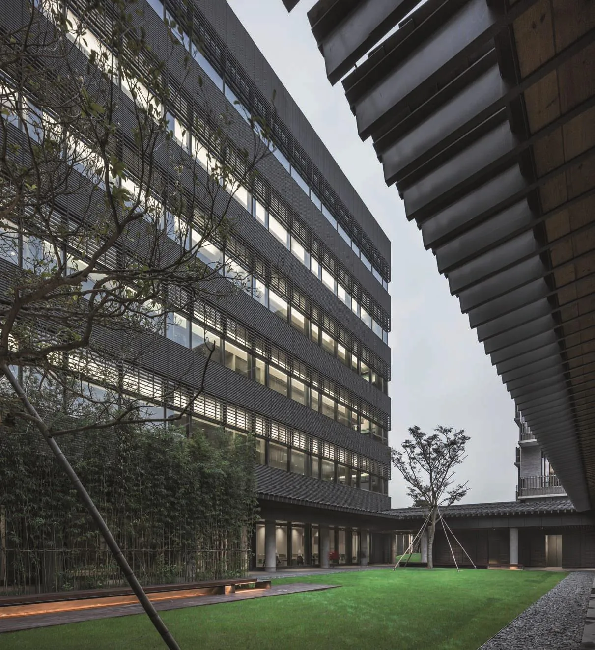
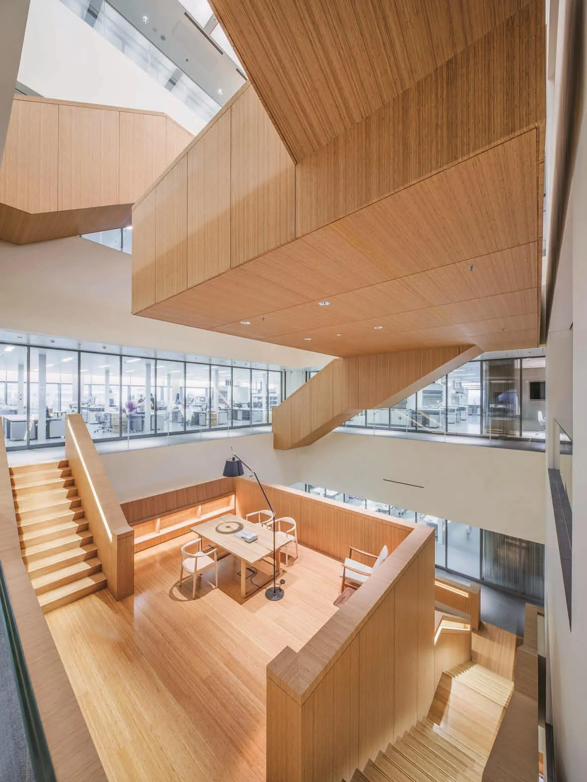
方正体量和外墻上的青灰陶筒瓦是这个建筑的外部特征,楼梯中庭则是内部空间的核心面貌,那些放大成休息座的楼梯平台,概念简明,足够精彩,由于太上相,光从照片上看有点抢了其他地方的风头。其实,明朗的员工餐厅,斜瓦顶的裙房,方正简约的室外庭院,都很令人愉快,对我来说,这些地方隐隐约约有一种“老北京”气质,大气而舒朗。更令人鼔舞的是,在分寸方面下的功夫最终没有白费,这种气质已经不大像是刻意设计出来的,更像是无意流露出来的了——好就好在这里。
Comment
LIU Jiakun: View Yung Ho's Work as a Spectator
Novartis Shanghai Campus is planned by Yung Ho Chang. The planning keyword is the Chinese tradition in the context of globalization. One special thing is that the podium part of the building must be close and aligned to each other, just like the house on the traditional old town streets; more special is his desire to show the sense of balance—I remember that he once posed a question: "Could we make the building look like just involving a little bit design?"
I do not know if other architects are concerned about his desire, but I see Yung Ho Chang's deliberation on this issue.
From the beginning, he chose the volume of a box with no eaves, which is his basic type. It may also show his long-standing inherent code about the modernity. The gradient angle of the terracotta tiles on the building exterior is calculated according to the change of light and sight, which he is pretty sure about. But the color of the terracotta tile has undergone several changes. At first, the color of gray should be the concept, which is a natural response to the tradition; later they talked about the natural color of clay, which means a turn to pursuit material authenticity and take the owners hope- warm and pleasant - into consideration ; if I remember correctly,it once appeared some color of warm brown gray,which seems to emphasize more on the intuitive feeling on site rather than the original concept; and later it stabilized on the color of gray, indicating that the abstract connection with the traditional building has been determined. After that, it followed a series of subtle changes in the gray tone though.
From the beginning, he chose the volume of a box with no eaves, which is his basic type. It may also show his long-standing inherent code about the modernity.The gradient angle of the terracotta tiles on the facade is calculated according to the change of light and sight,which he is pretty sure about. But the color of the terracotta tile has undergone several changes. At first,the color of cold blue gray should be the concept, which is a natural response to the tradition; later they talked about the natural color of clay, which means a turn to pursuit material authenticity and take the owners hope- warm and pleasant - into consideration; if I remember correctly, it once appeared some color of warm brown gray, which seems to emphasize more on the intuitive feeling on site rather than the original concept; and later it was decided on the color of cold blue gray, indicating that the abstract connection with the traditional building has been determined. After that, it followed a series of subtle changes in the gray tone though.
It seems to be in the later period that the roof around the courtyard have undergone some intense changes, becoming more like the sloping roof of the traditional courtyard house which is called "Si Shui Gui Tang", but with a much gentler slope. For the question whether we should reference the traditional directly or abstractly, I feel that he had finally made up his mind,and was pleased about it. These decisions may be very easy for some architects, but for Yung Ho Chang, it is likely to go through some inner struggle. Because for the reference of traditional architecture, too abstract is hard to understand while too direct is a like a show of f. It is easy to make a declaration but hard to strike a balance.And the sense of proportion and inner character are the core elements of traditional Chinese spirit.
The square volume and the gray tiles on the exterior wall are the external characteristics of the building, and the atrium is the core of the interior space. Those fascinating platforms along the staircase,which was enlarged to be resting space, are concise in the concept. Since they are so brilliant, it may steal the show of the rest of space. In fact, the bright staff restaurant, the podium with the pitched roof,and the square and simple outdoor courtyard, are equally pleasant for me. These places vaguely reveal an "old Beijing" vibe, generous and bright. Even more encouraging is that the effort for the sense of proportion is not in vain. The temperament of the building is not like deliberately designed out, and more like a natural revelation. This, I think, is the best part of the design. (Translated by QI Yiyi)
2
项目背景+目前阶段
自2006年,非常建筑为诺华上海园区做了总体规划、建筑设计导则的编制,及其中一栋实验楼的单体设计。在上海,诺华也延续了瑞士巴塞尔园区每一栋建筑都是请一位不同的建筑师设计的做法。中心园林及小院落的景观及建筑室内有些也分别请了设计师。在设计上,诺华给建筑师们提出的方向是:要在上海园区实现新型的实验室和新型的工作场所,使研究人员能在一个轻松舒适的环境、一个“家园”里有更多的交流与合作,更好地发挥出创造力。2016年,诺华上海园区一期完成施工,共有7栋建筑建成。
总体规划
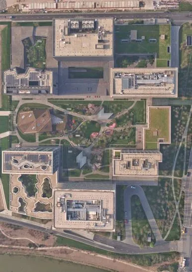
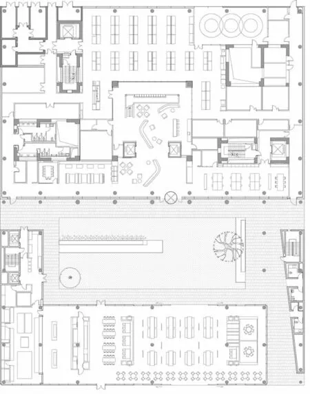
我们的规划重视园区内部的空间质量,试图创造一个宜居的工作社区,设计概念为庭园城市:即用院落作为空间结构组织总平面,以不同大小的院落覆盖整个园区,并将服务生活设施放置在庭园之内或周围。文化延续是我们的另一设计策略:把传统中国园林的意境融入其中,用“庭园”模糊“院”和“园”之间的区别。庭园比典型的园林更具有院落式的建筑空间特征;人们通过步行可将园区内的建筑内外空间串连成一个连续且丰富的系列, 体验一种对江南园林经验的当代阐释。
实验楼设计
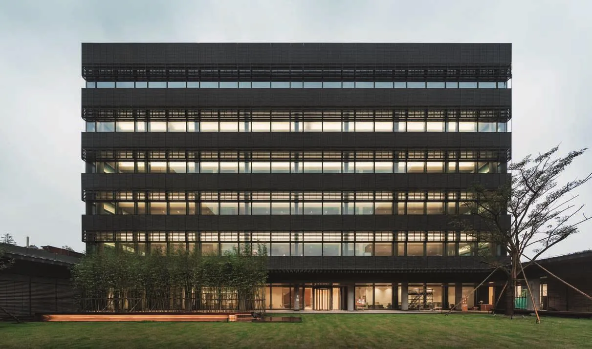
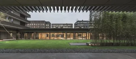
我们设计的实验楼中心是一个围合的庭园,可视为一个现代的四合院或没有屋顶的房间,景观设计由朱育帆完成。庭园的一侧是个园区餐厅。把各种公共服务设施置入各栋实验或办公楼的独立庭院内,是此园区重要的规划策略, 一方面方便员工,另一方面吸引园区的使用者在各楼之间探索或“游园”,从而多在户外活动。在本庭园的另一侧,即餐厅的对面,是5层高的实验楼。
外墙材料
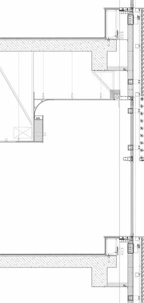
文化延续也体现在实验楼主体的外墙设计上:我们将4种不同灰色调的椭圆截面的现代陶土板逐渐旋转, 分别构成实墙的外饰面和窗外的遮阳百叶;在餐厅及廊子的屋顶上, 我们选用了另一种陶产品,使建筑整体上呈现出老江南粘土砖瓦的色调、质感和气质。
室内设计
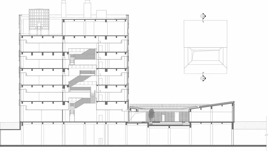
本着诺华把实验室家居化的精神,我们在每层面对庭园的一侧设置了具有起居室、餐厅、厨房氛围的非实验工作空间。同时,在实验楼的中心,我们把不同大小的开放式平台在中庭的竖向空间中上下叠摞, 并利用楼梯与各楼层互相连接,形成室内的、垂直向的庭园系列。如同庭园,这些平台有明确的空间质量,但并没有指定的功能。研究人员在上下楼的途中可以在这些平台上休息、看书、冥想;研发工作中互动合作至关重要,楼梯加平台的设计也旨在增加科学家们偶遇并交流的机会。□
3
4
5
6
7

8
9
项目信息/Credits and Data
客户/Client: 诺华(中国)生物医学研究有限公司/Novartis Institutes for BioMedical Research (China)
地点/Location: 上海浦东/Pudong, Shanghai, China
主持建筑师/Principal Architect: 张永和/Yung Ho Chang
项目团队/Project Team: 李启悠,陈正达,吴倛辉,冯纾苨,李相廷,郭照炜,常诚/Simon Lee, Dan Chen, Keith Goh, FENG Shuni, LI Xiangting, GUO Zhaowei, CHANG Cheng景观合作/Landscape: 北京清华同衡规划设计研究院有限公司/Beijing Tsinghua Tongheng Urban Planning & Design Institute
建筑面积/Floor Area: 141,270,000m2
建筑高度/Building Height: 36.45m
结构材料/Structure and Material: 钢筋混凝土结构;铝制窗间墙、陶板挡雨屏及遮阳屏/Reinforced concrete structure, aluminium spandrel with terracotta rainscreen and sun shading
竣工时间/Completion Time: 2015
摄影/Photos: 吕恒中/LYU Hengzhong
Project Background + Current Stage
Since 2006, Atelier FCJZ has produced a comprehensive planning scheme and architectural design guidelines for the Novartis Shanghai Campus,in addition to designing one research laboratory building on the Campus. In a continuation of the methods used by Novartis' Basel Campus in Switzerland, each building at the Shanghai Campus is also designed by a different architect. Further,a number of the buildings and elements of the landscape of the central garden and courtyard are also designed by different designers. With regard to design, Novartis provided architects with the following direction: "In the Shanghai Campus, we wish to achieve modern laboratories and modern workspaces, providing researchers with a relaxing and home-like environment such with greater opportunities to interact and cooperate, and make better use of their creativity." In 2016, Novartis Shanghai Campus had its Phase I construction completed, with a total of seven buildings.
Masterplan
Our plan emphasises on the spatial quality of the campus, and the creation of a liveable working community. We adopted "Courtyard Urbanism"as the design concept: courtyards are used to establish the overall spatial structure and given different scales across the campus. The service and living facilities are located within or surrounding the courtyards. Cultural continuity is another of our design strategies: we introduced the concepts of traditional Chinese gardens and blurred the difference between "court" and "garden" with the notion of "court-garden". A court-garden brings architectural qualities than a typical garden. The internal and external spaces of buildings within the campus are linked with pedestrian accessibility,forming a rich and continuous system, in which the users can perceive a modern interpretation of southern Chinese gardens.
Laboratory Building Design
The laboratory building is designed to be an enclosed courtyard. It can be conceptualised as a modern courtyard housing complex (siheyuan), or a room without a roof. The landscape design was made by ZHU Yufan. One of the campus restaurants is located on one side of the courtyard. An important design strategy for this campus plan was to include a variety of public service facilities in the independent courtyards of each laboratory or office building;this design is convenient for the staff, on the other hand campus users are encouraged to explore each building or moving through courtyards, allowing users to spend more time engaging in outdoor activities. On the other side of the courtyard,opposite to the restaurant, is a five-storey laboratory building.
Façade Materials
Cultural continuity is also present in the exterior wall design of the main body of laboratory building. Oval-section modern terracotta plates in four tones of gray are gradually rotated, which clad the outer surface of the wall and also open to become the sun-shading louver. On the roof of the restaurant and veranda, we used another type of terracotta product, so the building generally reflected the tone, texture, and a nostalgic feeling of gray clay bricks in South China.
Interior Design
In the spirit of Novartis' aim of home-like laboratories, each floor has non-lab work spaces facing the courtyard, with atmosphere of living room, dining room, and kitchen. In the centre of the research laboratory building, open platforms in different sizes are stacked together in atrium vertically, and connected to each floor by staircases,which forms an indoor, vertical courtyards series.Like the courtyard, these platforms have distinct spatial qualities but no specific function. While going up or down the stairs, researchers may use these platforms to rest, read, or meditate.Interaction and cooperation are crucially important for work such as research and invention, and so the combination of these platforms and staircases is aimed at increasing opportunities for scientists to meet and interact.□

