清华科技园科技大厦,北京,中国
清华科技园科技大厦,北京,中国
Science & Technology Mansion of TUS Park, Beijing, China, 2005
清华科技园科技大厦在设计伊始就定位为一个开放的城市公共空间。正如清华科技园的那句著名的广告词“空间有形,梦想无限”。在这个项目的设计中我们对空间的演绎,是依照着其中人们行为的叙事性发展而展开的。
科技园的建设用地非常紧张。建筑群围合出园区中心绿地,绿地地下部分为公共配套及停车场。场地的现状有明确的轴线关系。分析周边情况我们看到,园区位于清华大学和城市的交接处,是由大学校园相对封闭的空间向城市开放空间过渡的区域。从空间形态上看该项目应该是一个大学校园接驳城市的“转接器”,从功能意义上看应该肩负起融合学校科研、科技转化、对外交流和商业服务功能的“平台”。
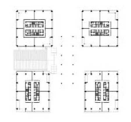
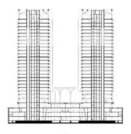
由于用地的狭小,科技大厦的容积率超过10。在130m×140m见方的用地内要建设地上和地下超过18万m2的建筑,而建筑限高又是檐口100m。如何减少建筑对周边的压力是首要问题。设计采取分散小体量的处理手法,将建筑分解为4个简洁的方塔插入稳固的二层大平台,缓解了庞大体量对周边地带的压迫感,并使单栋建筑均有良好的自然采光通风。以轻盈通透的建筑群作为城市对景。4幢建筑单体相距约30m,南侧两栋适当加大间距,使4栋建筑围合的空间有微微向南开放的趋势,形成微妙的空间感受,既相对独立又自成群体,并与园区其他建筑群形成对话。由于科技大厦位于园区主轴线的前端,是轴线起始点的建筑,我们将4栋大厦沿轴线分立而设,将轴线让开,以虚轴的方式引导城市空间进入园区,沿大台阶上到二层平台公共交往空间,再通向中心绿地,进而延伸到园区尽端的创新大厦。沿园区主轴线所形成的收放有致的序列空间,主宰了科技园整个建筑群,先抑后扬的空间形态将园区的建筑群统合成一个整体,营造了一个既开放又有向心性的城市公共空间,彰显了清华科技园的场所精神。
建筑的空间是有情节的,什么空间将发生什么事件,空间之间和事件之间又有怎样的联系,就像一个讲述着的故事。这种建筑空间的叙事性通常决定着我们对空间功能的理解和营造。建筑内使用者的活动模式、流线和状态都构成了建筑师生成空间的依据。我们也正是伴随着这些未来空间中人们的生活进行着创作。
上下班高峰时段大厦车流人流的集散——人车立体分流的导演
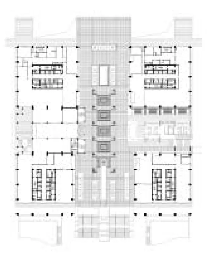
建筑面积18.8万m2的科技大厦,集办公、会议、研发、餐饮、休闲和娱乐为一体,其中办公写字楼面积占总面积的80%,日常大厦内的上班族加上外来人员,人数可达近万人,上下班高峰时段人流极其集中。地下车库设在地下二、三层,车库总面积24,240m2,加上地面停车,大厦日常停车数量近800辆。按照规划意见书的要求,满足大厦的停车数量尚不是件困难的事,但当我们模拟想象上下班高峰时段进出车的情景时,我们发现短时间内满足员工上下出入的问题远远大于机动车的停放问题。加上为了缓解机动车停放的压力,大厦管理要求部分员工通过大巴班车出行。因此,合理组织人流车流的集散就变成了大厦设计的关键点。首先,根据地下车库的平面设置,安排4个机动车出入口,以及与园区中心地下停车场相通的2个出入口,6个出入口保证车库短时间内的进出速率。其次,4个塔楼楼座下专设全开敞联通的地面回车通道,每一个楼座都设有专用的落客区。第三,专门设计二层公共平台,通过大台阶和平台廊桥与园区首层前广场和中心花园相联通,以此形成由地下、首层和二层公共平台所构建的立体人车分流系统。
午间吃饭休息——公共配套空间及“营养层”概念
通常大厦写字楼日常运营的另一个场景就是中午的就餐活动。每当中午临近,大厦各层员工会集中地寻找餐饮空间解决就餐问题。一般情况下,如果大厦内餐厅面积不足,或布局设置不合理,流线不顺畅,势必会造成人流的大量交叉和过度的拥挤,给垂直交通系统带来巨大的压力。
在设计伊始,我们就这个问题调研了北京7座具有一定规模的写字楼,现场就员工集中就餐的实态进行了调查,分析不同就餐人流的走向和行为特征。在设计中我们模拟大厦的人流情况,并计算垂直交通的运载量,同时餐饮空间按规格档次分别将职工餐厅设置在地下一层,各种快餐设在首层,以及各大风味餐厅设在二层。地下一层为供员工集体就餐的职工餐厅,大开间布局,讲求随来随吃,流线顺畅;首层为各式快餐,小店面,多选择,同时考虑对外营业;二层平台层为各大风味特色餐厅,与二层休闲平台结合,景色优美,品位高档,满足大厦内各公司宴请会客之用。将餐饮空间按档次分层设置在大厦底层公共开放空间,为大厦上部写字楼提供了“营养”保证,上部人流在“营养”层集散,寻找各自适合的就餐场所。
营造园区公共休闲空间——城市公共空间的一部分
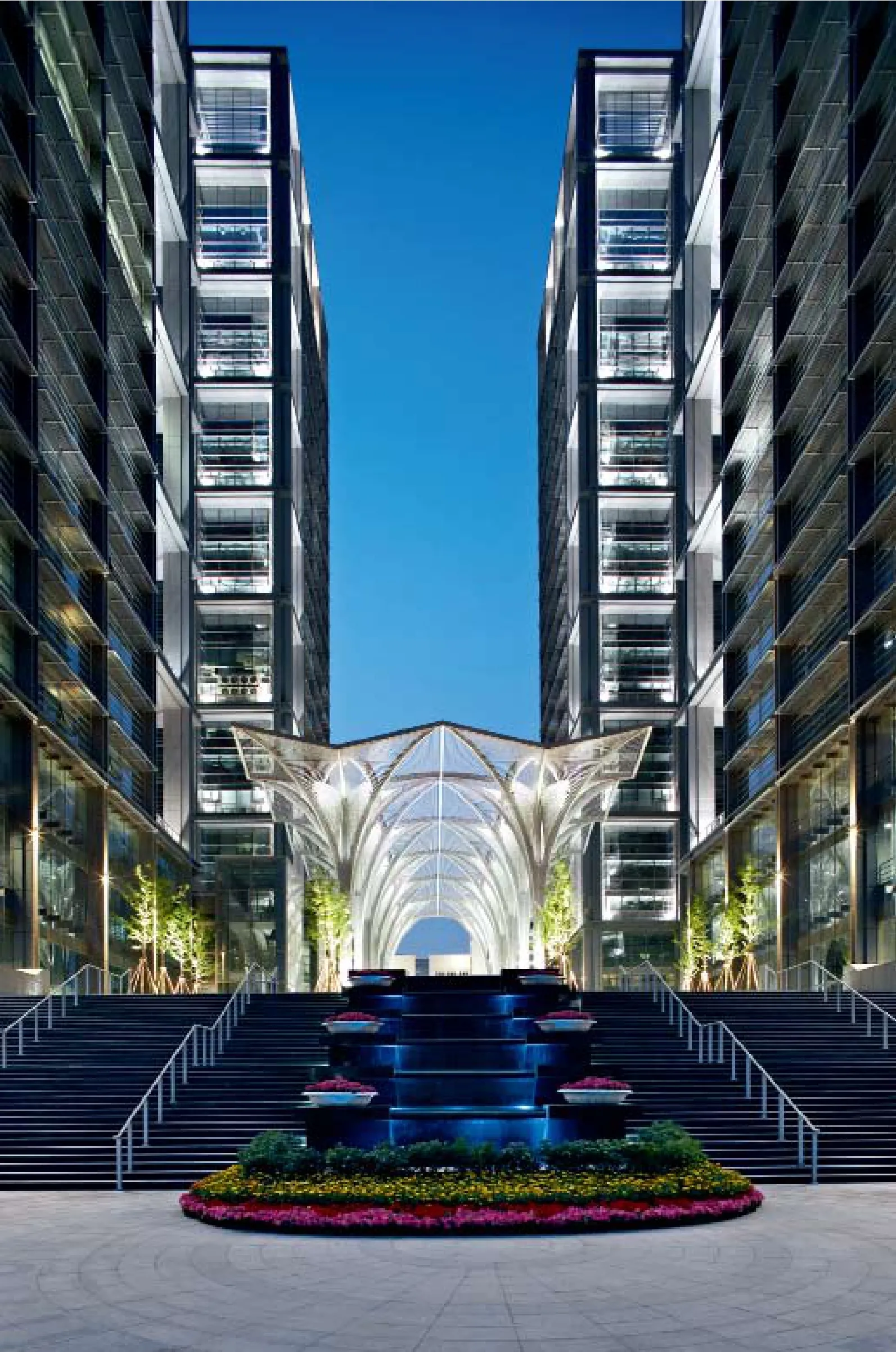
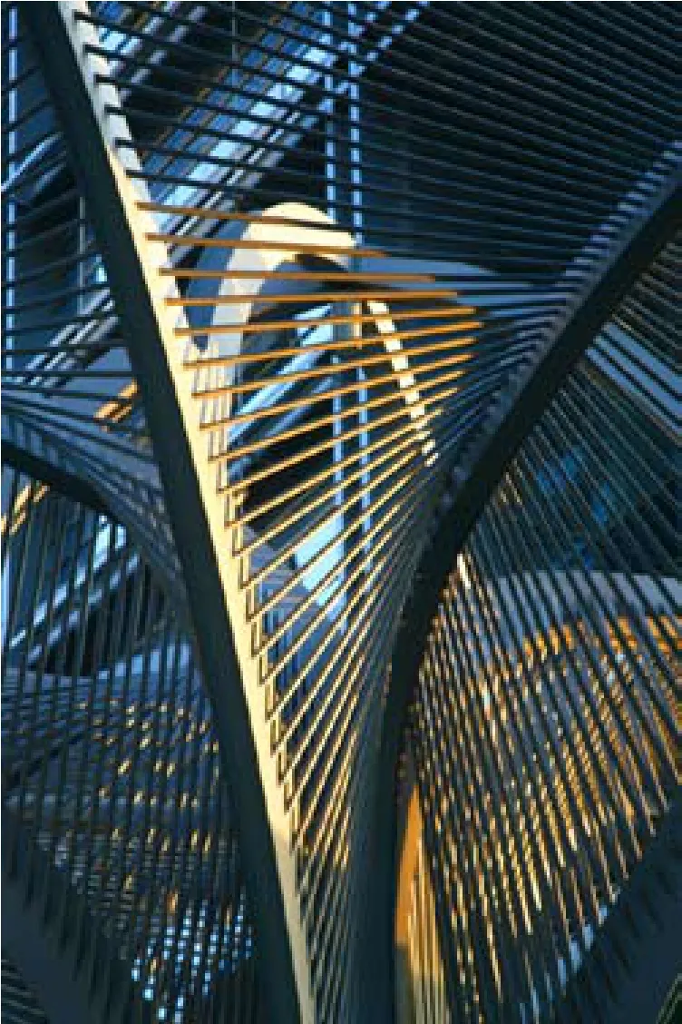
定位于开放的城市公共空间的科技园科技大厦,其空间形态营造均考虑了面向城市的各个层面。首先,结合首层机动车回车流线及落客空间的布局,将与城市相连的园区干道引入大厦底层,高效顺畅地与城市接驳。第二,通过近30m宽的大台阶将园区地面人流引向二层公共平台,与大厦公共空间和人行入口门厅相接驳。平台上设置12棵17.3m高的巨大钢树,钢树限定的空间气势恢宏。钢树下设置有喷泉、叠水,平台上结合底层空间采光设置的玻璃栏板天井、木质座椅平台、露天咖啡茶座、雕塑小品和树池花草,营造了一个开放而有活力的城市公共空间,在科技园主轴线上将城市与园区融为一个整体。第三,地下一层的商业休闲空间,通过下沉庭院的设计手法,以倾斜的绿草坡将阳光、人流和视线引入地下一层,既解决了地下层公共空间的采光通风问题,又扩大了面向城市的开放空间。大厦建成后,二层公共平台成为市民休闲、散步的理想所在,经常会有人们在那里驻足,留影。□
项目信息/Credits and Data
项目负责人/Principal in Charge: 庄惟敏/ZHUANG Weimin
设计团队/Design Team: 庄惟敏,巫晓红,鲍承基,漆山等/ZHUANG Weimin, WU Xiaohong, BAO Chengji, QI Shan, et al.
场地面积/Site Area: 165,000m2(园区指标)
总建筑面积/Total Floor Area: 188,027m2
建筑高度/Height: 110m
设计时间/Design Period: 2001-2004
竣工时间/Completion: 2005.7
摄影/Photos: 陈溯,莫修权/CHEN Su, MO Xiuquan
2 夜景/Night view

2 夜景/Night view
TUS Park technology building was set to provide urban open space at the beginning. Just like the famous slogan of the Tsinghua University Science Park (TUS Park): "Limited space for Unlimited Dreams.", the interpretation of space is based on the human behaviors in this project.
The construction land in this project is very limited. The buildings are located surrounding a central garden, and the public services and parking lots are located beneath the garden. The existed buildings near the site are controlled by a clear space axis. By analyzing the surroundings we can see that the TUS Park is the joint between Tsinghua University and the city. It performs as a transition area from the campus, which is an enclosed space, to the urban open space. In terms of space forms, the project is an adapter to connect the campus and the city. In terms of function, it should become the comprehensive platform of scientific research, technology transformation, communication, and commercial services.
Owing to the limit of the construction land, the floor-area ratio of technological building is over 10. Over 180 thousand square meters (including both above ground and underground) are to be built inside the land of 130m×140m. Furthermore, the height-limit of cornice is 100 meters. So the primary issue is how to relieve the pressure on the surroundings made by the project. the design strategy is dispersing the whole volume into four units which are plugged in a stable two- floor platform. The pressure is relived and each unit gets natural lighting and ventilation of good quality. The separate units also form a light and transparent cityscape. The normal distance between each building is about 30 meters, while the distance between the two units in the south is a little bigger to create an open space towards the city. the separate units form a cluster and establish dialogues with the other buildings in the TUS Park. the technology building stands at the starting point of the axis in the whole garden. We put the four units along the two sides of the axis so the urban space can get into the park along the steps, the communication area in the platform, the central garden and the Building of Creation at the end of the axis. The spaces along the axis form an order of adequate tightness and openness and command the buildings in the entire park. All the buildings form an urban public space which is both open and cohesive, which also represents the spirits of the TUS Park.
Spaces in building should be able to tell a story. Different activities in different spaces and the relationship between spaces and activities are just like parts of a live story. The narratives of architecture space tend to determine our understanding and creation of the functions of spaces. The mode, route and state of activities generated by the users actually form the basis for architects to create spaces. this is exactly the way in which we design.
The distribution of pedestrian and vehicle in rush hours: the director of the vertical separation of pedestrian and vehicular circulation
The Science & Technology Mansion has a floor area of 188 thousand square meters, which is a complex consists of office, research and development, restaurant, leisure and entertainment. Office space covers 80% of total area. The number of people (office employees and visitors) is nearly ten thousand on a general day in this buildings, so the crowds highly concentrated in the rush hour. the basement parking is located in the second and third floor underground, and there is a total area of 24,240m2of parking space. If combined with the ground parking, the daily parking number is nearly 800. According to the requirements of planning advice, it is not a difficult thing to meet the requirement of the number of parking in the buildings. But when we image the traffic situation in rush hours, we found it much more serious to meet the requirement of short period entry and exit width. Besides, in order to relieve the pressure on vehicle parking, the administration department demand that part of employees must travel by shuttle bus. therefore, a reasonable distribution of pedestrian and vehicle becomes the key point in this project. Firstly, based on the layout of basement, we arranged four vehicles entrances besides two entrances connecting with the central underground parking lot. We rely on these six entrances to ensure the rate of pass in and out in a short period of time. Secondly, we planned a circle lane connecting the four towers on the ground floor, and each tower had its own temporary drop off area. Thirdly, we designed a public platform on the second floor, and linked it with the square on the first floor and the central garden in the park by steps and bridges. thus a vertical transport system for both vehicle and pedestrian was formed with the underground floor, ground floor and the platform on the second floor.

3 首层平面/Floor 0 plan
4 二层平面/Floor 1 plan
5 标准层平面/Standard floor plan

6 外景/Exterior view
Lunch time and rest: public space and floors of nutrition
Another important scene in an office building's daily events is the activity during lunch time. Office worker on different floors will rush out to look for F&B space and have lunch. If there were not enough F&B space, or the layout and the routes were not well designed, there would be serious crosses and jams, ending up in huge pressure on the vertical transport system.
At the beginning of design, we made a survey about the conditions in lunch time in 7 high-rise office buildings in Beijing and analyzed the route of people and their behaviors. Durign design process, we simulated the circulation of people in the building and calculated the amount in vertical transport. Restaurants were set in different floors according to their prices. the dining halls were located in the underground floor, the fast food restaurants were located in the first floor and the special restaurants were set in the second floor. The dining halls were designed for groups of officers having lunch, and therefore were spacious and had a smooth access. The fast food restaurants have smaller spaces and are open to the public. The special restaurants on the second floor are designed together with the huge platform. They had the best views and space quality and can be used for parties of big companies. Dinning spaces on different floors in the bottom part of the buildings provide guarantee of nutrition for the people working in the office buildings. People gather and disperse at different floors according to their different needs.
Public space in the TUS Park: part of the urban public spaces
As an open public space, the building took the city into consideration in terms of space, form and construction. Firstly, combined with the layout of vehicle route and parking space, the main road which is connected with the city road is led into the bottom of the building, thus creating a convenient connection with the city. Secondly, the nearly 30 meter- wide steps led the people on the ground going up onto the public platform on the second floor and into the public spaces and the lobbies for walkers. There were twelve 17.3 meter-high steel trees placed on the platform, forming a grand space under them. Springs and water landscapes were set under the steel trees. The transparent skylights, wooden benches and platforms, open- air coffee tables, sculptures and plants created an open and dynamic urban public space. The city and the TUS Park were combined together as a whole along the axis. Thirdly, a sunken garden with a grass slope let sunshine, people access and sights inside the commercial and leisure spaces in the underground floor. This strategy solved the problems of natural lighting and ventilation and expanded the open space towards the city as well. After the construction of the building, the public platform has become a fantastic space for citizens relaxing and walking. there are always a lot of people staying and taking photos.□
7 建筑与钢树/Building and steel trees
8 剖面/Sectiion
评论
朱文一:10年前,我参加了首都建筑汇报展十佳建筑的评选。庄惟敏教授设计的清华科技园科技大厦以其准确的定位、简洁的形体、适宜的尺度入选,令我印象深刻。今天,位于清华主校门旁的清华科技园科技大厦经历了时间的洗礼,已经成为清华大学校园的显著地标。在我看来,清华科技园科技大厦有三个特点:
一是定位准确,4栋高层建筑起到了整个清华科技园的空间统领作用,城市地标效果突显。从最早建筑顶部的微软标志到后来的网易等若干顶级高科技公司的标志,可以看出建筑的高端科技定位,彰显了清华大学发展一流科学技术的目标。
二是4栋超高层建筑形体方整,楼层办公使用效率高,特别符合当代写字楼建筑类型的特征。建筑四角的设计更是考虑了建筑使用过程中出现的各种变化因素,如在不影响建筑整体的立面形象的情况下,充分考虑了办公室分体空调室外机外挂的位置和空间,等等。
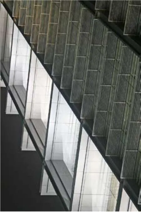
三是建筑形象简洁大方,庄严雄伟中不乏典雅和细腻。立面设计通过分段和分层的处理,呈现了金属板和玻璃两种材料的美学特性。建筑顶部设计与广告标识巧妙结合,体现了写字楼的科技性格,不失为超高层建筑顶部设计的一种成功策略。
总体上,清华科技园科技大厦是一座成功的建筑,迈向未来的建筑。

9 外景/Exterior view

10 钢树夜景/Night view of steel trees
Comments
ZHU Wenyi: Ten years ago, I was on the jury to select the top ten buildings for the Capital Architecture Retrospective Exhibition. the Science & Technology Mansion of TUS Park, designed by Prof. ZHUANG Weimin and located next to Tsinghua's main gate, made a profound impression on me with its precise definition, simple form and appropriate scale. Today, having gone through the test of time, the Innovation Plaza has become a distinctive landmark on Tsinghua's campus. In my view, the Science & Technology Mansion has three characteristics:
the first is its precise definition. Four high-rise buildings serve to command the entire space of the plaza, with outstanding effects as an urban landmark. From the initial Microsoft sign on top of the building to later signs of leading high-tech corporations such as NetEase, one can get a clear sense of the project's high-end technological definition, which manifests Tsinghua's goal to develop first-rate technologies.
the second is the square and regular form of the four high-rise buildings, which helps achieve high efficiency of floor office spaces particularly suited to contemporary office buildings. the design for the four corners has taken into consideration various changing factors in the use of the buildings. For example, full consideration is given to the hanging position and space of split air conditioners without having to affect the overall appearance of the building facades.
The third characteristic of the Science & Technology Mansion is its simple, generous architectural image, which contains elegance and delicacy in solemnity and majesty. Through segmental and layered disposition, the facade design successfully exhibits the aesthetic features of metal sheets and glass. the design of the top parts is deftly combined with advertising signs, thus embodying office buildings' technological character. this can be regarded as a successful strategy for the design of high-rise tops.
On the whole, the Science & Technology Mansion of TUS Park is a successful project evolving into the future.(English translation by LIU Chen)
11 钢树细部/Detail of steel tree
12 立面细部/Detail of facade

