10 Tips for Designing Presentations That Don’t Suck (I)
By Joshua Johnson
W hether you’re a student, the leader of a self-help group, or a corporate executive pulling in six figures1. pull in:〈美〉赚(钱);figure:位数。, the second you open up Powerpoint or Keynote2. Keynote: 苹果公司推出的运行于Mac OS X操作系统下的演示幻灯片应用软件,不仅支持几乎所有的图片字体,还可以使界面和设计更图形化,更容易夺人眼球。, you become a designer whether you like it or not.
You’ve chosen a visual tool to communicate and should therefore take the time to learn a thing or two about visual communications. One of the major reasons for this, especially for people in the professional business world, is that your colleagues will subconsciously3. subconsciously: 潜意识地。make judgements about you based on the visual appeal of your presentation.
Follow the ten tips below and see if you don’t start getting comments about your awesome presentation design skills. Just watch out, if your classmates or co-workers notice you getting good at it they’re likely to start asking for help with theirs!
1. Don’t Use a Built-in Theme4. built-in theme: 系统自带主题。
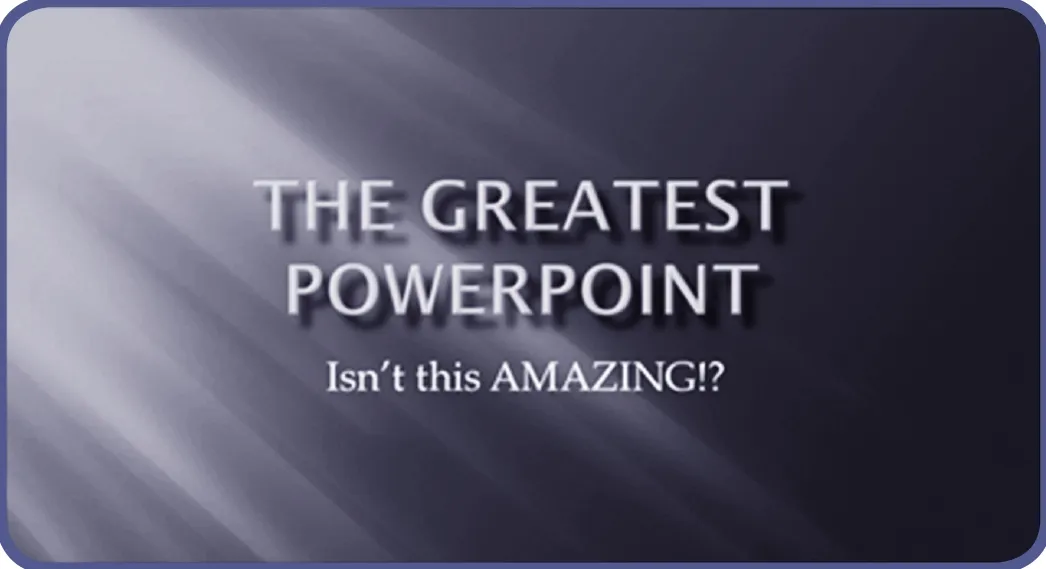
To illustrate this idea I opened up Powerpoint, grabbed an actual default theme5. default theme: 系统默认主题。at random and threw some type on it. This workflow is nearly identical to that of countless presentation designers and the result is a typical presentation slide that I’ve seen countless times throughout college and my career.6. workflow: 工作流程;identical:相同的;slide: 幻灯片。
Here’s a design secret, this slide sucks; as do many of the default themes you’ll find in Powerpoint. Granted, they’ve definitely improved the offering in recent years and Keynote (Apple’s presentation software) has some awesome templates, but you shouldn’t view these as the go-to method but rather a last resort if you need to create a presentation in record time.7. 诚然近年来他们提供的主题质量有所提高,Keynote(苹果的幻灯片软件)也有很多非常不错的模板,但是除非时间紧迫,否则不要把这些既定模板当做首选。template: 模板,样板;go-to method: 首选方法;resort: (凭借的)手段,方法;in record time:在创纪录的时间里,在极短时间内。
PPT已成为生活、工作、学习中不可或缺的工具之一,你是否也曾被一幅幅精美的幻灯片演示文稿深深地打动过?你是否也曾梦想着有朝一日自己设计的演示文稿能够一鸣惊人?如果你还处于摸索阶段,下面这些小技巧可能会为你带来惊喜!
The point here is that something custom8. custom: adj. 定制的,定做的。makes a much stronger statement. Your classmates or colleagues know and use the templates in Powerpoint and they’ll recognize immediately that you didn’t put any work into the aesthetics9. aesthetics: 美学,审美。of the slides.
I know for non-designers leaving behind templates may seem a bit radical10. radical: 激进的,冒险的。, but you can do it! Just be sure to read the other tips below before striking out11. strike out: 想出,设计出。on your own. Otherwise you might end up with something much worse that even the Microsoft designers could come up with.
2. Use Quality Photography
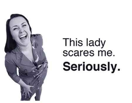
Photography is one of the single best ways to make your presentation look awesome. It’s also one of the single best ways to make it lame12. lame: 差劲的,糟糕的。. The“business people on white background” look is nice, but it’s overdone and tends to look a bit stock art-ish or flatout cliché.13. stock: 平凡的,陈腐的;flat-out:完全的,不折不扣的;cliché:老套的,陈旧的。
Further, just because a picture is on a white background doesn’t mean it’s a good photo. Stop using ugly or awkward photography just to have something to put on the slide. Remember that no photo is better than a bad photo.
3. Solid Colors Rock14. 单色系带来震撼效果。solid color: 单色,纯色。
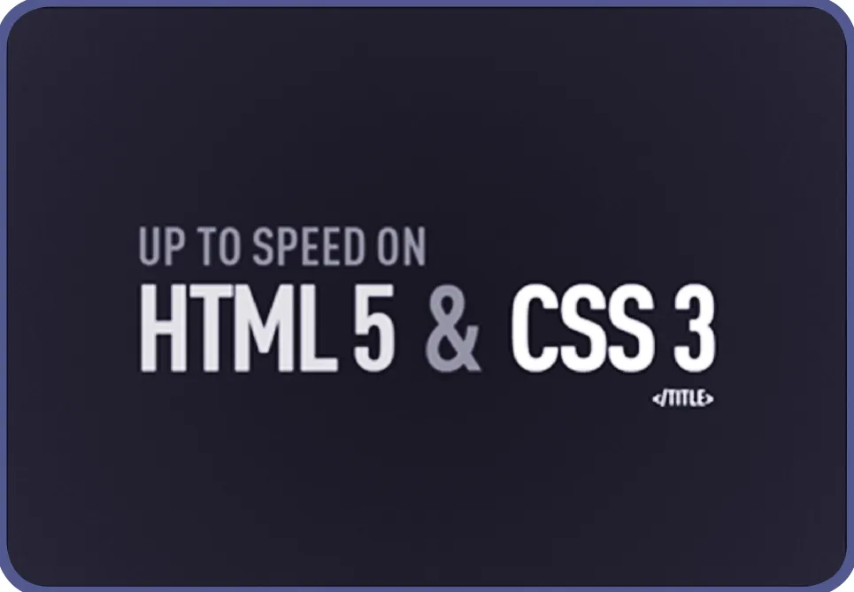
You don’t always need a fancy photo or crazy custom background to make a presentation look professional.Using a strong palette15. palette: 一组颜色,主色调。of solid colors can make for an awesome presentation.
There is a perfect example of using very plain design and little effort to create something that actually looks really nice. The key here is to be very cautious about your color choice. Something too bright and fun will blow the audience’s eyes out. Also make sure to use plenty of contrast in your secondary color.
4. Typography Speaks Volumes16. 字体排版很重要。typography:字体排印;speak volume: 有重大意义。
Non-designers frequently stress out about finding the proper typeface17. typeface: 字体。for a presentation, and for good reason. The right font18. font: 字体,字形。can make or break your presentation. Typography is a major art form in the design world and it can really set the stage for19. set the stage for: 为……打好基础。what you want to say.
Remember that typefaces can communicate a mood, a point in time, or any number of other factors. Instead of browsing20. browse: 浏览。your font list and looking for “something cool,” instead think about the message you want to convey.
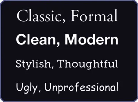
The biggest mistake that people make with fonts in presentations is assuming that the first three font styles listed above are boring. This causes them to jump to something like the font on the bottom because it feels more unique and interesting.
If you’re not a professional designer, remember that the first three styles above aren’t boring, they’re safe. They’re great looking typefaces that have been professionally designed to make you look good and that’s exactly what they do.
Never be afraid of standard-looking fonts. Using them can help ensure that your design remains inside the realm of clean and professional and away from cluttered and ugly.21. realm: 领域,范围;cluttered: 杂乱的。And you can use relatively “boring”fonts but varies the size and weight to add visual interest and create something that is ultimately quite non-boring.
5. Watch Your Readability22. readability: 可读性。
While we’re on the subject of typography, you should always be aware of how readable the type is in your presentations. Sometimes the amazing photography will leave you in an awkward situation.
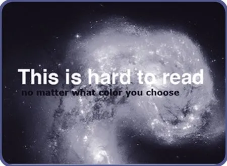
Here we have a really captivating image, but it’s wreaking havoc on the readability of the text.23. captivating: 吸引人的,迷人的; wreak havoc on: 对……造成严重破坏。Even if we make the text bold and try different color variations,it still comes up short.24. 即使我们把文本字体加粗并尝试变换各种颜色,还是达不到目的(即增强文本的可读性)。bold: 粗体的。This can be immensely25. immensely: 极大地。frustrating to new designers.
The solution however is quite simple: use solid colors rock. By creating a simple color bar behind the text we increase the readability by leaps and bounds and still maintain a stylish looking slide.26. 只要在文字后面用简单的颜色条作背景,我们就可以大幅度地提高可读性,同时还保持了幻灯片的时尚感。by leaps and bounds: 大幅度地,突飞猛进地。
Hey Where Are Tips 6-10?!
This topic quickly got out of hand so I decided to break it up into two articles. Come back next month for the next five awesome tips for better presentation design!

