法国新国家档案馆
地点:法国巴黎
时间:2005年-2013年
业主:法国文化和交通部,
法国档案管理局
建筑师:马希米亚诺•福克萨斯,多丽安娜•福克萨斯
面积:108, 136平方米
SITE: Pierrefitte sur Seine-Saint Denis, Paris, France
PERIOD: 2005-2013
CLIENT: French Ministry of Culture and Communication Represented by DAF -
Direction des Archives de France
ARCHITECTS: Massimiliano and Doriana Fuksas
AREA: 108,136 sq. m.
法国新国家档案馆工程从它周围的真实场景中、从这座混乱与秩序似乎并存的城市中汲取灵感。这种设计理念萌发于这样的一种双重性,在复杂的构造中得以体现。初期的选择是从地方性和社会文化两方面的背景去探讨选址和特色设定,以展现独具一格的特质。因此,该作品的设计遵循着一个基本建设原则,那就是根据根植于其中的社群的需求去创建空间。
法国新国家档案馆的设计着眼于优化Pierrefitte sur-Seine Saint Denis地区的地理及建筑景观环境,这里正是这座建筑物的栖身之所。
这座综合楼并未被设计成一座孤立的建筑物,而是一件能够保留记忆、具有集体性身份、同时面向当代艺术表达的作品。对于参观者而言,它一直被人以发现、探索和分享的眼光去观察,而不是用沉思的态度去看待。
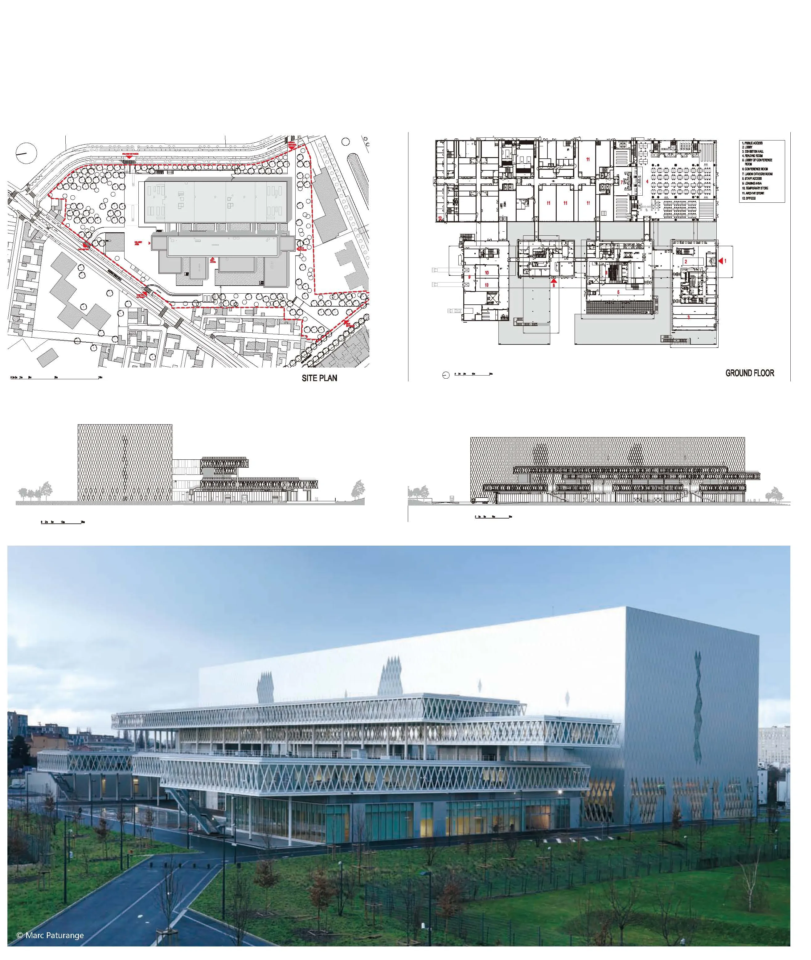
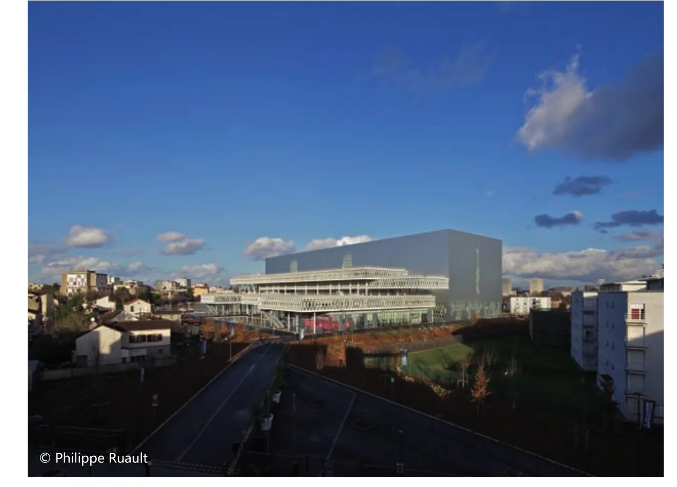
这项工程由两个主体构成:一部分在水平方向上延展,“悬浮、轻盈、透明”;另一部分在竖直方向上具有张力,“稳固、雄伟、深沉”。
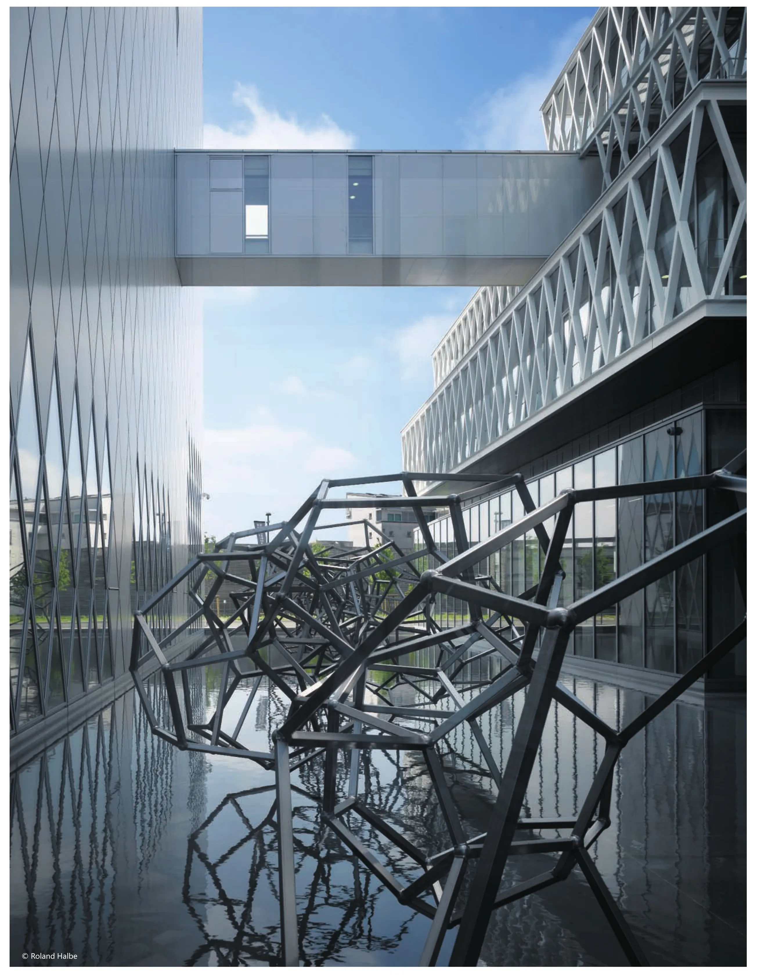
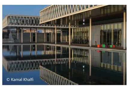
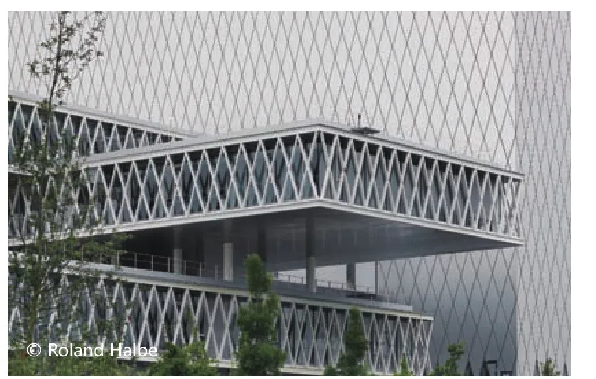
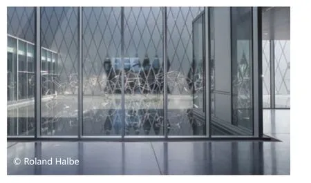
第一部分延伸向城市中间,它包含名为“卫星”的悬臂式体量,内部设有办公室、会议室以及展览厅。它的正面绝大部分由玻璃制成,赋予了彼此挨着以及悬浮堆叠于水面、大小各异的卷状体光亮和透明。
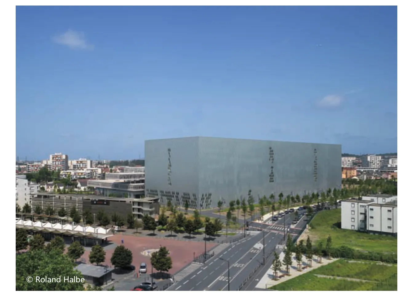
这座存放档案的建筑物是一幢壮观的庞然大物,它被认为是一个供回忆与追索的地点。内部存放档案资料,并有阅览室,除了阅览室及入口处供自然光进入的镶嵌玻璃外,其正面包覆在贯穿建筑体的铝质表皮之下。这座高贵得如同雕塑的建筑物,由水池环绕着,彰显着映在水幕上的珍品与宝藏的可贵。
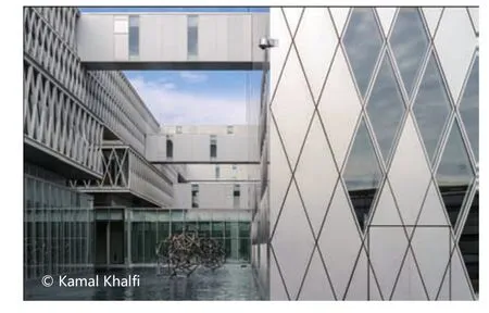
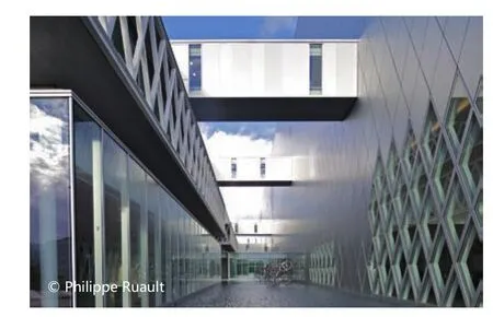
水池镶嵌在名为“卫星”的卷状体和档案大楼之间,也分布在“卫星”的脚下。其间的步道既是悬臂式建筑体之间的联结,也是两个主体之间的联结。正因为有了被悬浮体及大楼表面所分离形成的自然光,而光线反射、荡漾,水幕才成了该建筑转变的方式,设计出了间隙和新的空间。
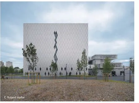
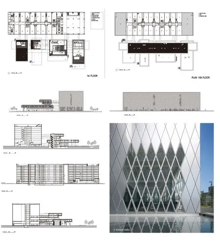
两个主体的正面呈几何菱形,在档案楼的铝包覆层上和“卫星”的玻璃表面上都反复重叠。
在庞然大物和“卫星”之间,竖立着安东尼•葛姆雷的艺术作品,那是一座从水幕中升起的珍贵雕塑品,好似在从中汲取力量。这种现代化的设计在建筑群之间蜿蜒,重塑了空间。几何面沿着通道链接艺术品,赋予投射在水池以及卷状体镜面的十二面体链式结构以生命。
记忆的链接可象征性追溯至当年帕斯卡的大作,那是坐落在“卫星”前方区域的一系列混凝土“保险箱”建筑群。这些都鲜明地显现了某些烙印在集体记忆中的个性面貌。和庞大的建筑体一样,装置艺术也牢牢扎根于土壤,就仿佛是深植于记忆中的根系一般。
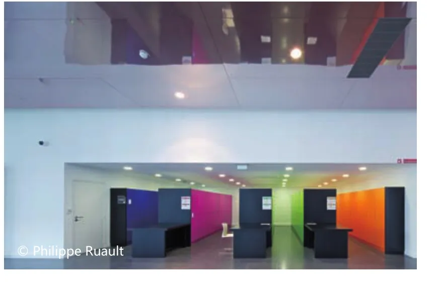
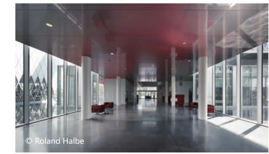
接待游人的是两层高的大厅。“卫星”的“悬浮”效果因Susanna Fritscher在艺术方面的介入而格外凸显,通过红色不锈钢假天花板片的呈现,以极其简单的联系强调综合楼体和“卫星”线条之间的交互。红色使得拔地而起、不同高度的建筑体更加深邃,同时在虚与实、有形与无形之间流转自如。
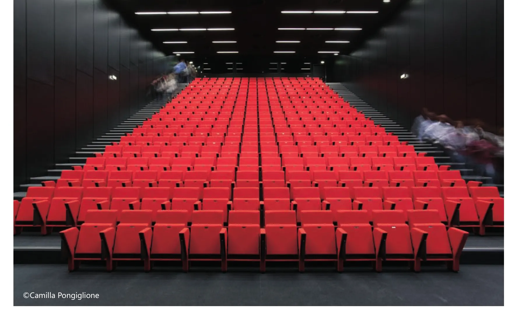
入口通往专门向公众开放的区域:阅览室、展厅和会议室。因红色的布料而十分醒目会议室的座椅是意大利弗劳家具公司的“Carla”,是出自意大利建筑设计公司福克萨斯之手。椅子由两个片状结构组成,它们交叉旋转着向后形成椅子和扶手,就像一朵花,形状从容而简约。
建筑内部被设计成宽大空间,令人感受到此地的重大价值和与众不同。
环境的重要性以及由此而来的地域的重要性具体表现在Florence Mercier在景观方面的交互。他设计的绿地给了自然、建筑和参观者一个真切的互动机会。绿色的步道引导和带领游客进入大楼,就像一个切换三维与二维、色彩与阴影的舞台。
一项激动人心的工程,两个主体、两个世界,象征性地以步道联接,着眼于当代与未来,经过长期相互地照映,创造了一个植根于过去回忆的身份。这个项目映射的是属于法兰西乃至全人类的身份与记忆。
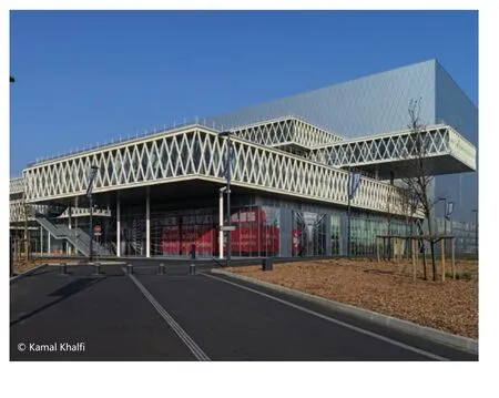
The project of the New National Archives of France draws its inspiration from the surrounding reality, from the city seen as coexistence of chaos and order.The concept is born and takes place from this duality which is re fl ected in the organization of the complex.
The initial choice was to investigate the site and its characteristics in both territorial and socio-cultural contexts to reveal an unique identity. The work has therefore been thought following a cardinal principle of architecture to create spaces according to the needs of the communities that populate them.
The design of the New National Archives of France has followed the intent of enhancing the geographical and architectural landscape of the area Pierre fi tte sur-Seine Saint Denis, where the building inserts itself.
The complex has not been designed as a self-referring architecture, but as a work that could hold the memory and the collective identity, at the same time open to contemporary artistic expressions. It has not been thought in a contemplative perspective, but in a perspective of discovery, research and participation for the audience.
The project is composed of two main “bodies”: one that extends horizontally,“suspended, lightweight, transparent”; the other with a tension in height,“anchored to the ground, imposing, reflective”.
The first, stretching out towards the city, consists of cantilevered volumes called “satellites” that accommodate the of fi ces, the conference room and the exhibition room. The facades, mostly glazed, give lightness and transparency to the volumes of different proportions, that follow each other and overlap in“suspension” on the surfaces of the water.
The building that accommodates the Archives is an imposing monolith thought as a place dedicated to memory and research. It houses the archival documents and the reading room. The facades of the monolith are coated with aluminium“skin” that runs throughout the volume, except for some glazed insertions that allow the amount of natural light in the reading room and the entry route. The“noble” sculptural building, with a basin in part lapped against it, reminds the idea of a precious object, a treasure chest, that is re fl ected in the water veil.
The basins insert themselves between the building of the Archives, the “satellite”volumes and at the foot of the satellite volumes. Walkways above them create a connection both between the cantilevered volumes and the two “bodies”. The water veil becomes a vehicle of change for the architecture, designing voids and new spaces, thanks to the reflections and the play of natural light created by the cuts of the suspended volumes and the “skin” of the monolith.
The facades of both “bodies” follow a lozenge geometry that is repeated both in the aluminium cladding of the building of the Archives and in the glass facades of the “satellite” volumes.
Between the monolith and the “satellite” volumes stands the artwork by Antony Gormley. A precious sculptural object that rises from the veil of the water below,like to draw strength from it. This redesigns the spaces in a contemporary way,winding along the facades of the architectural complex. The geometric faces articulate the artwork along its passage and give life to the structure of a chain of dodecahedra, which reflects and projects itself between the basin of water and the mirror surfaces of the volumes.
The link with the memory is symbolically traced in the work of Pascal Convert, a series of concrete “strongboxes” set in the area in front of the “satellite” volumes.These show in relief the faces of some personalities that left their mark on the collective memory. The art installation is tightly anchored to the ground, as well as the volume of the monolith, like roots sinking into the depths of memory.
A double-height hall welcomes the visitor. The “suspended” effect of the “satellite”volumes is highlighted by the art intervention by Susanna Fritscher which, through a minimalist touch that consists of the realization of false ceilings as stainless steel “sheets” shaded in red, emphasizes the interaction between the architecture of the complex and the lines of the “satellites” volumes. The red colour gives depth to the volumes that stand out horizontally at different heights, creating at the same time a play of solids and voids, between material and immaterial.
The entrance leads to areas dedicated to the public: the reading room, the exhibition room and the conference room.The seat for the conference room,"Carla" for Poltrona Frau, realized in red colour textile is by Fuksas architects.The chair is formed of two planes that intersect and rotate their way into the back, chair and armrests, just like a flower. A measured, minimalist shape.
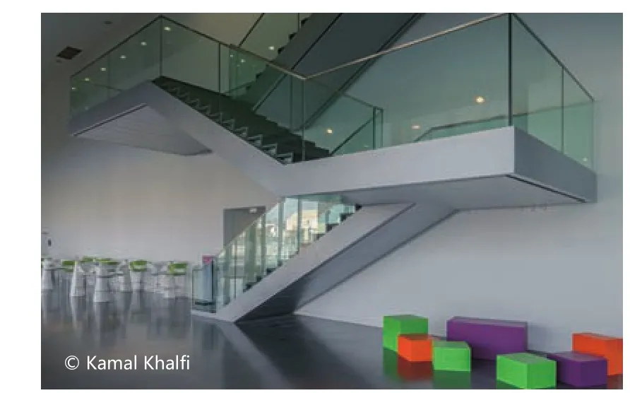
The interiors are characterized by large spaces that give an overview that makes immediately perceive the importance and the uniqueness of the place.
The importance of context, and therefore the importance of the territory,assumes concrete form in the landscape intervention by Florence Mercier.His design of green spaces has created a real interaction between nature,architecture and the audience. The green walk that introduces and takes the visitor to the complex is like a stage that alternates geometries, shapes, colours and shades.
A project that aims to give emotions. Two “bodies”, two “worlds”, symbolically connected by walkways that, in a constant cross-reference, creates an identity that is rooted in the memory of the past with an eye to the contemporaneity and the future. The project reflects identity and memory that belong to France and to all humanity.
