曼谷大学国际学院和美术馆,曼谷,泰国
建筑设计:Office AT有限公司
曼谷大学国际学院和美术馆,曼谷,泰国
建筑设计:Office AT有限公司

1 从停车场看建筑/View from parking
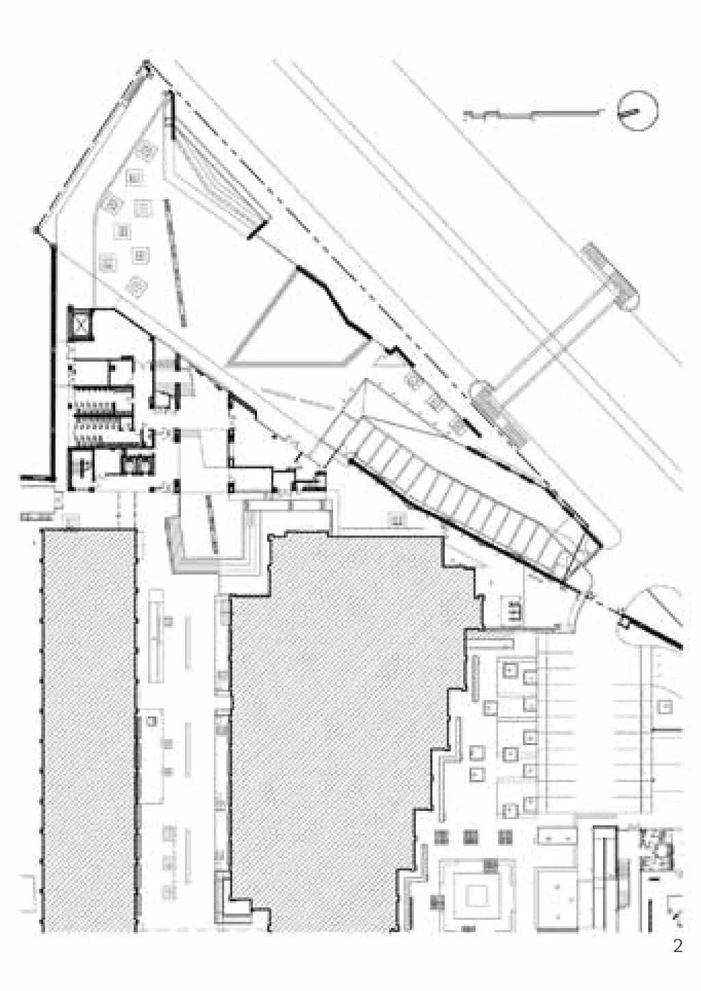
曼谷大学国际学院和美术馆(BUIC & BUG)项目的最初构想是创建一个汇聚多元文化、生活方式以及社会活动的当代美术馆。在研究了大学的总体规划之后,校园的活动轴线被作为设计要考虑的主要因素。在轴线的一端,三角形的项目地块与城市主路相连。为了延续校园轴线上的所有活动,令学校更具活力,设计师决定将活动轴线延伸到新建筑的内部并穿过建筑直至校外。
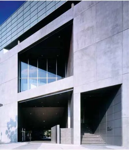
新建筑体块简洁而严谨地沿着规划允许的用地范围布置,从而获得建筑体量的最大化。建筑面积超过3000m2,共6层。在建筑的首层,沿着活动轴线辟出一些露空体量,这将创造一个通往大学的新通道,而一层的洞口则成为校园新的门户。在新的活动轴线入口上方的二、三层还有嵌入建筑的另一个大洞口。这是一个全新的灵活空间,洞口不能用于穿行,却为校园内外提供了穿透的视觉通廊。在这一空间中,人们可以因循活动轴线眺望整个校园,也可以向外环顾大学周边环境。可以说这里是校园内外的过渡空间,也是校园内外景观之间的连结区域。并且,它将在二、三层建立一种视觉连通,并与建筑一层顺应相连。
这座建筑最精彩的部分叫做“活动阶梯”,它位于二、三层的透视洞口之间。它被赋予灵活机动的使用功能,可举办不同活动,艺术展示和其他用途的传统差异在这里被模糊了。这个空间将沿轴线展开的活动延续进来。平日这里可作为通道使用,或也安放一些艺术装置,而在美术馆开放日,这里则用作接待厅或者举办特别活动的剧场等等。
这是一个混合用途建筑,主要由两部分构成:国际学院和美术馆。将国际学院的生活方式、多样活动、多元文化与当代美术馆结合设计,建筑为原本就热闹的城市校园注入了更多的活力。美术馆的功能设置包括一层的咖啡厅、书店,二层的美术馆办公室,以及位于二层和四层的艺术展示空间;国际学院的办公室位于建筑的三、四层,五层是学生休息室,建筑六层则容纳了一个80座教室和96座的礼堂。
整座建筑的墙体材料也根据其功能变化多样。美术馆的大部分外墙采用了裸露的预制混凝土板,通道部分覆以铝制盖板。而整个国际学院部分的外墙则采用透明玻璃与铝翅片,并与美术馆的混凝土板相连锁。建筑6层外包一圈磨砂玻璃。大学与校外之间的衔接区域则覆以穿孔铝板。□(覃莺 译)
The project, the Bangkok University International College and Art Gallery (BUIC & BUG), started with an idea about creating a contemporary art gallery that would exist in conjunction with cultural and lifestyle activities. Analysis of the University's master plan made the activities axis a main factor of consideration. At one end of this axis, connected to the main road, was the triangle-shaped piece of land that became the site of the project. To continue all the activities of the main axis and make the university more dynamic, the designers decided to continue the activities axis into and through the new building to the city beyond.
Simply and strictly following the permitted zoning envelope to create the maximum allowable volume, the new building was built to over 3000m2and 6 floors. Carving out some of this volume at the ground floor along the axis created a new access to the university-the hole created on the ground floor became a new gateway to the campus. On the first and second level above the new activities axis entrance, another big hole-a new multi-purpose spacepenetrates the building. This hole creates a view corridor between off-campus areas and the University outside and vise versa. From this space, users can view all of the campus along the activities axis and also look beyond the school to its Bangkok context. This space is between outside and inside, one that links exterior and interior views. Furthermore, it creates a visual connection on the first and second floors and a physical connection on the ground floor.
The highlight of the building is the Event Stair, created between the visible hole on the second and third floors. It is functionally flexible, accommodates the challenge of different activities and changing events and eliminates the traditional distinction between gallery and other programs. It is a space that continues activities from the activities axis. On a regular day it can be used as circulation or a space for installing art pieces. For a gallery opening, it can be a reception hall or special even podium and so on.
The new building is a mixed use design composed of two main programs: international college and art gallery. Designed as a contemporary art gallery together with a mix of lifestyle activities and serving the mixing cultures of the University's International College, this building adds energy to the already lively City Campus. The Art Gallery programs include a café and bookstore on the ground floor, a gallery office on the first, and the gallery's main programs on the first and third floor. International College programs are located on the second and third floors with a student lounge on the forth and an 80-seat lecture room and 96-seat auditorium on the fifth.
A variety of materials were used in the building. Most of the Art Gallery's exterior walls are of exposed precast concrete panels and with circulation marked with aluminum cladding. All international college programs are housed behind clear glass with aluminum fins-a system that engages the with the gallery's concrete panels. The fifth floor is clad with frosted glass. The "hole" connecting the University to the city is clad with perforated aluminum.□

2 总平面/Site plan

3 剖面/Section

4 从城市主路看建筑外立面/View from main roads

5 位于三层的“活动大厅”/Event hall on the 2ndfloor
评论
郝琳:泰的现代诉求
曼大国际学院与艺廊,功用和体量清晰;穿越的布局、外露式的二层剧场,以及贯通的室外广场空间的设计,既有现代大学的庄重,也有校园的透明度,同时也促进了坊间的自然通风,并激发学生的社群活动。这样的高质量建筑,在当代的泰国,出现得愈来愈多,运用的手法也颇为顺畅。不论个中的语素精炼与否,我认为,它们同属于泰当下的现代风格。泰国的当代建筑,无论如何,当脱离了族群工艺和气候形成的文化脉络与处理方法后,确显迷失。这样的建筑,反映着作为发展中国家的泰国渴望与自信的方向——籍由现代主义的建筑,展现迈向亚洲先进国家和教育的姿态。但是,隐约的类似迈耶式的成熟建筑语汇,虽具有可赞许的光影、形式和都市设计要素,在利落之余,对于连接泰国丰富的历史建造、气候调控形成的异国装饰、几乎人人具有的手工艺传统、以及丰富的都市空间景观层次,到底有什么样的意义呢?亚洲的建筑和思考的方向,除了精益求精的质量和现代化的意向,又有何独特的现代性见解呢?是否到了反思何谓“当代泰的识别性”的时候了?在从未被西方人殖民过的泰,这样的思考和反射,恐怕对于培育年轻一代的校园,尤为重要。
李烨:矛盾的现代主义
房子对待城市的态度是值得肯定的,设计者朴素直接地运用了平面和剖面形式表达对城市的回应,房子开口的策略也的确贡献到了城市空间品质中。但有一点比较遗憾的是,除了这一点我们没有看到更多建筑师对曼谷大学国际学院和美术馆的功能和使用的创新的思考。我们感受到建筑师的初衷是努力为使用者创造出一个活跃的遇见和交流的空间,但材料和空间的尺度却传递出一种严肃和缺少人情味,这一点是这个房子中最大的矛盾。
项目信息/Credits and Data
客户/Client: 曼谷大学/Bangkok University
室内设计/Interior Designers: Office AT Co., Ltd.
场地面积/Site Area: 1032m2
建筑面积/Floor Area: 3641m2
设计时间/Design Period: 2004
摄影/Photos: Wison Tungthunya

6 “活动阶梯”/"Event stair"
Comments
HAO Lin: A Road to Thai Modern
The Grand Cayman International School and Gallery has a clear program-related massing. Its open lane circulation, exposed elevated theater and associated outdoor plaza reflect the nature of a modern university. It provides openness for the campus, promotes natural ventilation and encourages a spirit of inclusiveness. Such high-quality buildings, executed in a skilled design language, are being seen more and more in the modern Thailand. Whether the design is sophisticated or not, such projects exhibit the current Thai drive to pursue modernism. But when modern Thai architecture becomes detached from its local craftsmanship, cultural heritage and climaterelated traditions it loses its identity. This building, no doubt represents Thailand's growing aspirations and confidence as a developing country en route to a modern educational system and twenty-first-century identity. The building utilizes a Richard Meier-esque design vocabulary and its form, choreography of light and shadow and city-scale design moves are worth praise. But what does the building mean in relation to the rich architectural history of Thailand, its tradition of exotic decoration influenced by climate, its craftsmanship or its rich habit of urban and landscape layers? This new modernity is of high quality but does it offer a unique perspective on the modern-thought or architecture-in Asia? Isn't this the time to reflect on the identity of modern Thai? Thailand, as the only country in Southeast Asia never to be colonized by a Western power, is an important place for this kind of reflection on modernity, a conversation particularly important for the nurturing of the new generations ofThais on campus.
LI Ye: Contradictory Modernism
The building's attitude to its urban context appears successful: the open breezy ground floor plan and section have a nice spatial quality and respond well to the building's environment. But these gestures are the strongest thing about the project and there is little evidence here of creative thinking about the program of a college + gallery in such a context. There seems to be a basic contradiction between the strict cold materiality and scale of the building and the architect's ambition of creating vivid spaces for meetings and communication.
Bangkok University International College and Art Gallery (BUIC & BUG), Bangkok,Thailand, 2006
Architects: Office AT Co., Ltd.

