新博洛尼亚中央车站,博洛尼亚,意大利
建筑设计:矶崎新与安德鲁·马费建筑事务所
博洛尼亚的城市整体条件和各类基础设施的建设需求,促使我们尝试以车站来串联起一些相互交叉的城市设施。
铁路将博洛尼亚市区分为两个迥异的部分:南部是有着纪念性建筑和宫殿的老城;北部是工业园区(也称“博洛尼那”)以及由丹下健三设计的博览会(1967)。城市布局有着这样的差异:北面是阶段性开发的矩形结构;而南面则是中心放射形的。新的车站将把过去与现代、中世纪老城与新的工业区结合起来。
我们必须将多样的功能包含到一个项目里:高速地铁站、新的地铁线、车站与机场之间可10分钟抵达的穿梭班车、出租汽车站、为旅客准备的地下停车场。
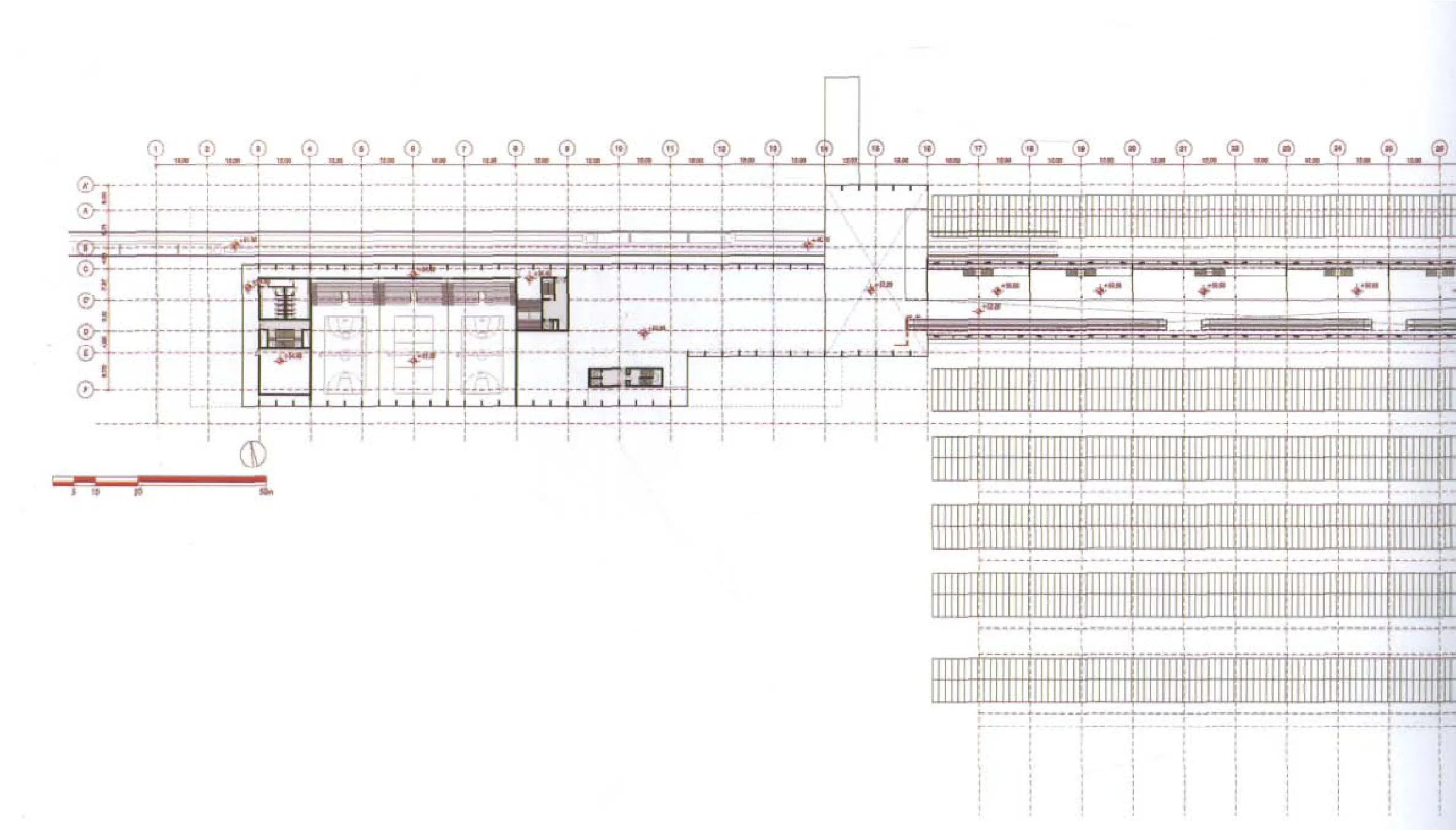
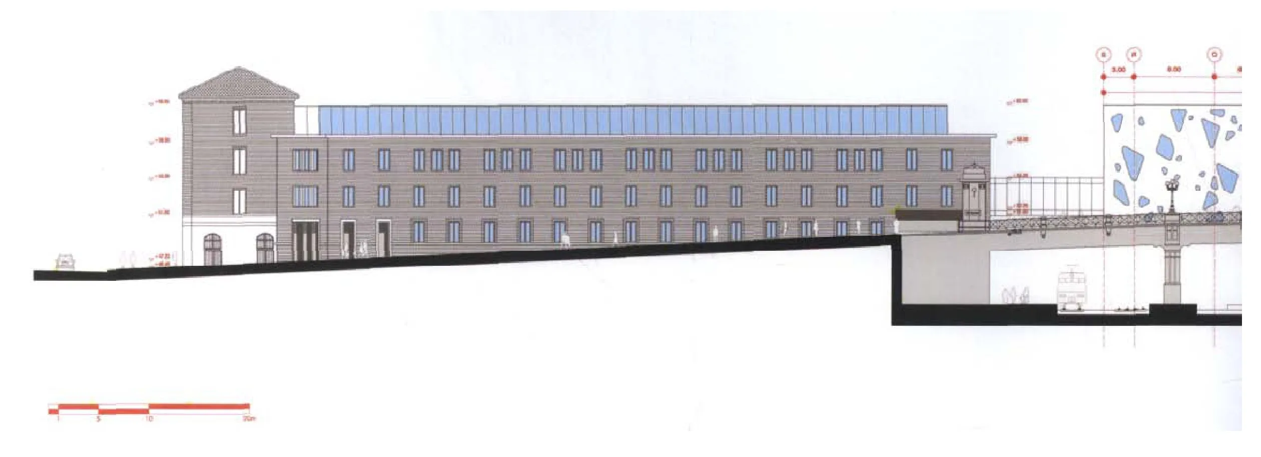
建筑首层按照需要将被轨道和为中短途列车设置的站台全部占满。唯一的解决方法是提供一个桥型车站跨越这些功能并将它们统一起来。另一个棘手的问题是,要解决邻近Soprintendenza大街的现存老车站与有着古老的加列拉门及罗马时代城墙的九月二十日广场之间的关系。
在这种古老与现代的关系之中,我们更希望保持两种从建筑视角看截然不同的现实。面向旧城中心,老车站及周围建筑物得以保留,而在它们后面,从第一条轨道开始,面向现代城市形成新的建筑形式。通过铁路线,这种纵向的差异成为对城市历史划分的诠释:一座双面的建筑,老的在一边,现代的在另一边。
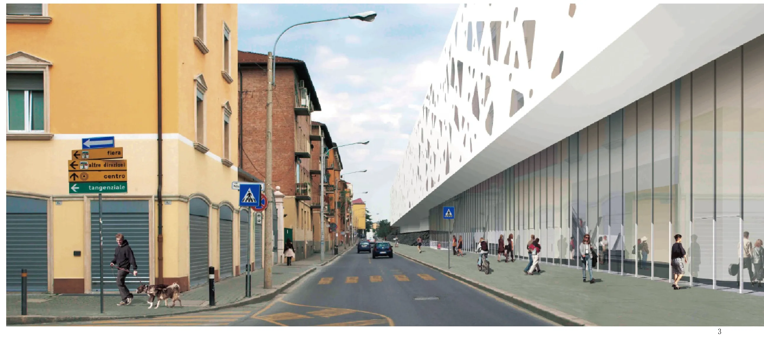
建筑介入的规模——背立面的长度可能会超过600m——这是在制造一种明显具有侵略性的庞然大物,与周围环境不成比例。为此,我们采用了分解的手法:将车站的体量变为并置的几栋建筑。
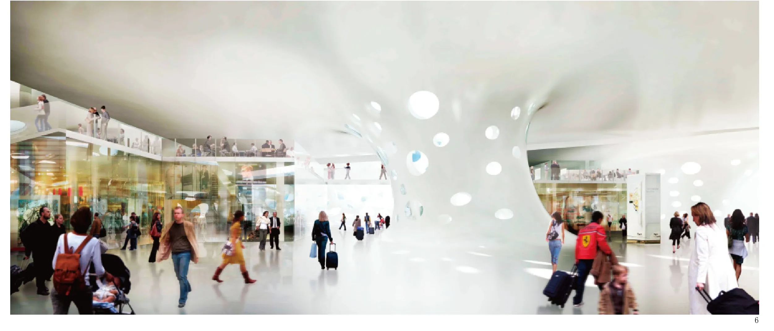
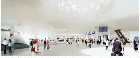
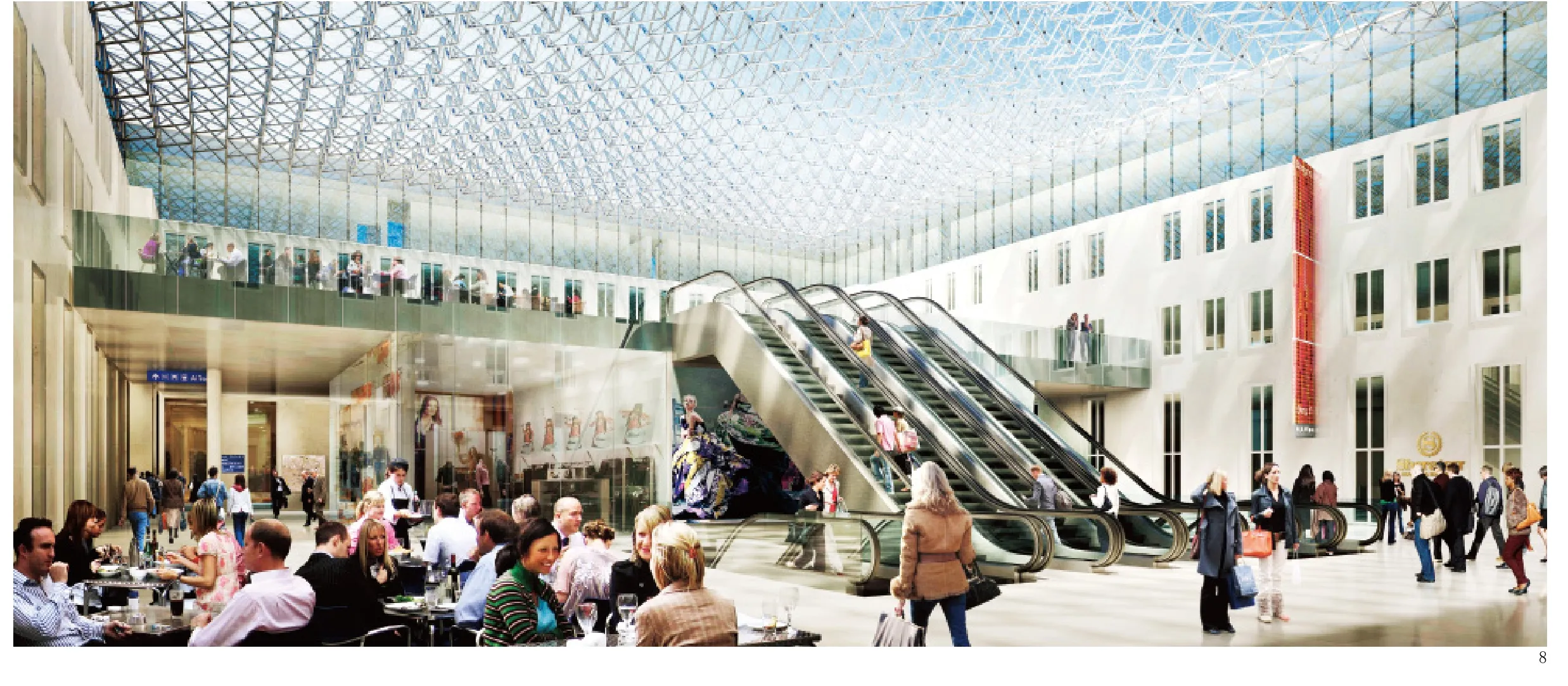
设计以矩形桥型车站的形式将老车站延伸了一倍,覆盖过所有轨道,直抵博洛尼那区的后面。白色的矩形建筑独立于现存建筑,包含了所有商业功能:售票、候车室、餐馆和新车站的酒吧。从这里,你可以通过自动扶梯和电梯去乘高铁。一系列的庭院和屋顶上长长的开口为室内引入了自然光,照亮流通空间内的旅客和下面的铁轨。
在Marcato Navile区的新博洛尼亚市政厅前面,我们设计了一个通向车站的附加空间,这个由错综的形体构成的绿岛上有中央电站和一座运动中心。设计竞赛还规定建筑需包含会议厅、剧场、体育设施等公共设施,这是为了将车站从一个单独的铁路设施变为城市的一部分,让它不再仅仅只为出行服务,也为市民提供其他用途。
一个商业用途的玻璃管状建筑将这个岛和桥型车站连接起来,它面对着运动的火车及博洛尼亚的群山。将新车站分解成一系列体块,令这个项目比整体解决方案更柔和。整个序列与博洛尼亚的新城肌理相应。
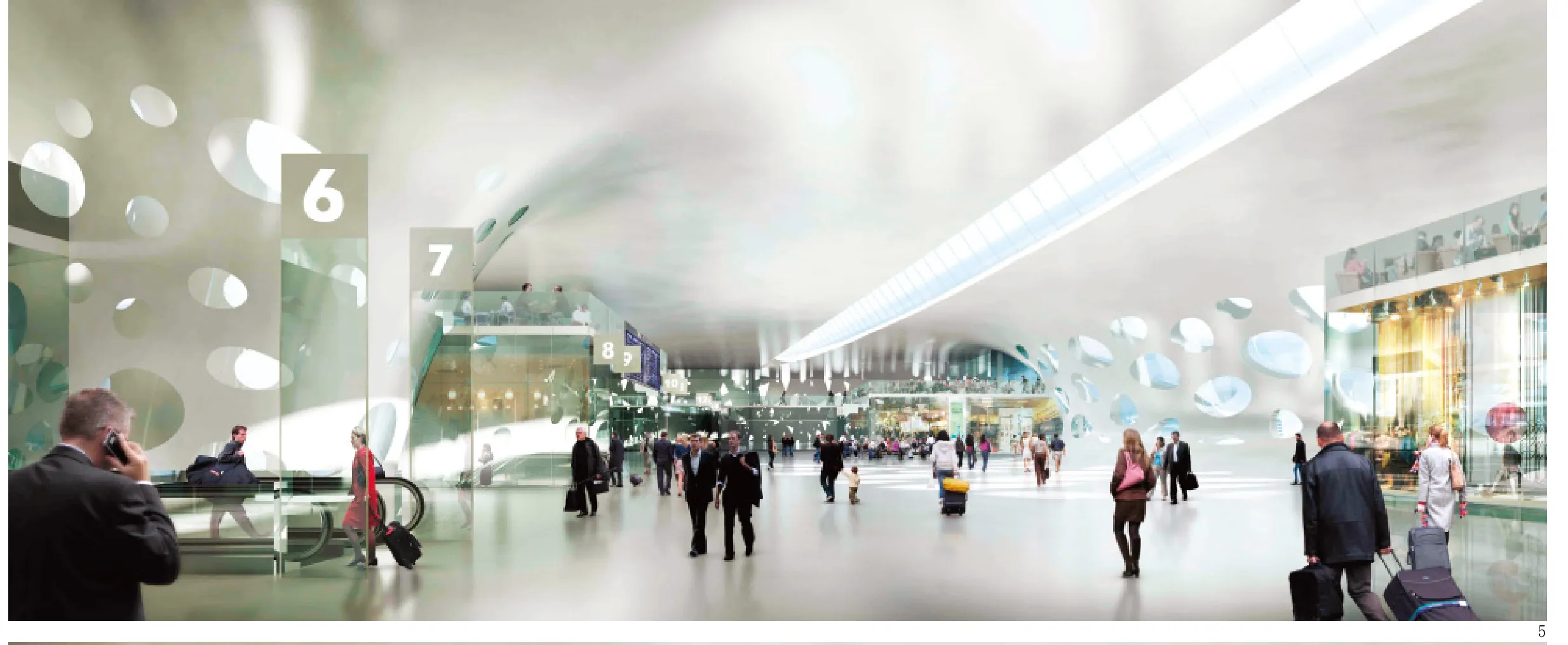
自然光是这个项目的另一个重要主题。桥型车站的内院设有明亮的光柱,吸引着旅客。在内部的双层空间里,视觉效果与下层站台紧密地结合在一起。各个院落里多种形式的开口让它们有了鲜明的不同特色,也令自然光提升为这个项目的重要元素。
在站台上等车时,人们能够获得日光,并看到天空。屋顶上长长的开口照亮了内部的动线,它们的戏剧性张力也在内部空间形成了各种各样的演绎。□(叶扬 译)

业主/Client: RFI – Rete Ferroviaria Italiana
设计时间/Time Schedule: 2007.06-2008.06
建设完成时间/End of Construction: 2015
设计团队/Design Team: Arata Isozaki, Andrea Maffei, Takeshi Miura, Stefano Tozzi, Hidenari Arai, Ryousuke Kamano, Haruna Watanabe, Rawad Choubassi, Atsuko Suzuki, Seisuke Higaki, Simone Utzeri, Giuseppe Micale, Nakanishi Minori, Simona De Nicolais, Filippo Biagi/Arata Isozaki & Andrea Maffei Associati, Stefano Tozzi/M+T & Partners结构/Structure: Maurizio Teora (PD), Angelo Mussi(PM), Gabriele Del Mese, Luca Buzzoni, Francesco Uggetti, Giovanni Tecchio, Matteo Codignola,Salvatore Settecasi / Arup Italia s.r.l., Ove Arup &Partners International Ltd
机电工程/Mep Plants: Pietro Guarisco, Enrico Zara, Alice Quinterio, Nicola Carofano, Alfonso Mastrodicasa/Arup Italia s.r.l., Ove Arup & Partners International Ltd
消防安全/Fire Security Plants: George Faller, Luis Mulinelli/Arup Italia s.r.l., Ove Arup & Partners International Ltd
车站布局/Station Layout: Leszek Dobrovolsky, Julie-Ann Janko/Arup Italia s.r.l., Ove Arup & Partners International Ltd
安全系统/Security Program: Barbara Marino/Arup Italia s.r.l., Ove Arup & Partners International Ltd
施工设计/Construction Planning: Tom Honnywill/Arup Italia s.r.l., Ove Arup & Partners International Ltd
计算机制图/Computer Graphic: Miller Hare
楼层面积/Floor Areas:
新车站/New station: 92 870m2
“Bovi Campeggi”区/Area“Bovi Campeggi”: 58 102m2“Ex Ie”区/Area“Ex Ie”: 6 710m2
“ex-OMA”区/Area“ex-OMA”: 10 318m2
材料/Materials:
混凝土,钢,玻璃/Concrete, Steel, Glass

Bologna’s overall conditions as a city and the need to provide various infrastructures prompted us to develop the station as an attempt to string together a number of overlapping urban needs.
The rail line had always divided the city of Bologna in two very distinct parts: on the south, the Old Town with monuments and palaces; to the north,the industrial districts (so called“Bolognina”) and the Fair designed by Kenzo Tange (1967). The urban layout followed these differences: regulartory developments and rectangular to the north, and radio-centric focus to the south. The new station was to mend the past and the modern, the medieval Old Town and the new industrial districts.
We had to combine several functions in one project: the high-speed underground station, the new subway line, the“people mover”shuttle connecting the station with the airport in ten minutes, the taxi stops, the underground parking for travellers.
The ground floor was requested to be fully occupied by the tracks and platforms for medium distance trains. The only solution was to provide a bridge-station hovering over all these functions and unify them into a common denominator. Another delicate issue was the relationship with the existing old station bound by Via dell’Soprintendenza,and with Piazza XX Settembre characteized by the ancient gate Porta Galliera and the Roman walls.
In this relationship between ancient and modern, we preferred to keep the two realities separated from the architectural point of view.The old station and the surrounding buildings are preserved towards the old city centre; while on their back, from the first track on, new forms of architecture are developed towards the modern city.This longitudinal distinction is the interpretation of the historical division of the city by the railway line: a double-face building, old on one side and contemporary on the other.
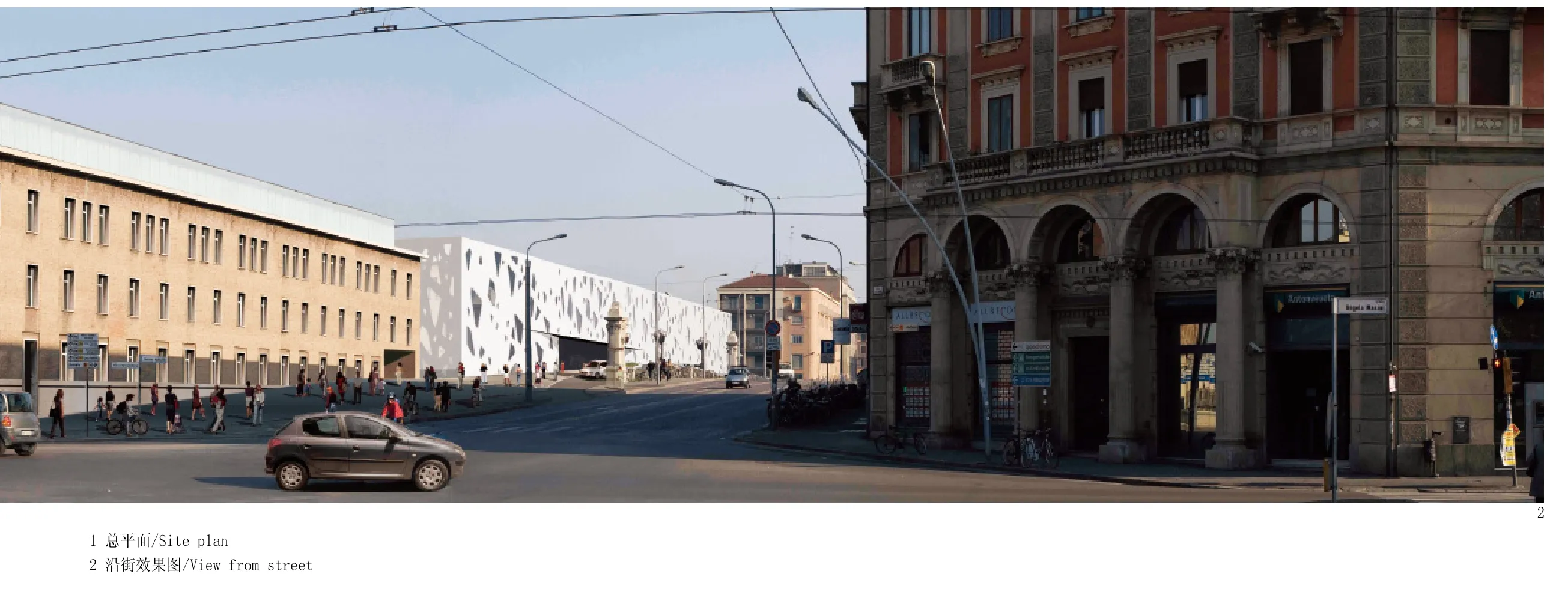
The size of the intervention-on the back it could exceed 600 meters long-was in risk of creating an overtly invasive monolithic building,disproportionate to the context. For this, we have applied a process of de-composition: a volume of station juxtaposed by different buildings .
The old station is extended over the tracks with a rectangular bridge-station of the same length to reach the Bolognina district behind. A white rectangular volume, isolated from the existing buildings, contains all the commercial functions,the ticket counters, waiting rooms, restaurants and bars of the new station. From here you reach the high speed train tracks with escalators and lifts. A series of courtyards and long cuts on the roof bring natural light inside, illuminating the circulation spaces of the travellers and the tracks below.
In front of the new Bologna City Hall, in the Marcato Navile district, we have provided an additional space to the station, a kind of green island made by overlapped volumes containing a central power station and a sport centre. The competition also made provision to include facilities for public use such as congress halls, theatres, sport facilities, in order to transform the station from solely a railway infrastructure to a part of the city used by the citizens for other purposes in addition to travel.
The island and the bridge-station are connected by a commercial glass tube facing towards the moving trains and the hills of Bologna. The decomposition of the new station in this series of volumes led to the easing of the project compared to a monolithic solution. The sequence corresponds to the massing of Bolognina’s new urban fabric.
Natural light was another important theme of this project. The internal courtyards of the bridgestation create bright poles of light, an attraction for the travellers. In the internal double volumes,visual connection engages with the platform level below. Different types of openings are provided in the courts to accentuate their different characters and to stage natural light as the main element of this project.
In the train platforms, it’s possible to get natural light and see the sky while waiting for the train. The long cuts in the roof illuminate the paths of movement inside and their dramatic tension makes the internal space open to different interpretations.□
