深圳宝安国际机场
中国深圳
建设单位:深圳宝安机场3号航站楼机场管理局
建筑设计:Fuksas Architects
执行建筑师:BIAD
照明设计:Speirs + Major
摄影:© Leonardo Finotti & Speirs + Major
Client: Shenzhen Bao’an Airport Terminal 3 Airport Authority
Architect: Fuksas Architects
Executive Architect: BIAD
Lighting Designer: Speirs + Major
Photography: © Leonardo Finotti & Speirs + Major
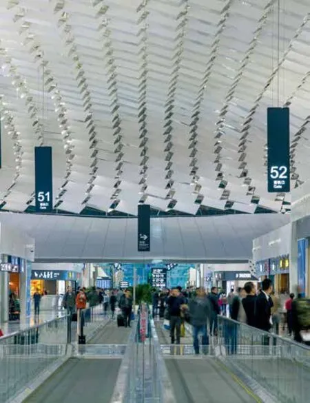
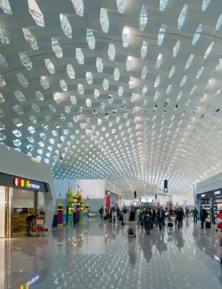
深圳新航站楼的照明设计旨在实现一种平衡之美:光照勾勒出建筑的外形,优化标志性设计的形象,并极具实用性:灯光帮助乘客在陆空之间往返。
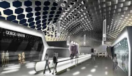
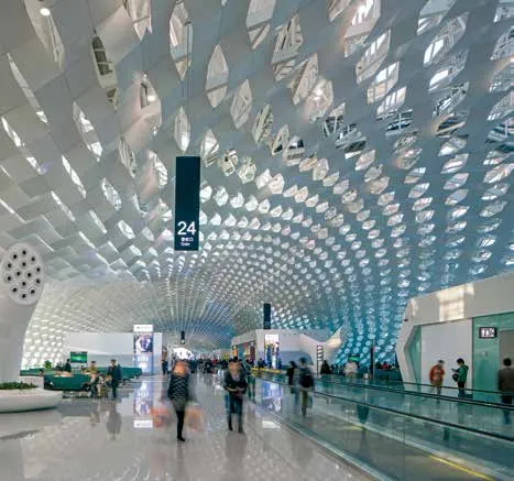
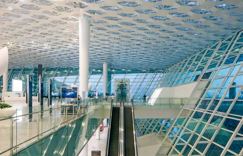
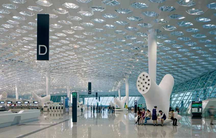
在机场的持续运行过程中,我们格外留意24小时一周期内照明对乘客乘坐体验的影响。航站楼长度为1.5公里,双层屋顶如波浪般延绵起伏,设计独特,点缀着数千个六角天窗。六角天窗引入自然光,创造出动态的光影图案,在多变的设计中,我们有意使人造光与其交相辉映,从而使白日至黑夜过渡自然。我们进行了几项研究,评估并控制光线分散和统一的影响,并在窗户和玻璃墙上逐渐减少光照,让人们可以看到窗外的景色。
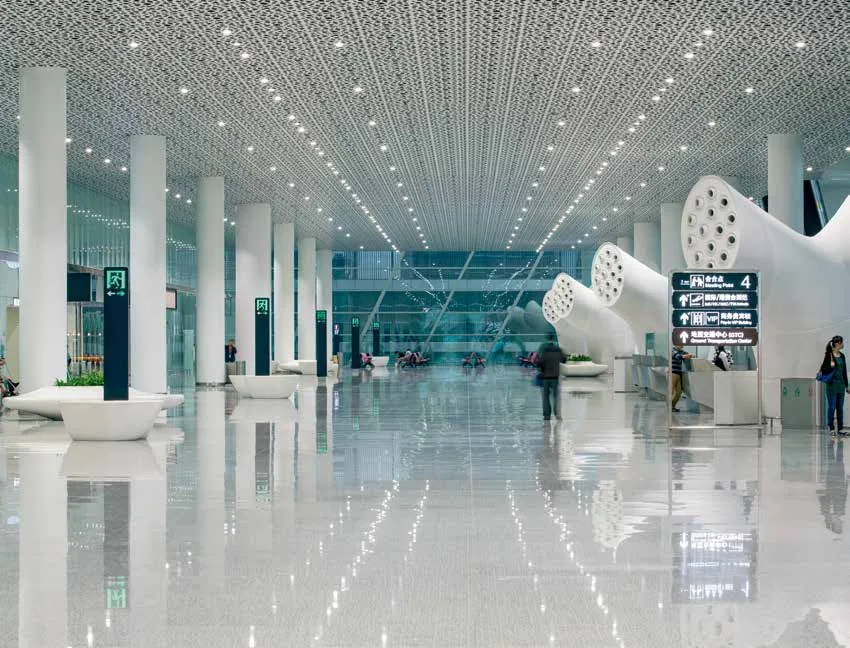
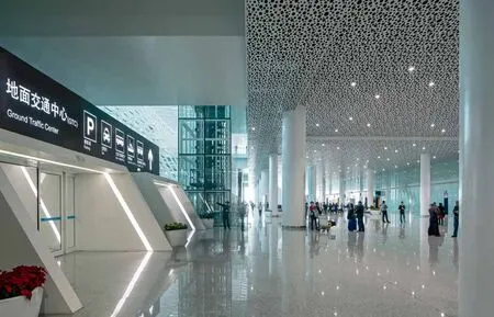
一个关键之举在于点亮屋顶两层之间的空隙,形成宛如“纸灯”一样的效果,在夜间提升室内空间,使光线将其笼罩。突出大门、装置和标牌等方向标识物,使其更易于辨认并具有引路功能——帮助乘客快速且轻松地熟知空间及方向。
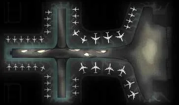
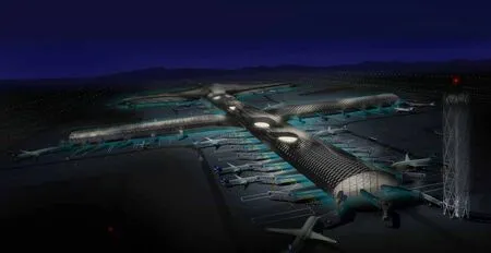
在户外,也同样需要光照来显示建筑的标志性特征,这样在黑暗中也会显现其醒目的独特形象。我们清理了停机坪一层和航站楼下的泻湖,使其不再泛着暗淡的青色光芒,从而创造出建筑物漂浮在泻湖上的效果,如此反复,以对空中桥梁形成同样的效果,在飞机和航站楼间建立视觉上的联系。
The lighting of the new terminal at Shenzhen is designed to strike the right balance between the spectacular: revealing the form and enhancing the image of the iconic design, and the pragmatic: lighting to aid the passenger journey to and from road to air.
With the airport constantly in operation, special care was taken to understand the effect of the lighting on the passenger experience over a 24-hour cycle. The 1.5km long building features a unique undulating double skin roof punctuated by thousands of hexagonal shaped skylights.These create dynamic patterns of natural light and shadow, which we deliberately echoed in our variable design for the arti fi cial lighting, helping to smooth the day to night transition. We conducted several studies to assess and control the impact of light distraction and uniformity,and tailed off the lighting at the windows and glass walls to preserve views out.
A key move was to light the void between the roof skins, creating a feature ‘paper lantern’effect that lifts and frames the space at night. Orientation features such as gates, furniture, and signage are highlighted to improve legibility and aid way fi nding - helping passengers to quickly and easily understand the space and orient themselves.
Outside, the iconic nature of the building demanded lighting that would contribute to a strong identity after dark. We washed saturated pale cyan light at apron level and under the building to create the impression that the building is fl oating on a lagoon, and repeated the effect for the air bridges, to create a visual link between the plane and the terminal.
