光华路SOHO 3Q联合办公空间,北京,中国
设计:AIM恺慕建筑设计

1 SOHO 3Q“剧场”主题示意图/SOHO 3Q Theatre area
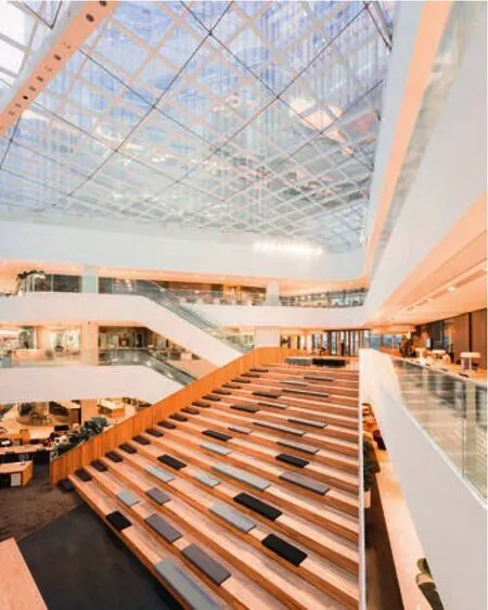

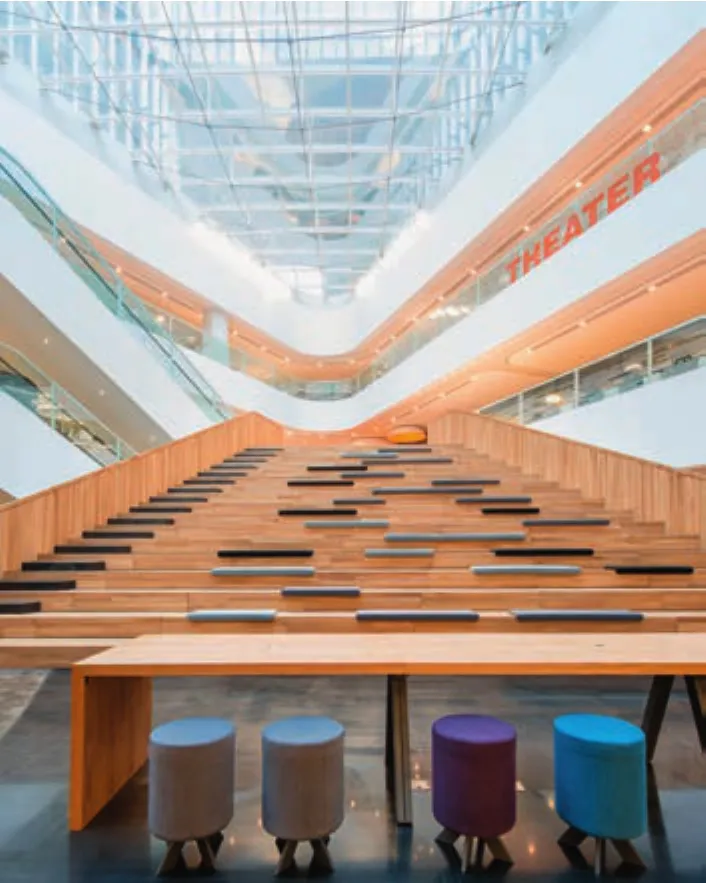
2-4 观演席/The auditorium
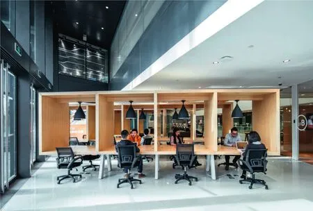
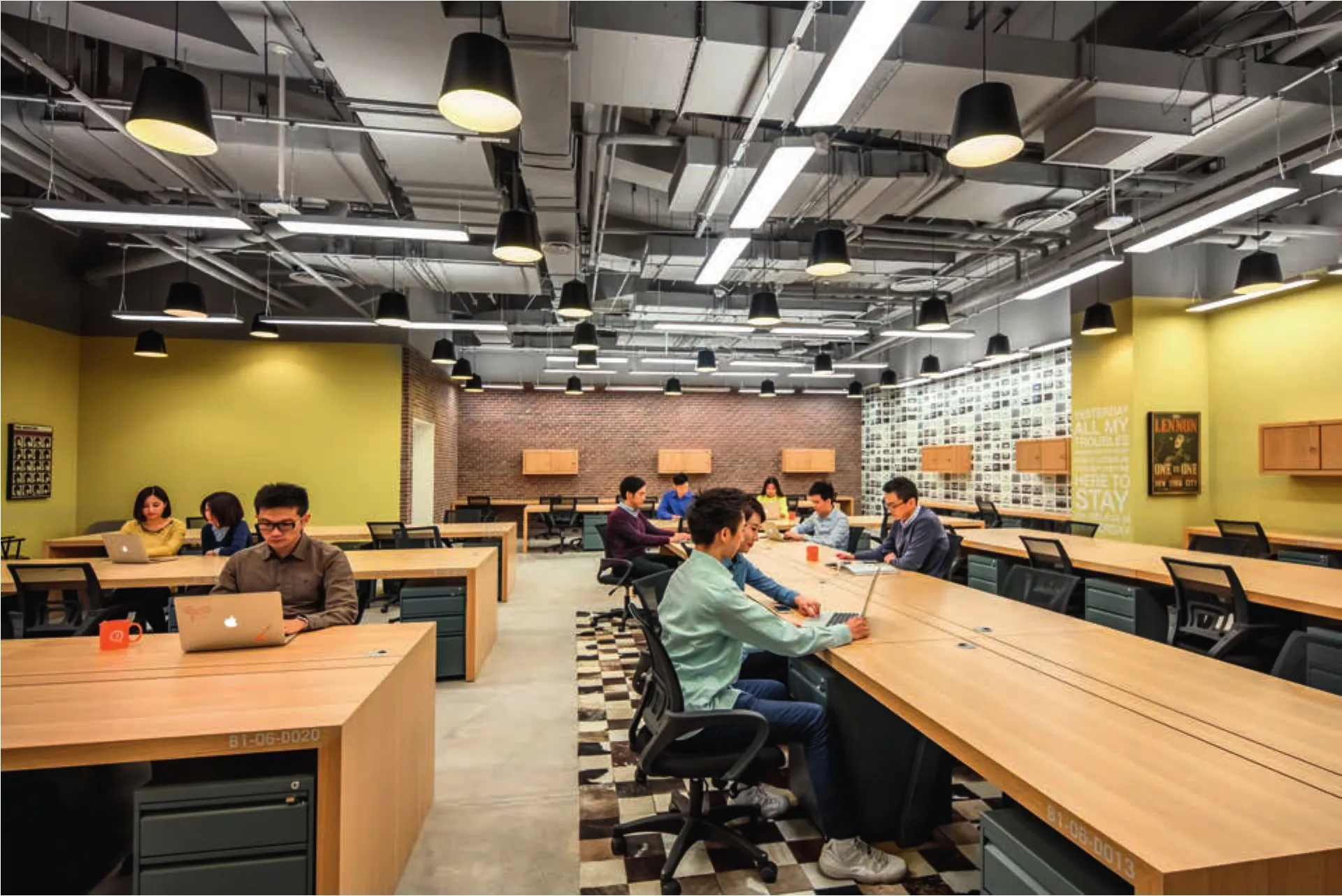
5 工作小间/Working area
一种联合办公的设计哲学
北京光华路SOHO 3Q位于一座由GMP设计的精彩建筑中。它的3层底商原本设计为购物中心,拥有一个峡谷般的、华丽的公共空间,贯穿于200m长的建筑中。另有垂直贯通3层的吹拔和中庭,赋予建筑室内充足的光线。
尽管设计得很好,但这个空间无疑具有明显的商场特征,本身就是为了促进消费。SOHO中国给我们提出的设计挑战是,将这个巨大的白色空间改造为一处充满活力的、温馨的共享办公空间,作为其旗舰商业品牌3Q的旗下产品,另辟蹊径地重新诠释3Q的独一特质。
中国的办公模式正在改变:如今,办公采取完全异于传统的形式。在公司小隔间中朝九晚五的办公状态不再是必须。人们可以选择独立工作、作为自由职业者、在小型团队或公司、或是办公地点灵活的职业。SOHO 3Q提供了优美的办公空间,同时拥有最大化的灵活度。在办公桌或独立办公室周围,设置了共享的讨论设施、休憩空间、路演剧场及其他一切他们需要或想要的。除了灵活性的空间,它还提供了一个共享平台,可通过各种各样的共享设施拓展商务网络,与来自各行各业、志同道合的人交流创造性的理念。
将这座购物中心改造为一个符合3Q品牌价值的创新型办公空间,意味着为人们提供一个能不断带来启发、充满活力的聚集环境。一开始,我们的“改造”策略限定在现有空间的边界内。我们在原空间基础上改造,如此可以节省造价,并通过维持原有的消防系统而将建造的复杂度降到最低。
然而,这是一个20,000m2、拥有3500台桌子的空间——中国最大的联合办公空间。在如此巨大的白色流动空间中,采用大尺度、大胆的设计似乎是唯一可行的方向。我们创造了大型的活动设施及社交空间,作为人们会面、聚集和互动的核心。我们设计了充满活力而又舒适近人的空间,人们会乐于在此聚集和交流。我们使用亮眼的大色块作为建筑中的标识体系。明亮的色彩带来区域间的区分和领域感。
在一种偏向匀质化的空间中,引入个性化及真实性的设计是十分重要的。为了平衡这种大胆、大尺度的标识体系,我们融入一些人体尺度的元素以营造亲切感。我们亦添加了不少像厨房、沙发这样的家庭式布景,给人感觉如同邻居家的起居室一样。
为了进一步提升社区感,我们提出一系列公共空间设想,基于对原购物中心走廊的宽敞公共空间的改造之上。建筑的两个大中庭成为公共空间的中轴。作为对大胆、大尺度设计主题的延续,我们在主中庭嵌入一部戏剧化的、大于生活尺度的木制台阶,形成一处类剧场空间。如今这里是举办讲座及大型活动的完美场地。更重要的是,如今它也成为知识和理念共享的中央舞台。除了第一个中庭的剧场,我们又在第二个中庭设计了一座聚会公园。这里铺上了草皮、设置了公园家具,加上透过采光屋顶洒落的自然光线,成为一座阳光明媚的聚会公园。此外,公园中还点缀了许多透明玻璃体量作为会议室。
剧场和公园是光华路3Q的标志性特征。它们是这个200m峡谷空间中理所当然的“必去”之地。
在材料设计策略上,我们试图引入更丰富的细节和质感,与纯白色的空间形成对比。我们把所有办公室按照颜色和图案组织起来,赋予其不同主题,在建筑中形成一种泛光谱关系。此外,我们使用了大量木材,使得白色和亮色空间更为和谐。
最终的设计成果,是一处平衡了办公、休闲和社区感的场所。这个空间既让人感觉充满活力、广阔无垠,又给人带来一种自然的、亲密的氛围。
我们对于这个3Q空间的设计处理与之前的3Q产品都大为不同。它的独一无二不仅在于它是中国同类项目中最大的一个,同时也是当代中国最能够代表共享办公社区精神的一个。□(文森特和宋文迪 文,黄华青 译)
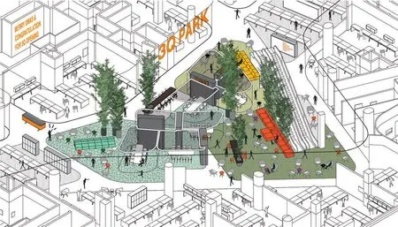
6 SOHO 3Q“公园”主题示意图/SOHO 3Q Park area
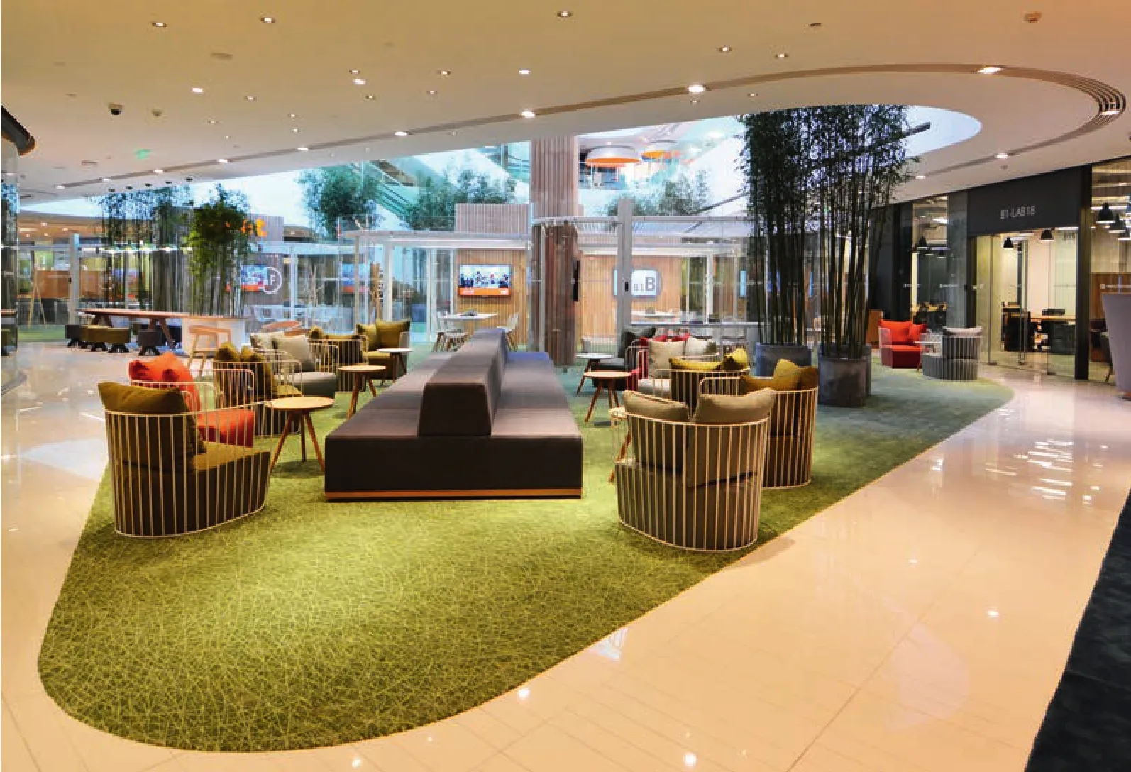
7 休息区/Lounge
A co-working design philosophy
SOHO 3Q Guanghua Road in Beijing is located in a wonderful building designed by GMP. The 3-storey commercial base was originally intended as a shopping mall with a beautiful public canyonlike space that meanders through the 200-metre long building. There are voids and atriums vertically linking the 3 floors giving it plenty of sunlight.
While beautifully designed, the space was nonetheless distinctly mall-like and intended to promote consumerism. SOHO China challenged us to transform this vast white space to a vibrant and warm collective office space under its commercial flagship brand – 3Q and to reinterpret the unique attributes of 3Q with a different design approach.
Work life in China is changing: work now takes on a more unconventional form. 9-5 in corporate cubicles is no longer the norm. People work alone,as freelancers, in small teams or companies or in jobs with mobile locations. SOHO 3Q offers beautiful work space with maximised flexibility. By the desk or per room, with shared use for meeting facilities, break-out spaces, a presentation theatre and everything else they need or expected to want.In addition to flexibility it also provides a shared platform where can expand your business network and share creative ideas with like-minded people,from different industries through the different shared facilities.
Transforming this shopping mall into a creative work space that matches the 3Q brand essence means bringing people together in an environment that inspires and moves. Right from the start, our strategy towards "transformation" has been within the boundaries of the existing space. We had worked with the existing space to save costs and minimise construction complications by keeping the existing fire systems.
However, it is a 20,000sqm space with 3,500 desks – the largest of its kind in China. In a vast white fluid space like this, applying big and bold seemed to be the only Way to go. We created large activity elements and social spaces that served as nuclei for gathering, congregating and interacting.We designed vibrant yet comfortable spaces where people would want to hang out together and exchange ideas. We used big patches of strong colours as identifications throughout the building.The bright colours allow distinction between areas and a sense of space.
It is important to bring personable and authentic design into a space that was intended for a more generic programme; so, balancing the bold and big we blended in some human-scale elements to provide a sense of intimacy. We also incorporated many home – like settings such as kitchens and break-out lounges that resemble your neighbours'living rooms.
In order to further encourage a feeling of community, we devised a public space programme that was built upon the abundant public space which was originally intended as common corridors in the shopping mall. There are two large atriums in the building that became the anchors of the public space. Continuing with the theme of bold and big we inserted a dramatic larger-than-life wooden staircase in the main atrium creating an auditorium-like space. It is now the perfect place for lectures and events. And more importantly it becomes the centre stage for knowledge and idea sharing. With an auditorium in the first atrium we designed a meeting park for the second atrium. We put in grass and park furniture, which combined with the natural sunlight coming through from the sun roof transforms it into a sunny meeting park. In addition, we dotted many transparent glass volumes as meeting rooms.
The auditorium and the meeting park are the flagship features of the 3Q Guanghua Road. They are the natural "go-to" places along the 200-metre canyon.
In the material strategy we have sought to bring more details and textures to contrast with the stark white. We have themed each office and organised them by colour or pattern, so a loose colour gradient exists throughout the flagship. In addition, we have used a lot of wood to harmonise the white and the vibrant colours.
The end result is a place that balances between work, leisure and community spirit. A space that feels energetic and expansive, yet it also offers an organic atmosphere and intimacy.
We have interpreted this 3Q quite differently from all the previous 3Qs. It is not only unique in that it is the largest of its kind in China but also the most representative of work community spirit in modern China. □ (Text: Vincent de Graaf and Wendy Saunders)
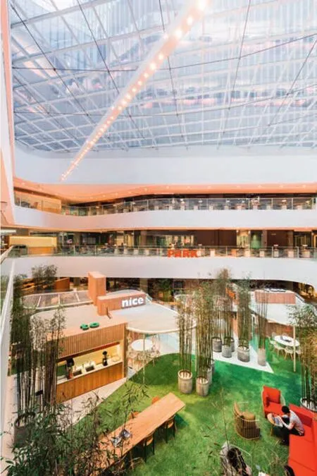
8 公园主题/Park area
WA:在这个项目中,设计发挥了什么作用?
AIM:我们得到的任务书是将一座零售场所改造为共享办公空间。传统的零售商场拥有大量公共空间,但主要服务于交通功能。在光华路3Q项目中,我们有幸面临的本身就是一处十分优雅的空间,它由GMP设计,拥有充足的自然采光和公共空间。我们的契机和挑战是如何使用这个空间。最终,我们在其中添加了工作站、会议室、一座聚会公园和一部可用于公共讲演的大台阶。WA:设计中最有创意和最具吸引力的部分是什么?
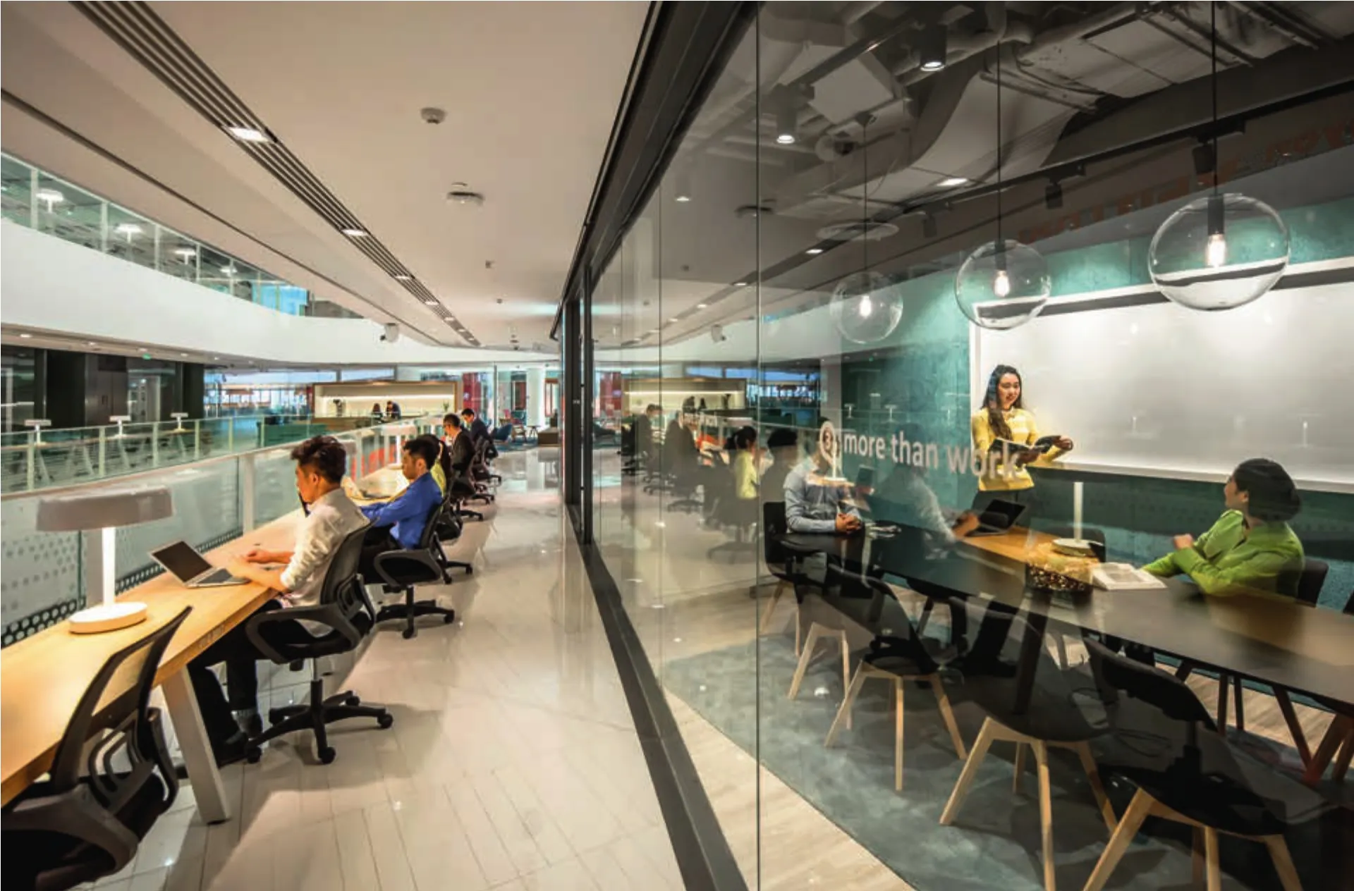
AIM:我认为最吸引人之处在于,我们设法让这个整体上比较乏味的商业空间充满了生机。我们在中庭周围的公共走道中增添了办公桌,有点像是图书馆的阅览桌;我们还增设了中庭的大台阶。这部台阶不仅将地下一层转变为一处真正可用的楼层,也增添了一处让人们聚集、开办讲座、会面和讨论的空间。它真正成为了空间中的点睛之笔。最美妙的是,它看起来如同本来就存在一样,从这个意义上说,它与原建筑之间无缝衔接。WA:设计过程中最大的困难是什么?
AIM:这个项目是据我们所知全球最大的联合办公空间,而且建得很早。我们很难想象它的使用者究竟是谁、我们需要什么程度的设计、如何让空间足够有趣和多元而又不显累赘。我们希望在空间中增加尽量丰富的内容,因此尽力采取更强有力而清晰的设计元素,从而在高强度的使用中保持秩序。
WA:使用者的反馈如何?
AIM:使用者似乎都很喜欢这里。它避免了每家公司都局限于自己手头的事物,而创造了大量人与人之间的互动机会。
此外,使用者也很享受那些若非联合办公空间即无法获得的功能:大台阶上经常举行有趣的、有时还是高规格的活动(如法国总统马克龙曾在此举办一场公共活动),这里还有一座真正意义上的封闭剧场,可用于培训及公司路演。
这个独特的联合办公空间看起来与其他办公空间皆有所不同,因为它能够让那些中小型公司或企业分部轻松地找到适合自己的办公场地。
WA:这个项目是如何改善使用者的工作状态的?AIM:这很难说,但不妨说在这栋建筑中存在一个生态系统,促使人们使用那些碰巧在同一处办公的公司所提供的服务。这是一个动态的环境,可以根据需要增加或减少办公空间,这为一些企业提供了理想的办公模式。
总体上说,这座建筑在改造之前就很好,拥有极佳的采光和组织。我们又添加了一个通透、直观、高标准的室内设计,提供了灵活性、多元性、额外的功能、高品质的材料和舒适的家具。能有什么不让人喜欢的呢?□(黄华青 译)

9 三层平面/Floor 2 plan
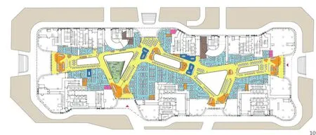
10 二层平面/Floor 1 plan
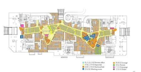
11 首层平面/Ground floor plan
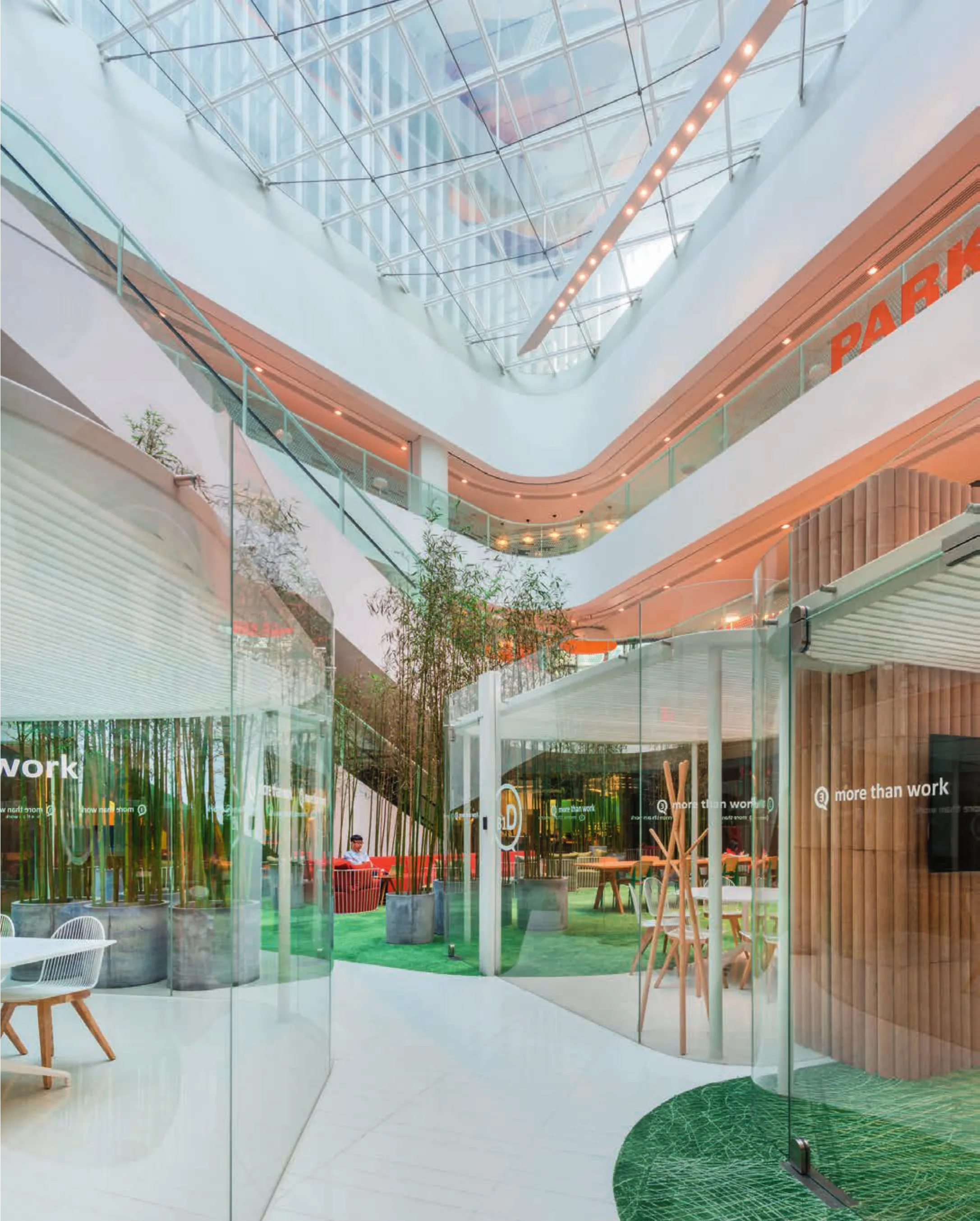
12 公园主题/Park area
WA: What is the role of the design in this project?
AIM: Our design brief is to change the nature of a retail environment into a collective work space.Typically, a retail mall has a lot of public space that is mainly used for transport. In the case of Guanghua Road 3Q, we were lucky to deal with a very nice space already, designed by GMP with lots of light and public space. Our opportunity and challenge were how to use that space. We have ended up added work stations, meeting rooms, a meeting park and a gigantic stair that serves as a public forum for the building.
WA: What is the most creative and attractive solution?
AIM: The attraction to me is that we managed to blow a lot life into all this generally un-inspiring retail public space. We added desks around the atriums in the public walkways, a bit like having desks in a public library, and we added the huge atrium stair. That stair has not only changed the B1 into a real usable floor, we also gained a space for the people to gather, have lectures, meet, talk. It really turned into the heart and the wow of the space.Nice thing on top is that it looks like the stair that has always been there, so in that sense it seamlessly interacts with the original architecture.
WA: What was the most difficult part in the process of design?
AIM: This is to our knowledge the biggest coworking space in the world and done quite early. So,it was hard to imagine who would be its users, how much design did we need, or how to make the space interesting and diversified without filling in too much. We expected an abundance of things in the space, so we concentrated on offering strong and clear design that would be hold up well under heavy use.
WA: What is the feedback from the users?
AIM: They users seem to love it. It avoids companies to get locked up in their own issues, as there is a lot of interaction between people.
Also, they seem to appreciate getting functions they would not have in their office if they were not in this co-working space: the ramp is home to pretty nice and sometimes high calibre functions, (French president Marcon chose this as a place for one of his public events), also the space is equipped with a real closed auditorium for trainings and company presentations.
This particular co-working space seems to be a little different from many others in the sense that it can easily accommodate mid-size companies or business divisions.
WA: How did this project improve the users' work?
AIM: That is hard to say but let's say there is an ecosystem within the building where people are using services from other companies that happen to be in the same space. It is a situation that is dynamic, it makes it possible to have more or less space, so that offers opportunity to the business cooperation a company might have.
Generally, this is a very nice building to start with, with great light and organisation. We have added a transparent, intuitive and high standard interior that allows flexibility, diversity, extra functions, good materials, nice furniture. What is not to like?□
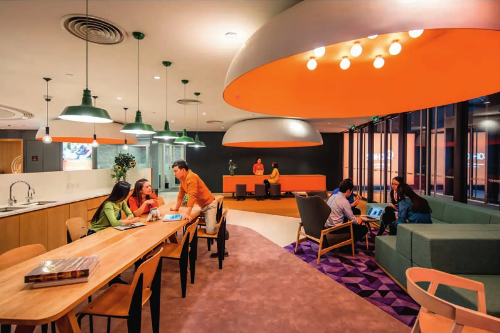
13-15 工作间/Labs
项目信息/Credits and Data
地点/Location: 北京市朝阳区光华路西里/Chaoyang District Guanghua Rd Xi Li, Beijing
设计团队/Design Team: Wendy Saunders, Vincent de Graaf,Ivan Yu, German Roig, Byungmin Jeon, Liat Goldman, Lily Zhu, Bertil Dongker, Alex Fripp, Zhikun Zhang
面积/Size: 33,874m2
设计时间/Design: 2014.12-2015.06
建造时间/Construction: 2015.07-2015.12
摄影/Photos: 阴杰/Jerry Yin (fig. 5,7,13-15), Dirk Weiblen(fig. 2-4,8,12)

