上海日清建筑设计有限公司办公楼改造,上海,中国
建筑设计:上海日清建筑设计有限公司
上海日清建筑设计有限公司办公楼改造,上海,中国
建筑设计:上海日清建筑设计有限公司

1. 入口处/Entrance
创新与生活,喧闹中寻找安静的自我
日清主楼是上海一幢商务楼的裙楼,本身并无什么特色。立于吴淞路与余杭路路口,多年风雨未能洗净外滩的沧桑,周边生长着几片带有殖民地时期烙印的传统里弄。外白渡就在不远处,横跨在苏州河上。
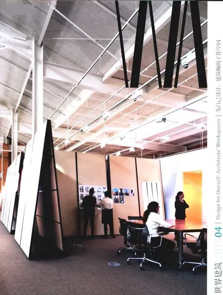
设计现在已经是一个体力活,都市的快节奏压得人喘不过气了。在满眼的喧闹繁华中想找到一片安静的所在,结合自身的乐趣找到一些心灵的寄托。前屋是一个小花园,穿过这个园子是原境界的长廊。近代欧洲的绘画与现代的展示空间相结合。想告诉人们在“艺术哲学”的范畴中,各种形式的表现始终归于艺术的原点。建筑设计只是其中之一。这是公司对外展示的窗口和客厅。4层的多功能厅也是一个聚会研讨的场所,既能开大会,也提供了一个体育健身的环境。整个九层建筑的核心,从早餐会的方案研讨到工作之余的锻炼,以及分组研讨,都能在这里不受打扰地展开。5层是个更大的多功能空间,绘图、交流、讨论与娱乐生活在这里都能找到存在的环境。画几笔图之余,可以打打台球,看看艺术展示品。家具都是自己设计的,不算实用,但多少都有设计情怀,向别人标识设计师的身份,并不想完全以现代的建筑语言和“少即是多”的法则去套用在自身天天触摸的每一个空间与器具上。希望能发掘环境的随意性和丰富性,更希望摆设、陈列的艺术氛围让自身逃脱极简主义冷酷和照片摆拍的效果。所以很多的设计并不遵循一贯制的法则,空间的流动性和无障碍化让交流、互动、研讨成为公司内部的一些常态,如果不是高层的结构,我们更希望能最大限度地强调水平的互动。
5层的屋顶露台设计成一个小小的花园,种上蔬菜搭配着鲜花、水果等植物,让我们在某种程度上自给自足。在这里可以聊天、烧烤,也可以晒太阳,尤其是春秋两季的午时,成为同事们聚会的好场所。整个公司的色调是暖色的,希望员工们在这里放松身心,专注于创作,无障碍的空间鼓励水平方向的互动与交流。作为个性的不同和厌倦单一表现的冲动,从主入口的门厅开始,就把建筑模型与传统的建筑梁头共同展示在一起,使身份的辨别让建筑设计与传统与艺术联系到了一起。
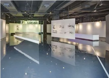
两个展示厅,一个展示近现代到当代的绘画,另一个展示古董的收藏,“跨界”地吸收养分在这里得到更多的鼓励。于是,每一个团队在个性的标识上也打造出很多属于自身的小空间,可以展示建筑材料,可以展示模型,也可以展示植物与招贴。加上几只流浪猫时不时穿梭于其中,使整个办公环境拥有一些生活的味道。这里不仅仅是我们工作的场所,也是我们生活和为之奋斗的环境,它伴随着我们一起走过人生的一段美好时光。(文:宋照青)
Life and Innovation: Seeking a Quite Self amid Bustle and Hustle
La Cime Main Building is originally a podium of a business building in Shanghai with no distinctive features. At the intersection of Wusong Road and Yuhang Road, the building still bears on the vicissitudes of the Bund. It is surrounded by traditional lanes reminiscent of the colonial period. Not far from it is Waibaidu Bridge over the Suzhou River.

2. 入口处/Entrance
Design is now a manual labor. Overwhelmed by the fast-paced urban life, we want to find a quite place amid bustle and hustle that accommodates a sense of pleasure and spiritual sustenance. The front room is a small garden, across which lies a long corridor of the gallery Original Identity. Modern European paintings, in combination with modern exhibition space, indicate that in the realm of "artistic philosophy", all forms of expressions would finally return to the origin of art. Architectural design is just one such expression. this is a window and hall through which the company exhibits itself. The multi-functional hall on the fourth floor is a place for gathering and discussion. It functions both as a conference room and a fitness center. This is the core part of the nine-floor building. Activities can be held here without being disturbed, from breakfast design meeting to spare-time exercises and group seminars. the fifth floor is an even larger multifunctional space where drawing, communication, discussion and recreation can all be accommodated. You can play billiards or take a look at the artistic works on exhibition after a few strokes of drawing. Furniture is designed by our architects, not quite practical yet conveying a good sense of design and revealing the unique identity of the architect. Apparently the idea is not to impose modern architectural language or the principle "less is more" on a space or appliances of everyday touch. Instead, we try to unearth a rich yet random environment, creating an artistic ambiance of escape. there is also a sense of minimalist coolness and an effect of artistic pictures. Therefore, many designs do not conform to the principle of consistency. The fluidity of space, together with the barrier-free activities of exchange, discussion and interaction, becomes the normal state of the company. We would expect maximum horizontal interaction if it were not a high-rise structure.
The roof terrace on the fifth floor is designed to be a small garden where flowers, fruits and vegetables are planted, somehow resembling a selfsufficient economy. Here people can chat, barbecue and bask in the sun. During spring and autumn, it makes a perfect place for studio gathering at noon. The whole company assumes a warm tone, expressing a wish for the staff to concentrate on their creation in a relaxed mood. Such a barrierfree space encourages horizontal interaction and exchange. The setting also invites display of different personalities and diverse looks. Starting from the main entrance hall, building models are exhibited side by side with traditional beam heads, incorporating tradition and art into architectural design through evoking a sense of identity.
There are two exhibition halls, one displaying modern and contemporary paintings and the other antiquities, thus encouraging cross-fertilization between various fields. Consequently, every team brands itself with a personalized label to create their own small space, in which they can showcase building materials, models, plants and even posters. Stray cats run through it now and then, adding a flavor of life to the entire office environment. this is not only my workplace, but the environment where I live and strive, accompanying us to walk through the best time. (Translated by ZHANG Qingfei)

3 五楼花园/Garden on floor 4

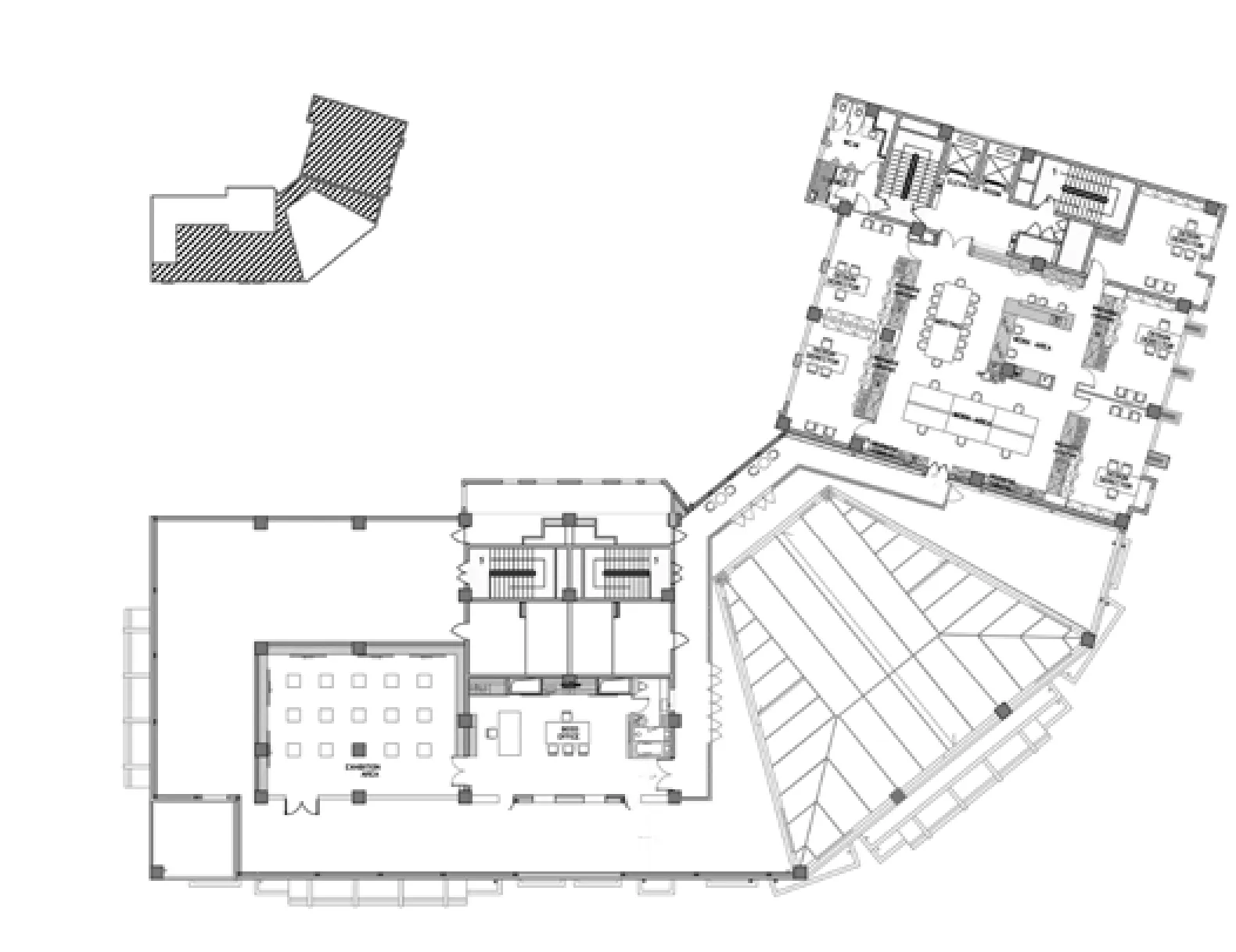
4 五层平面/Floor 4 plan
项目信息/Credits and Data
项目地点/Location: 上海市吴淞路328号耀江国际广场4F-8F/4F-8F, Yaojiang International Plaza, No.328, Wusong Road, Shanghai
概念设计/Conceptual Design: 宋照青/SONG Zhaoqing
照明设计/Lighting Design: Azlan Nazam
室内设计/Interior Design: 北京一工建筑装饰工程有限公司/Robarts Spaces
改造建筑面积/Renovation Floor Area: 4034m2
设计时间/Design Period: 2011
摄影/Photos: 上海日清建筑设计有限公司/La Cime International

5 原境界画廊/Original Identity gallery
评论
郑方:日清的办公室包含多种多样复合的使用功能,办公、会议、讨论、接待、健身、种植、展示等等,入口花园、五楼花园和多功能厅穿插在这些活动之中,可以想见丰富多样的工作和生活场景。材料的运用相当放松:混凝土、木材、织物、玻璃、人造板、石材的质感,粗糙的,光洁的,天然的,人工的,见于不同的空间,植物的搭配也不刻意为之。入口大门的金属线条、前台等待区的织物条纹、四层多功能厅的放射线灯具、五楼花园的木格栅光影闪烁,仍然流露出建筑设计的形式意图。这是一个充满生活气息的地点,既不酷,也不抽象,正如同日常生活本身,模糊随意,混杂多变。
范悦:这是位于城市中心区高层写字楼中,较大规模的设计事务所办公空间改造设计。本案饶有兴趣之处有两点。相对于一般乘公用电梯进入所属楼层,办公空间呈水平展开的做法,此处为将高层建筑裙房的一部分(首层,4-8层)竖向化,一层可形成独立入口和门厅,并通过专用电梯联系各层。另外一个特点是,在不同楼层布置了展览、运动集会、餐食等场所,所用器具、家具很多也是自行设计的。

6 四楼多功能厅/Multi-function hall at floor 3
Comments
ZHENG Fang: The office of La Cime International contains complex functions such as working, meeting, discussion, reception, fitness, plantation, exhibition, etc. Interspersed among these activities are an entrance garden, a fifth-floor garden terrace, and a multi-functional hall, so one can well imagine the manifold working and living scenes. The material is applied in a quite relaxed manner: tactile values of concrete, timber, fabric, glass, artificial board, and stone, either rough, clean, natural, or artificial, are presented in different zones and accompanied by a random decoration of plants. Nevertheless, such elements as the mental lines at the entrance, the fabric stripes at the reception, the spotlights in the multifunction hall at the fourth floor, and the wooden grating in the garden at the fifth floor, all express the architect's design intention. Neither cool nor abstract, it is a place full of life: fuzzy and random, yet sophisticated and varied, just like our daily life. FAN Yue: Located amid high-rise office buildings in the city center, this is a large-scale renovation project of a design office. I perceive two interesting points in this scheme. First, it deviates from the horizontal office space which usually relies on the public lift to access each floor. Part of the podium of this high-rise building (1F, 4-8F) is turned vertical, so that a separate entrance lobby is set aside on the ground floor, with a private lift to access each floor. Another characteristic is that each floor has its own venues for exhibition, sports, meetings, and meals. All appliances and the majority of the furniture pieces are deigned by the studio's own architects.
La Cime Main Building Renovation Project, Shanghai, China, 2012
Architects: La Cime International

