维特拉厂房,莱茵河畔魏尔,德国
建筑设计:SANAA建筑事务所,NKBAK事务所

1 外景/Exterior view

2 鸟瞰/Aerial view
在维特拉校园的一角伫立着最后一个老旧厂房。SANAA 被邀请用一个新的装配构筑物替代现有的工业空间:一个可供多方使用者共享、原尺寸2 倍大的厂房。
我们在呈直角的场地内提出了一个可替代旧有传统厂房的圆形设计方案。方案的造型和所在位置使得建筑可以自由地伫立在周边环境之中,不分正面或背面,从各个方向都可以探索它。随着后勤运输层面的最新进展,货车可以在厂房周边的任意方向自由地行驶、停靠。
尽管建筑的轮廓呈现出一种自由之感,但内部布局经过了严谨地组织。大到结构小到洒水口的布局,网格状的设计思路贯穿了项目始终。不同区域、不同货架和不同商品都经过了精心排布以满足物流需求。厂房的结构由高9.5m 的细长钢柱组成,主梁及桁架尺寸为17.5m×22.8m。使用圆弧形混凝土立面来支撑并稳定构筑物,使得我们可以将钢材的结构尺寸最小化。
自然光通过大量开设的线形屋顶天窗渗透进来,经由屋顶的白色钢结构进一步漫射,营造出一个愉悦的工作环境。除了主要的工作区域,该厂房还包含几个小型办公室、车间及快餐区。
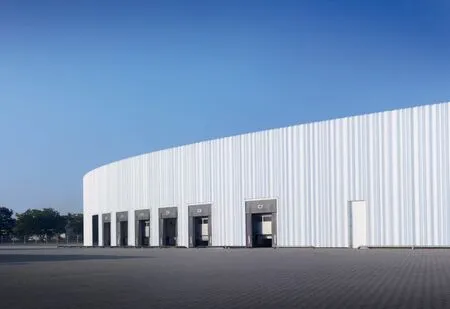
3 立面/Façade
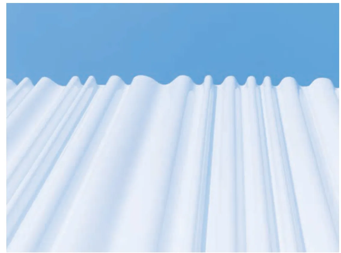
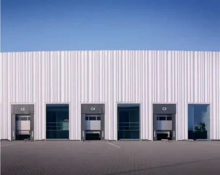
外立面上,定制的波纹挂板包覆着建筑,犹如一组优雅的幕布,既揭示又隐藏了内部的活动。我们对工业产品低成本、标准化的常规形状和尺寸进行了调整,以打造独特的外观。3 种波纹不同的模具打造出了6 种挂板,挂板沿立面排列形成了节奏的变化。光滑的白色丙烯酸挂板映衬出周边的树木与建筑,将这个大体量的工业厂房与维特拉的景观融为一体。
厂房下方是一个可为维特拉的访客及员工提供存储空间及地下停车场的大型地下室。项目总占地面积30,535m2,分两期建成。建筑已于2012 年12 月完工。(天妮 译)
The last of the old factory buildings stands in a corner of the Vitra Campus. SANAA was asked to replace the existing space with a new storage and assembly building: an industrial shed twice the size of the original one to be shared by several users.
We proposed a round design, offering an alternative to the present tradition of factory buildings set at right angles on the site. The shape and position of the shed allow the building to stand freely amongst its neighbours, with no front or back,allowing it to be explored from all directions. With the latest developments in logistical flows, lorries are free to circulate around the perimetre of the shed and to dock and then drive off in several directions.
The silhouette of the building conveys a sense of freedom but the internal layout is strictly organised.A grid-like design runs through the project, from the structure to the sprinkler layouts. The different areas, shelves and goods are carefully arranged to suit logistical needs. The shed structure comprises slender 9.5-metres-high steel columns, with the main I-girders and trusses running 17.5 m by 22.8 m metres. Using the circular concrete façade to brace and stabilise the building meant we could keep the structural measurements of the steel to a minimum.
Natural daylight filters into the shed through numerous linear roof lights to be further diffused by the white steel structure in the roof, creating a pleasant working environment. As well as the main working area, the building contains several small offices, workshops and snack areas.
On the exterior, customised corrugated panels envelop the building like an elegant curtain that both reveals and hides the activities inside. We altered the regular shape and size of a standard,low-cost industrial product to create a unique appearance. Three differently shaped moulds create six individual panels which are arranged to compose a changing rhythm along the façade. The white,glossy surface of the acrylic panels reflects the surrounding trees and buildings and helps this vast industrial shed to blend in with the Vitra landscape.
Below the building is a large basement with storage spaces and underground parking for Vitra guests and employees. The project covers a total surface area of 30,535 m2and is built in two phases. The whole building has been completed by December 2012.
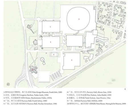
4 总平面/Site plan
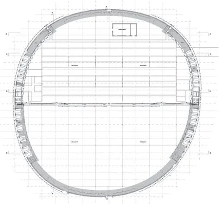
5 首层平面/Ground floor plan

6 天花平面/Ceiling plan


15 外景/Exterior view
16 立面细部/Façade detail

17 立面体系/Elevation scheme

18 外景/Exterior views
19 外景/Exterior views
评论
王国钰:在方正直角的场地上采用圆形平面的设计方案,是维特拉工厂的显著特点。圆形平面,使建筑自由伫立在周边环境中,不分正面或背面,建筑形象令人印象深刻。圆形平面同样为厂房的运输和交通带来灵活性。外立面采用光滑的白色丙烯酸挂板,富有节奏变化和韵律感,纯粹且极具视觉冲击。难能可贵的是,以圆形平面生成外轮廓,内部布局却是网格状,该设计思路贯穿始终,合理的布局和物流、实用经济的建构以及舒适的工作环境均在设计考量之中。
张小龙:在传统概念中,工业厂房的样子多为轻质钢结构的方盒子,工业建筑的最大追求就是既要满足不同行业生产工艺及产品生产要求,又要用最低的投入取得最大的收益。SANAA建筑事务所的方案在呈直角的场地内提出了一个替代旧有传统厂房的圆形厂房设计方案,用一个不规则圆形(半径接近80m)来诠释这个旧厂房替代设计方案的突破和更新。从另一个视角揭示工业厂房的设计可以如此超乎寻常,洁净优雅,给工业建筑设计师以无限的空间想象。设计无论是从总图布置还是单体平面的功能分区,无论从屋顶天窗设计还是外墙轻质模块化白色丙烯酸挂板波纹板的采用和造型设计,都体现了对传统工业建筑设计有选择的继承与突破,以及大胆的创新与尝试。
Comments
WANG Guoyu: The outstanding feature of the project is that it adopts a circular plan on the rectangular site.The circular plan enables the building to freely stand in the surrounding environment, regardless front or back, and has an impressive architectural image. The circular plan also brings the factory the flexibility of transportation and communication. The façade is made up of smooth white acrylic panels, which is full of rhythm, pure and visually striking. It is noteworthy that the idea of the round outline of the plan with the grid layout of the circular plan is undergirded throughout the design. Reasonable layout and logistics, practical and economical construction, and comfortable working environment are all considered in the design. (Translated by PANG Lingbo)
ZHANG Xiaolong: In traditional concept, the factory should look like a light steel-structure box whose greatest pursuit is to not only meet the demand of different technologies of different industries and production, but also get the highest profit from the lowest input. SANAA proposes an alternative for the traditional factories which is a circular plan on the rectangular site – an irregular circle (with a radius of nearly 80 m) to demonstrate the breakthrough and innovation of the alternative design of old factories.It reveals that the design of industrial workshop can be so extraordinary, clean and elegant from another perspective, which gives industrial architecture designers infinite space imagination. Whether from the master plan or the functional zoning, whether from the design of roof skylight or the application and stylistic design of light modular white acrylic pendant corrugated plate on the exterior wall, all suggest the selective inheritance and breakthrough of traditional industrial architecture design, as well as bold innovation and attempt. (Translated by PANG Lingbo)

