深圳市梅林二十四小时自助办证大厅
类别:室内设计 | 公共及文化空间
设计师/ 设计团队:靳刘高设计


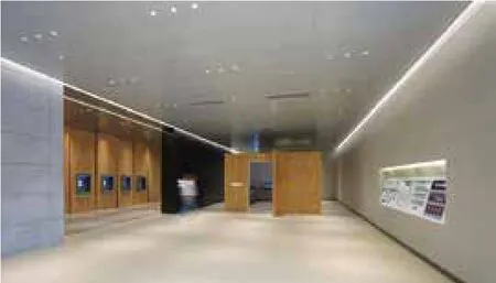
为了让广大市民享受科技发展带来的快捷和便利,进一步提高出入境办证效率及服务质量,梅林关自助办证大厅重新规划空间布局与整体视觉设计,打造更佳的服务体验,从而改变民众对政府服务机构固有的严肃冰冷印象。 整体设计围绕便捷、科技、高效、舒适的概念。整体空间布局中正,功能分区与动线清晰。有别于以往政府机关比较冰冷的形象,这次设计更强调简洁温暖的氛围,因此使用大面积的木饰墙面,以几何变化作空间节奏,并配合灯光色温的调整,让空间更具有当代的审美取向。同时考虑到造价的控制,物料选用都以实用高效为原则,突显简洁的品质,而非奢华堆砌。 大厅入口正面为民警形象墙,整体仿石墙面与黑色金属作灰调的搭配,庄重大气而简约。入口左边为休息区,座椅的设计一反常规,用了阵列交错摆放的方座,颇具艺术感。入口右侧为网上自助申请区,将原本较为杂乱的预约区域独立开来,使整个空间更为简洁整体。自助办证区域,机器按序排列,墙面使用较为明显的几何形态,既表现空间的节奏感,又使民众从中体验到高效的服务。24小时大厅墙面与天花板从造型及材质上无缝对接,整体设计感强烈,背景墙几何形态的设计,充分展现流动的视觉观感,与空间层叠的效果呼应。
To change people's impression on administration hall, the design follows the concept of convenience,technology, efficiency and relaxation. The regular spacial layout divides the functional area and the circulation clearly. Unlike the cold feeling displayed by other government departments, the design presents a precise and warm atmosphere using wooden walls on a large area in a geometric way to create a dynamic space. With the help of the lighting, the entire space gives a contemporary aesthetic pleasure.The construction material follows a practical principle to show the preciseness rather than redundancy.Right into the hall entrance, there presents an image wall. The faux-stone wall corresponds to the black metal with a grey tone, elegant and concise. The left side of the entrance is the rest area. The chairs are placed in a interlacing pattern irregularly showing an artistic sense. The right side of the entrance is the area for self-service online application. It separates the old messy appointment section to simplify the entire space. The self-service section, the organized machine, the walls with geometric forms not only reveals the dynamic rhythm of the space, but also improves the service experience for people. The wall of the hall is consistent with the ceiling in every way in terms of the shapes and materials. Together with the strong sense of design and the geometric wall patterns fully show the visual flow, corresponding to the stacking effect of space.

