序言
文/曾仕乾
序言
文/曾仕乾
描述自己设计建筑的过程总是很艰难。因为这个过程需要作者不断反躬自省、开诚布公。设计过程本身是不断流动和进化的。稳定不变的是循环出现的组织策略,虽其形式各异,但目的均是在特定场景中完成既定任务。写这篇序言的目的是寻找其中所涉及作品的共性思路。在分析十二幢房屋的过程中发现,经验性的空间和组织策略体现在了所有的项目中。这些作品依据类型建造,其空间颇具古典精神气质。
想理解自己的建筑,需要先理解自己。我们都是自己过去经验的总和,我的建筑亦是如此。我在二十世纪80年代早期接受的训练以及与对我影响至深的导师的交流,均对我的建筑职业生涯发展产生了巨大的影响。当年在耶鲁大学,罗伯·克里尔(Rob Krier)在校园酒吧里,一边喝啤酒一边历数他未能获胜的竞赛,这番对建筑的热情令我印象深刻。罗伯特·文丘里 (Robert Venturi)曾说,他总是被一些细枝末节弄得辗转难眠。那时是80年代早期,建筑学的包容性极强。我记得当时的学生自发归组成各个“阵营”:后现代历史主义学派、新理性主义学派、正统古典主义学派等等,不一而足。在保罗·鲁道夫艺术和建筑大楼的六楼自习区,许多即兴讨论一直持续到深夜。
还记得在我设计学习的基础阶段,华盛顿大学的莱斯利·拉斯科(Leslie Laskey)老师给了我很大的启发,当年他讲授包豪斯建筑的设计模型。光头,一身黑色着装,我确定他是在效仿包豪斯学派的奥斯卡·施莱默(Oscar Schlemmer)。那时学到的知识——比如精简设计方法的实用主义本质,以及对物质性的重视,一直伴随着我。后来在耶鲁大学的进阶工作室,我参加了托马斯·戈登·史密斯(Thomas Gordon Smith)组织的古典设计工作室,但很快意识到自己并不属于那里。我认为它的论述过于教条,整个学期也没画出一根古典柱子。陈述报告的形式又是乏味冗长的水彩画分析——将平面图、立面图、剖面图和细节图整合到一个展板上。总之,学习重点只在于死记硬背一些规则和古典主义句法。
尽管没有深陷于所学的古典主义,我和一位同学蒂姆·斯蒂尔(Tim Steele)利用晚上的时间为一家法律事务所做改造设计。我们的设计是正统古典主义风格,在入口门廊处布满了托斯卡纳柱,图书馆里也都是爱奥尼克柱。我和古典主义略为复杂的关系由此开始。一方面我觉得古典主义限制过多,另一方面我又被其创造厚重宏伟空间的能力所震撼。在罗伯特·斯登 (Robert Stern)纽约工作室的最终审核中,菲利普·约翰逊(Philip Johnson) 以我没有展示立面图为由拒绝讨论我的古钢琴博物馆扩建项目。我将建筑的立面用空白墙壁的形式展现,紧靠博物馆的罗马式立面,因为我对讨论该项目的设计概念和空间隐喻更有兴趣。当时,挪用他方资料、借用其他建筑立面加以重新阐释,便可形成整个审核的根基,但是评论家们更热衷讨论风格。总之,我从没感觉自己归属于某个特定的建筑学派运动。毕业后,我找到了跟艾伦·格林伯格(Allan Greenberg)实习的机会,他是最为正统的建筑师之一,曾为白宫和美国国务院工作。毕业后的罗马之旅令我更加坚信古典空间拥有震撼人心的力量。
我在这里尝试定义一下 SCDA 建筑设计事务所作品中的设计方法论。SCDA 设计的项目均涉及建筑的一些基本元素(光、空间、透明性、物质性和秩序),也有志于融入一些人文品质, 比如宁静感、美和秩序。空间编排决定了体验空间的顺序,并重新定位规划止于远景或开放空间的感知“轴线”。这属于现象学范畴,关乎用户对空间的情感反应。建筑形式的外观多为一系列长方形盒子,定义了同样重要的庭院、花园和紧贴围墙的其他外部空间。整片区域 倾向于是规整的长方形;若不是,则常用灌木丛或景观填补。这样的组织策略让“反转”概 念成为可能。从建筑学角度阐释,建筑物和户外庭院空间(即空地)被给予同样的重要性和权重,我们将该策略实践到项目中,利用开阔空间(即空地)的设计图来辅助建筑的形成, 如马六甲的 Heeren Street House、Emerald Hill House 以及 Sennett House 等等住宅。
建筑物与外围边界间的空间通常会由于分区规则而产生,因为建筑退界空间总被定型为景观庭院;建筑内房间的角落常被切割,以打破空间的稳定感,使空间向外部花园或者庭院延伸;而在城镇类型的项目中,这种做法也让空间可以向内部庭院进行离心式的重聚;同时,大尺寸滑门可以藏到隐蔽处,模糊了内外空间的界限,将其和外部区域融合。
在城镇化愈演愈烈的亚洲郊区,为保证住户隐私,可控景观的需求日益增长,于是小型庭院和采光天井被引入到设计中。早期项目中各种当地特色的整合,更多依赖于对殖民风格黑白色平房上悬坡屋顶的意象化。随着时间的发展,这些项目逐渐根据抽象形式和亚洲住宅的循环模式而演变为更加微妙的空间构图。
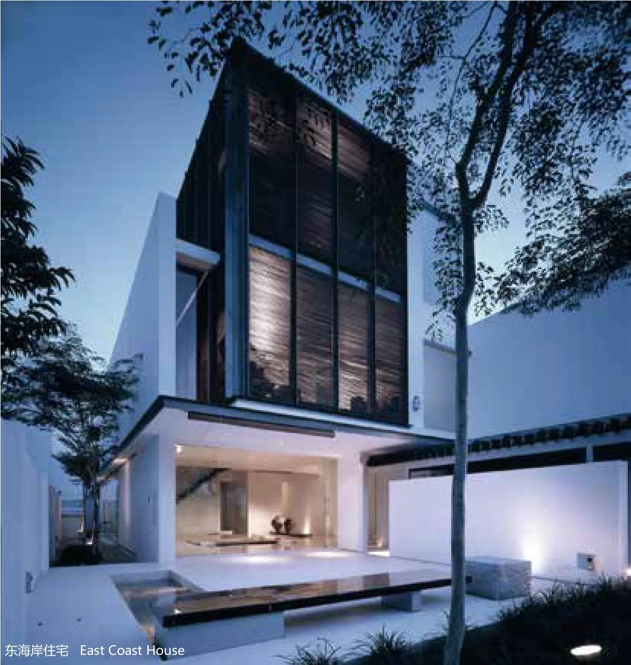
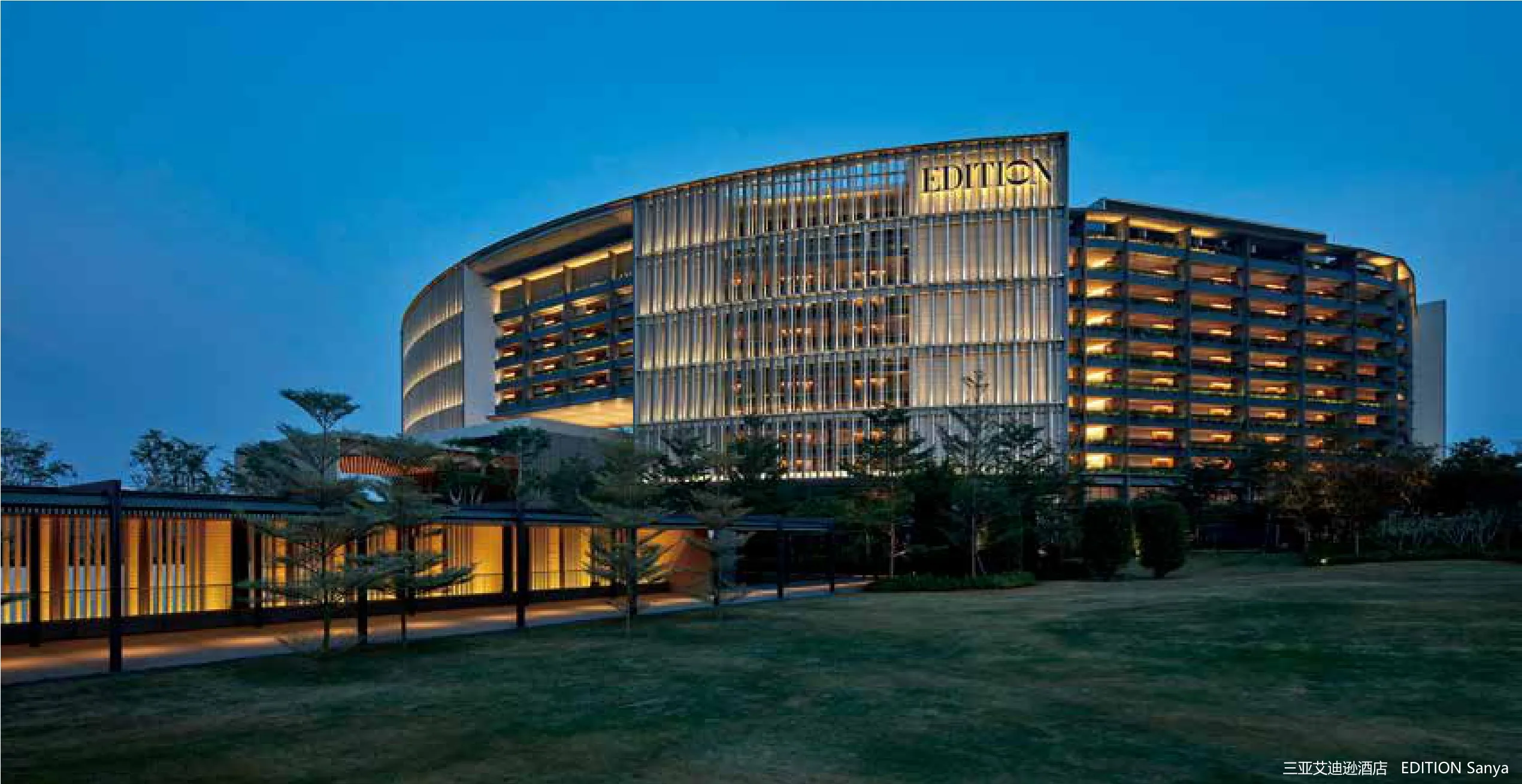
通过设计筑造起的建筑语言为我们在南亚设计的房子留下了类型学解释的空间。我们的项目,尤其是位于热带的住宅开发,把关注点放在室内外之间的“中间地带”或模糊地带,以此作为对热带地区气候的整体建筑学回应。通过手工或机械操作装置(穿孔表层、特制遮板和木质、金属质或石质格架),来控制热带气候中太阳光的照射和热量。这种特制遮板是当地热带房屋的重要组成部分,充当了不透明墙壁和透明玻璃门窗布局之间的缓冲元素。这层建筑面纱改变了光与影的质量,虚化了建筑表层,在不同的灯光布置下显示出不同透明度。
从具有代表性和民间的风格中解放出来,将建筑设计的体量和立面建立在体积、光线和表面这样的原型元素之上。墙面以独立平面的方式被处理,使得墙与墙之间的实体材料能够分隔开来。这不仅为重新诠释和转化既定空间实质提供可能,同时可以通过对当地手工艺、文化和气候的审慎阐释来整合地域的基本元素。
通过死记硬背基本建筑模块去理解建筑风格其实和学院派的建筑学训练并无不同。熟悉的风格和连贯的设计语言不容混淆。我必须强调,此设计方法不以任何形式削减设计实践中针对过程和概念导向方法的分层能力;尽管空间的本质是古典的,细节却是普遍的现代风格。
二十世纪90年代后期,事务所终于收到了高层公寓的设计委托,这让我们有机会把典型的低层建筑空间元素融入当代的高层多单元住宅之中。1999年的“Lincoln Modern”和“Ladyhill”这两个关键项目,就为我们提供了验证这些设计概念的机会。两个项目中的空间都被设置为可塑和相互联动的,进而创造出一个个“天空庭院”。“Lincoln Modern”中的 L 形部分互相联结,并通过立面传达出设计理念,以致敬柯布西耶(Corbusier)的别墅楼。每个连锁模块中都有一个三层高的空中大厅,这从立面中得到了直接体现。这些三层高的大厅亦被看作空中露台,为高层建筑注入热带元素。
“Ladyhill”项目中的六个内部庭院是具有组织性的象征空间,它们彼此相连形成一个长方形体量,随后公寓内部的空间以此为核心展开布局。内部空间是建筑的延续,同时符合抽象派还原艺术美学。空间的形成是通过整合交错的体量、表面和平面继而使结构和施工清晰化来实现的。所用的调色板相当自然,单片材料在表层彼此独立,以清晰表达其正式结构。遵照工程计划,空间概念被精炼到它的最基本形式,这一方式让材料的微妙细节和建筑构造得以充分表达。为了突破项目的实用主义,内部空间利用明确的空间、光线和布局设计来成就祥和的风格。
随着设计方法的日渐国际化,实际应用的设计语汇更需要吸收气候、文化和地域的细微精妙之 处,而清楚明了的建筑设计语言将有利于普世性和地区特性间的有效融合。

It is always a difficult proposition to begin to write about the process that goes on in the making of one’s own architecture. To do so requires sustained introspection and ability to be open. The process of design by its very nature is fluid and is always evolving. What is constant is the recurring organizational strategies that manifest themselves in different forms to address the given brief in a particular site. The objective in writing this essay is to discover the common threads fundamental to the works in this monograph. In the process, a dozen houses are analyzed and it becomes evident that there is an empirical spatial and organizational strategy behind all the projects. The works are typologically driven and the spaces are classical in spirit.
To understand one’s own architecture requires an understanding of self. We are a product of the sum of all our experiences and this is true of my architecture as well.The influence of my training in the early 1980s and coming into contact with my in fl uential mentors played a big part in my own development as an architect. At Yale,I remember Rob Krier’s passion for architecture as he recounted over beers at the campus pub the number of competitions he did not win. Robert Venturi talked about the fact that it was always the small things that kept him awake all night. It was the early 1980s, a time when architecture was very inclusive. I recall students aligning themselves with di ff erent camps: the Post Modern historist, the Neorationalist, the Orthodox classicist, etc. Many spontaneous discussions took place at the sixth fl oor review pit at Paul Rudolf’s Art and Architecture building late into the evenings.
I remember my early grounding in design under a particularly inspirational teacher by the name of Leslie Laskey at Washington University, who conducted the design modules in the curriculum of the Bauhaus. He was shaven bald, dressed in black and I was sure he was modeling himself after Oscar Schlemmer of the Bauhaus School. The lessons learnt of the utilitarian nature of design achieved through an economy of means, and a concern for materiality stayed with me. Later at the advance studios at Yale, I signed on to a Classical design studio under Thomas Gordon Smith but quickly realized that I did not belong in that studio. I found the treatises too dogmatic and never drew a single classical column in the semester.The presentations were to be in the form of the very tedious water colour analytiques,a composite of plans, elevations, sections and details composed on a single board.The emphasis was on learning by rote the rules and syntax of classicism.
Even though I did not indulge in classicism in studio, I was freelancing with another student, Tim Steele, on a law office conversion in the evenings. The project we designed was orthodox classical and was replete with the Tuscan columns at the portico entrance and ionic columns in the Library. It was the beginning of an uneasy relationship with classicism. While I found it restrictive, I was also moved by its ability to produce grounded monumental spaces. At the final studio review at Robert Stern’s New York office, Philip Johnson refused to discuss my project as I had not presented any elevations. The façade was presented as a blank wall against the existing Romanesque façade of the museum. I was interested in talking about concepts and spatial metaphors for the Harpiscord Museum addition. It was a time when appropriating a source and borrowing the façade to reinterpret could form the basis of the entire review; but the critics were interested in discussing styles. So it was that I never felt aligned to any particular movement. Upon graduating I sought an internship with the most orthodox of architects, Allan Greenberg, who did work in the White House and State Departments. My visits to Rome after graduation con firmed my conviction in the ability of classical spaces to move the human spirit.I shall attempt to define a design methodology in the works of SCDA. The projects designed at SCDA refer to the fundamental elements of architecture(light, space, transparency, materiality and order) and aspire to humanist qualities such as serenity, beauty and order. The spaces are composed to be experienced sequentially through choreographed processions that recenter and realign the perceptual ‘axis’, terminating in landscaped vistas or open spaces. The approach in phenomenological and is about the emotional response of the user to the space.The figure of architectural forms, which are often a series of rectangular boxes,defined equally important courts, gardens and other external spaces set against the wall boundaries of the lots. The lots tend to be fairly rectangular and when it is not the differences are usually taken up by shrubs or landscape as Poche. This organizational strategy allows for the concept of ‘inversion’. This can be interpreted architecturally as the building and outdoor court spaces (grounds) being given equal importance and weightage. This strategy has been applied to projects such as the Heeren Street House in Malacca, the Emerald Hill House and the Sennett House,among others, where the diagram of the expected open spaces (grounds) has been used to generate the building form.
The interstitial spaces between the building and its perimeter boundaries often created by zoning bylaws as setbacks are claimed to become defined view courts.Corners of rooms are often cut to destabilize the space propagating it outwards towards the garden or courts while allowing for possibilities of refocusing the spaces centrifugally towards internal courts in the more urban typologies. Large sliding doors that disappear into pockets blur the interior zone to the fully exterior surface.In the increasingly urbanized suburbs of Asia, there is a need for controlled views to ensure privacy of the occupants and this is manifested in the introduction of small courtyards and light wells within the plans. The incorporation of vernacular features in the early projects relied more on the imagery of the large overhanging hipped roofs of the colonial black and white bungalows. With time the projects began to evolve into more subtle compositions of spaces based on abstracted forms and on the circulation patterns of Asian dwellings.
The architectural language established in the design allows for typological interpretation for the houses we designed in South Asia. Projects, particularly the residential developments in the tropics, focused on the treatment of the ‘in between spaces’ or the ambiguous boundaries in between the inside and outside that are integral architectural response to the climate of the tropics. The device deployed (the perforated surface, the tectonic screen or lattice of timber, metal or masonry) is manually or mechanically operated to temper the heat and glare of the sun in the equatorial climate. This screen, which is the staple of vernacular tropical house, is the mediating element between the opaque walls and the transparent glass fenestrations. This architectural veil alters the quality of light and shadow.It dematerializes surfaces and allows for translucency or opaqueness when strategically lit.
Liberated from notions of representation and the vernacular, the massing and façade is built on archetypal elements, of volume, light and surface. The walls are treated as separate planes allowing for physical material separation between walls. While this vocabulary provides possibilities to re-interpret and transform the spatial essence of a given vernacular, it is also able to incorporate the rudimentary elements of place making through considered interpretation of local craft, culture and climate.
This process of understanding by rote the basic building blocks of the architecture is not unlike the training in architecture in the Beaux. One must not confuse a consistent design language with a familiar style. I must stress that this approach has not in any way diminish the ability to layer a process and concept-oriented approach with the design practice; while the spirit of the spaces are classical, the details are universally modern.
In the late 1990s, new commissions of high-rise apartments that eventually came into the office provided opportunities to interpret typical low-rise spatial typologies into contemporary highrise multi-unit dwellings. The opportunity to test the ideas came with the commission of two pivotal projects in 1999, the Lincoln Modern and the Ladyhill. In both projects, the spaces are conceived to be plastic and con figured to interlock or slide by each other creating pockets of ‘court spaces in the sky’.In the Lincoln Modern, the L-shaped sections of the units interlock and express themselves in the façade, an ode to Corbusier’s immeubles villas. The result is three storey sky lobbies at each interlocking module, which is in turn expressed directly in the elevation. These three storey lobbies are conceived as sky terraces, bringing tropicality to the high-rise typology.
In the Ladyhill, the six internal courtyards became the organizing figurative space and interlock to form a rectangular volume. The apartment spaces are then organized around this spatial core. The interior spaces within the projects are the continuation of the architecture and within a reductivist aesthetic. The process of space-making is through clarifying structure and construction by expressing them as a composition of intersecting volumes, surfaces and planes. The palette deployed is natural and monolithic materials that are kept separate to each surface to clarify its formal composition. The manner of distilling the spatial ideas to their very essence – as dictated by the program – allows the subtleties and tectonics of the materials to express themselves. To transcend utilitarian concerns of program, the interior spaces are designed to achieve tranquility defined by clear spaces, light and composition.
Increasingly, as practice becomes globalized, the applied design vocabulary has to absorb nuance of climate, culture and place. Working with a clean design language allows for the reconciliation of issues of universality versus regional specificity.

Introduction
By Soo Chan

