Golden Arches Go East


One of the worlds largest fast-food chains, McDonalds is a fairly recognizable name to the average person. But for patrons in China, that name just got more complicated. McDonalds Corp. changed its name in China to one that reflects the chains main logo: “Golden Arches (China) Co Ltd,”. The decision came after McDonaldssold parts of its China business to a new company that plans to expand to about 4,500 locations throughout the location. There are currently around 2,500 locations.
But despite concerns by customers in China about the name-change, McDonalds has clarified that it is only on paper— and not necessarily in its branding. “Our restaurant name will remain the same, the change is only at business license level,” a spokesperson said.
That means customers in China shouldnt expect to see anything too different at their local restaurant. Regardless, the name change seems to have prompted confusion on social media in China. Social media users on Weibo — used in place of Twitter in China — have made jokes about the name change. One user joked that Golden Arches “sounds like a furniture store. Are you sure the fod is edible.” Another described it as “rustic,”and one pointed out the significance of the Golden Arches, as displayed in the recent biopic on McDonalds Ray Kroc called The Founder.Still, whether customers prefer McDonalds or Golden Arches, it appears they will still get the same Big Mac and fries.
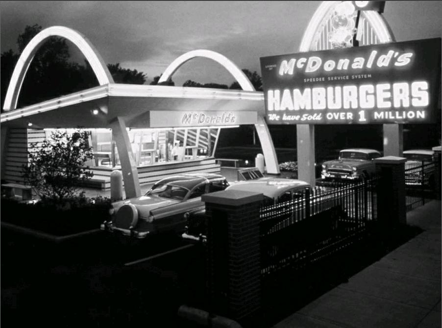
McDonalds golden arches have come a long way over the years.The now iconic logo had its start in 1952, when the McDonalds brothers were interviewing architects to design the first McDonalds location. The first three architects were skeptical of the brothers plan to construct a restaurant with two arches, shaped like semicircles, on each side.
Then, they found Stanley Clark Meston. Meston designed the McDonalds location to stand out amongst the surrounding buildings, grabbing the attention of hungry drivers who could be convinced to pull over and buy a quick burger. Two golden arches, one on each side of the building, did just that.
Originally, the two arches were not meant to form an “M,”as they do today in the chains logo. However, as the building design became famous, the chain created a logo intended to be a minimalist view of a McDonalds location, with a slanted roof and two arches lining up to form an M.
By the late 1960s, McDonalds had ditched the two-arch design, with the golden arches appearing instead on signs. This is the era in which Ray Kroc had taken over the business and was swiftly franchising McDonalds across the US, using the golden arches as a logo, not as an architectural instruction.endprint
There was, at this point in time, reportedly some discussion regarding the need for a new logo. However, the change was rejected by a marketing expert for a somewhat bizarre psychological reason.
Apparently, design consultant Louis Cheskin convinced McDonalds to maintain its branding with the argument that with the golden arches carried the “Freudian symbolism of a pair of nourishing breasts.” Since Cheskins reported progolden arch argument in the ‘60s, there have been a few tweaks to the logo as it has traveled around the world.
As the arches have become immediately recognizable, there have been instances in which McDonalds has allowed differences in color at local restaurants. In Sedona, Arizona, the arches are turquoise, to avoid clashing with the surrounding environment. In Monterey, California, the arches are black, as part of a compromise with the city to create a more “sophisticated” look. There have been small aesthetic shifts over the years, to make the arches taller or thicker, or to change the shading, but for the most part the arches have remained the same. Across the world, the golden arches mean one thing: McDonalds.
The strange story of the worlds most famous logo
Theres Trajans Arch and Marble Arch, the Arch of Constantine and Napoleons Arc de Triomphe. You can ride to the top of the biggest of them all, the 630ft (192m) high Gateway Arch in St Louis, or, in southern Spain, stare amazed at hundreds of intersecting horseshoe-shaped arches in the hypostyle hall of what was once the Great Mosque of Cor-doba.The worlds most famous arches have no claim to high culture, innovative engineering or grand history
And yet the worlds most famous arches may well be those – with no claim to high culture, innovative engineering or grand historical narrative – of McDonalds. Under the sign of these arches, currently on display at more than 30,000 restaurants in 119 countries, 68 million customers a day are served variations on a theme of burgers and fries washed down with Coke and shakes. But this famous M logo formed of two intersecting golden arches and developed over a number of years came about more by accident than design.
In 1937, Patrick McDonald, who had come to California from New Hampshire the previous decade, opened The Airdrome, an octagonal drive-up hot dog stand outside Monrovia airport, northeast of Los Angeles. He ran it with sons Richard (‘Dick) and Maurice (‘Mac) who, in 1940, moved the stand to San Bernardino. Eight years later the brothers re-launched it with their new assembly line fastfood concept, meaning they could sell burgers at 15 cents, half the price of their competitors. A new roof sign boasted “McDonalds Famous Hamburgers”.endprint
Los Angeles architect Stanley Clark Meston designed a sleek, futuristic McDonalds restaurant flanked by twin golden arches in 1953. In 1952, Dick and Mac sat down with the LA architect Stanley Clark Meston and his assistant Charles Fish. The plan was to design a McDonalds roadside restaurant that could be franchised. Dick had sketched out two half circles he thought would look good at either end of the structure, catching the eyes of motorists and their hungry families. Meston, who had worked as a set designer for Universal Studios and for Wayne McAllister, architect of streamlined 1930s drive-in restaurants, turned Dicks half circles into a pair of striking 25ft high tapered and neon-lit ‘golden sheet metal parabolas. In tune with the latest architectural fashions and engineering inventions, they looked more like a million dollars than 15 cents.
The McDonald brothers even failed to retain the rights to the McDonalds name. Mestons arches, crafted by signmaker George Dexter, made their debut in 1953 with the first franchised McDonalds at Phoenix, Arizona. The franchisee was Occidental Petroleum executive Neil Fox. Foxs brothersin-law and business partners, Roger Williams and Bud Landon, took a franchise on the third new-look McDonalds in Downey, California. Threatened with demolition, this remarkably original building was listed in 1994 and restored by the McDonalds Corporation. At this building you can see how, from certain angles, the twin golden arches intersect, and how the McDonalds logo emerged.
Lovin it
The McDonald brothers themselves were content to let the franchise expand slowly and steadily, but not so Ray Kroc, one time jazz musician, radio DJ and paper cup salesman. While selling milkshake machines in the early ‘50s, Kroc saw the potential of a hamburger chain with a distinctive design and fast, cheap food. Appointed franchise manager in 1955, six years later the energetic Kroc bought the company from Dick and Mac for $2.7m.
The double-arches, or M logo, was introduced in 1968 after the McDonalds building design with bookending single arches was retired. The brothers lost out big time as Kroc transformed McDonalds into a global corporation. The fasttalking Chicagoan had promised them a royalty on every new restaurant, but the agreement had been a handshake and never written down. They were to be no royalties. Disingenuously, Dick and Mac had also failed to retain rights to the McDonalds name. The story of how Kroc took control of McDonalds, pushed the brothers aside and made his fortune is told in The Founder, a film directed by John Lee Hancock, starring Michael Keaton and due for release later this year. The movie poster reads, “He took someone elses idea and America ate it up”.endprint
As America ate, Kroc dropped the parabolic golden arches from the ends of restaurants, transforming them, graphically, into the double arch, or M logo, perfected in 1968. This was the year McDonalds broke away from Mestons forward looking architecture, opting instead for an altogether more old-fashioned mansard roof style that has characterized the burger chain ever since. Crystal clear by 1968, the logo was revised in 2003, the double arches now shadowed and plumper than before.
If McDonalds had lost the elegant simplicity of its original architectural design, the corporation was seen increasingly as both a great US success story and as a bulging threat to health. Although the premise of Morgan Spurlocks provocative 2004 film Super Size Me was easily undermined – no one, least of all Spurlock needed to eat 5,000 calories a day at McDonalds, and eat nothing other than McDonalds three times a day for a month – it did point the finger at the way in which the fast food chain had lost the innocence it enjoyed in the 1950s.
McDonalds golden arches could now be seen as symbols of aggressive global capitalism, excessive consumerism and of US cultural imperialism. And yet they are not invincible. The arches of McDonalds Sedona, Arizona branch, opened in 1993, are turquoise, to blend by law into the local landscape. For much the same reason, the mission-style McDonalds designed by Fresno architect Gary Vigen in Monterey, California and opened in 2010 features black arches, while on the Champs-Elysées, Paris and in medieval Bruges, the arches are white.
Though McDonalds is very protective of its logo, the company has been willing to alter its colour to conform to local building codes around the world.The golden arches, however, were to have gone far beyond America and Europe. Cancelled in 1995, a Nasa mission to asteroid 449 – named Hamburga after the Germany city, not the beef patty – was to have been sponsored by McDonalds.
Happy meals
Back on Earth, the arches have attracted the attention of contemporary artists, much as Campbells soup cans had appealed to Andy Warhol. The Australian artist Ben Frost has used countless McDonalds fries containers as canvases for images drawn from comic books, cartoons and the worlds of fantasy, fetish, manga and super-heroes. In Freudian terms, it was suggested that the arches symbolised a mothers nourishing breasts. Masato Nakamuras installation of McDonalds arches was first shown at Tokyos Museum of Contemporary Art in 1998. This crown of arches can mean anything you want, he said. The work was inspired because he had come back recently from a world trip and found the golden arches in many of his photographs. He even had the full backing of McDonalds itself. Presumably, the company saw this enigmatic work as a good advertising opportunity.
Perhaps it was. When in the 1960s McDonalds gave up on Mestons architectural arches, the company nevertheless listened to the American psychologist Louis Cheskin, who had worked successfully for Ford. In Freudian terms, suggested Cheskin, the McDonalds arches symbolised a mothers nourishing breasts. While this might seem a little too much like Carry On or Beavis and Butthead for comfort, McDonalds has certainly played on tens of millions of peoples inner child, as well as children themselves, with its Ronald McDonald clown, forkless food – much of which requires little in the way of teeth or chewing – and bright poster colours. However you view the burger chain, its corporate identity straddles the world. No wonder spoof images of the Gateway Arch in St Louis depicting the biggest arch of all as a pair of giant intersecting golden parabolas can seem, at least for the time it takes to get served at McDonalds, all too convincing.endprint

