京兆尹素食餐厅室内设计,北京,中国
京兆尹素食餐厅室内设计,北京,中国
King's Joy Restaurant, Beijing, China, 2012
评论
王维仁:合院四帖:游园京兆尹
之一城市肌理:四合院胡同
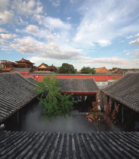
京兆尹餐馆在北京的东城雍和宫西侧,北侧紧邻五道营胡同,往南是官书院胡同和国子监以及孔庙,是一栋新建的两进四合院。仔细比对乾隆时期的京城全图与之前的航拍图,我们发现这个地块和乾隆年间的地块是符合的,应该是一栋两跨两进的四合院宅子,或者是两栋两进的四合院宅子并列着。东侧的四合院形制完整,西侧的四合院前院较窄、形制不规则。四合院宅子的南侧也是一条东西向的短胡同,和北侧五道营胡同平行,但这条胡同在西侧被一栋大宅给堵住了。胡同应该是可以和街廓里面的国学胡同对齐的,但近年的航拍图已经看不到这条胡同了,成为一片宽广的空地。
新修的京兆尹建筑是一栋新建的仿传统四合院,除了主轴上南北两个院子,西侧院加了两组南北朝向的双坡屋顶。地块南侧胡同变成的空地,现在成为餐馆的停车配套,也是四合院建筑的前庭广场。这样的城市地块和建筑变迁,改变了雍和宫大街沿街致密的城市胡同肌理。现在我们从安定门东大街沿口沿雍和宫大街往南,可以明显地看到前庭宽广、相对独立的大院餐馆。建筑多了一番京兆尹的阔气,却也少了一分北京城胡同空间的转折。这些条件应该都不是非常建筑的室内设计能够控制的,却也是他们面对的挑战。
之二形态空间:两进院对两跨院
面对新建的四合院,非常建筑对整体空间体验与空间秩序的安排,做了一个重要的决策:利用大门的由南转向西,调整四合院的空间秩序,把原有面南的两进院,改变成面西的两跨院。设计将原本建筑门厅的大门封闭,门厅成为围绕南院一系列的餐室之一。访客由雍和宫大街转入四合院外的前庭,过前厅而不入,反而由宅子尽端的侧墙入口转入了西侧院,再迂回进入设于西侧厢房的新大门。这样的调整,替建筑带入了巷弄的前奏体验,增加了城市空间的深度,除了避免访客由南面停车场登堂入室的尴尬,也弥补了城市改造后失去的胡同空间经验。
被转化成为两跨院空间关系的餐馆,进入西大门后右转到过厅前台, 往左举目旋即看到改为室内中庭的南院,步下台阶站在中庭天窗下,可以隐约看到北侧的另一个室外庭院。四合院的两个院子南北呼应,分别被赋予天窗中庭和树木庭院的不同个性,也是餐厅和园林的不同功能。南院天窗中庭利用中央的十字结构,四分悬挂了八面屏风增加空间的尺度感,也折射缓和室内中庭的直接光线。西厢房和前台过厅成为组织建筑南北空间的主要流线,围绕着南北院的四周布置餐台,分别围合呼应两个院子的空间个性 。
之三装折天花:砖瓦织里的小木作
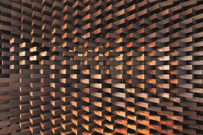
餐厅室内的墙体装折与隔扇,无论是餐室间隔、走道屏风、天花反折、吧台背墙,都成为非常建筑用来试验材料织里方式的展示。石涛描述画家写生“收进奇峰打草稿”,应该就是建筑师的这种探索状态。以走道上前后交错五六不等的两排屏风为例:内镶在木框里的小青瓦是半弧形的单一模组,经过了非常建筑横竖、上下、正反、内外、曲折的各种组合,竟然可以砌出11种不同的肌理。我们说密斯对细部的执着或明末文人的赏奇玩物,大约也就是进入这种情境了。
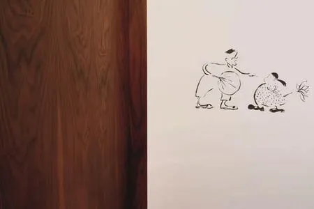
李渔在闲情偶记里描述的“堂高数仞宜,于夏而不宜于冬”,以及“登贵人之堂”的“令人不寒而栗”,也许常常是室内设计入场,面对冰冷阳春的建筑内壳时的感慨。经过了非常建筑的“装修”后,从整体的室内效果看,这些反转逻辑的材料建构,无论是砖瓦作成的小木作,或者是木料作成的砖瓦砌叠,都成功地唤起了人体对材质和尺度的知觉。从深木色的木砖旋转砌隔墙,到丰子恺式的黑白笔墨,与天花的反折木板或卷棚顶,透过与白色混凝土梁柱的交错,设计巧妙地遮掩了原来建筑的高大与尴尬的结构,真正达到了建筑需要装折的目的。
之四园林庭院:竹林院的游园
京兆尹餐厅共有大小6个庭院。除南北两院和北正房左右两个天井小院,最成功的安排就是西侧前院和后边院墙之间的竹林院。竹林院原本只是建筑与院墙间不规则的剩余空间,改造后不但能提供北侧餐室窗景,更强化了餐厅进口空间的层次。
入口从西侧的小巷转折进入餐厅,非常建筑在小巷尽端加砌了一道约2m高的短墙,挖了一个椭圆形带斜角的洞窗。虽然短墙轻微地暗示访客右转直入大门,然而墙后一片致密葱绿的竹林,却巧妙地引发访客一探究竟的好奇。加上一路进来水气感应形成雾气缭绕的仙气,进一步地增加了背后竹林的神秘感的吸引力。就整体设计来看,这6个大小不同庭院与餐室布局,让流线贯穿大小庭院,也引发访客用餐前后一探究竟的游园情境,是空间组织成功的关键。
后记
张永和的非常建筑一向以空间思辨严谨与建构系统明晰着称,然而在京兆尹的设计说明里却是明摆着写道“设计不希望引人注意,旨在创造一个舒适的环境 ”。这样非常不“非常建筑”的设计说明也许是室内设计的必然状态,也许是张永和心境的改变。而张永和对文学电影的情境描绘,或许反而在京兆尹的空间里得到了释放。

1
Comment
WANG Weijen: 4 Notes on a Courtyard: Walking Through King’s Joy Restaurant
No.1 City Texture: Courtyard & Hutong
The newly built building for King’s Joy Restaurant is an imitation of the traditional courtyard, except for the north and south courtyards on the axis, and 2 double pitch roof facing south on top the west courtyard. The empty area south of the site which used to be hutong became the parking space for the restaurant and the front square for the courtyard architecture. This transition of urban land and architecture changed the city texture of dense hutongs alongside Yonghegong Avenue.
No.2 Form & Space: 2 Courtyards in Depth vs.2 Courtyards in Width
FCJZ made an important decision about the entire space experience and space sequence arrangements of the newly built courtyard: adjusting the space sequence by turning the entrance from facing south to west, and changing from 2 courtyards in depth facing south, to 2 courtyards in width facing west. In the design, the original gate in the entrance hall is closed, and the hall became one of the series of dining rooms surrounding the south courtyard. Visitors turn to the front square outside the courtyard from Yonghegong Avenue,pass the entrance hall but not entering, but enter the west courtyard from the entrance on the side wall at the end of the house instead, and then enter the new gate in the west wing house. This adjustment brought architecture into the prelude experience of alleyways,increased the depth of city space. It not only avoided the embarrassment of visitors entering from the south parking space, but also made up for the hutong space experience lost in the transformation of city.

2
The 2 courtyards are corresponding from north and south. The different characteristics given to the skylight courtyard and the tree courtyard are also the different functions of restaurant and garden. 8 screens are hung down in 4 groups from the cross structure in the center of the south skylight courtyard. They increased the sense of scale and softened the direct sunlight in the courtyard by refraction.
No.3 Decorative Folding Ceiling: Little Wooden Crafts in the Weave of Bricks and Tiles
All the decorative partitions and screens in the restaurant are demonstrations of FCJZ’s experiment in material weaving, no matter if it’s the partitions between dining rooms, the screens in the hallways,the folding in the ceilings, or the back walls of the bar.
After FCJZ’s decoration, from the entire interior effect, all of these reversing logic material constructions, whether the little wooden crafts made from bricks and tiles or the piles of bricks and tiles made from wood, arouse people’s awareness of material and scale. From the partition walls built by rotating dark wooden bricks, to the black and white ink in Fengzikai Style, and where the folding wooden ceiling or Juanpeng ceiling meet the white concrete columns, the design cleverly hid the original huge and awkward structures in the building. It truly achieved the goal of decoration the building needs.
No.4 Garden Courtyard: Walking through the Bamboo Garden
Entry to the restaurant is through the turn in the small alley in the west. FCJZ added a short wall about 2m high at the end of the valley, with a window shaped as eclipse with bevel angles. Although the short wall slightly suggests visitors to turn right and enter straight through the gate, the flourish and green bamboo grove behind the wall cleverly intrigues visitors to explore out of curiosity. The moisture along the way forms a kind of heavenly fog, which further increases the mysterious attraction of the bamboo grove behind. Judging from the entire design, the organization of these 6 different courtyards and dining halls allows the circulation to go through all the courtyards, and encourages visitors to explore the gardens before or after meals. This is the key to a successful space organization.

3
Postscript
Yung Ho Chang’s FCJZ has always been known for the strictness of space logic and the clearness of construction system, but in the design introduction of King’s Joy Restaurant, there’s a plain writing saying “the design didn’t want to draw attention but was aimed at creating a comfortable environment”.This introduction which is very not FCJZ may be the inevitable statue of interior designs, or a change of Yung Ho Chang’s state of mind. However, the scene description of literature movies by Yung Ho Chang, might be released in the space of King’s Joy Restaurant instead. (Translated by CHEN Yuxiao)
项目信息/Credits and Data
客户/Client: 北京京兆尹餐饮文化有限公司/Beijing King's Joy Food Culture Co., Ltd.
地点/Location: 北京市雍和宫大街/Yonghe Lama Temple Street, Beijing, China
建筑设计/Architets: 非常建筑/Atelier FCJZ
主持建筑师/Principal Architect: 张永和/Yung Ho Chang
项目团队/Project Team: 王玥,郭照玮,邢大伟,陈正达,吴瑕/WANG Yue, GUO Zhaowei, XING Dawei, Dan Chen, WU Xia
设计范围/Designed Area: 地上1层用餐区/Dining area on Ground Floor
建筑面积/Floor Area: 1298.5m2(地上/Above ground)
主要材料/Material: 木砖、筒瓦、青砖/Wood, bricks and tiles
设计时间/Design Period: 2011-2012
施工时间/Construction Time: 2012
摄影/Photos: 舒赫/SHU He
设计条件
基地:雍和宫对面五道营胡同口里的一组新四合院;使用:素食餐厅。
空间
这是一个室内设计,我们需要在尊重四合院基本格局的基础上对该建筑的空间进行重组。餐厅的入口从南边一进院子的倒座改到西侧的夹道里,使人们在到达中心院落之前先经过一个曲径式的过渡的空间系列。为了获得需要的使用面积,原有的一个院子需要封起来,但我们希望仍然保持两个院子的感觉,因此将封闭的院子做得尽量通透、明亮,用一个悬挂的八面屏营造既开敞又亲密的尺度。其结果是形成一个室外、一个室内的两个院子空间的对比。其他空间都围绕院子展开。
材料
我们采用了传统材料当代做法的策略。从典型四合院建筑中提取了木、砖、瓦等材料,将它们以非常规的使用和建造方法来对待:将木作成砖来砌筑;砖叠涩本是墙的砌法,但被移植过来作吧台;屋顶上用的瓦则用来搭屏风和酒瓶架;等等。其目的是想达到传统和现代的共生与结合。
景观
我们对传统园林是抱批判态度的,认为其设计偏于繁琐。我们的景观设计中把传统的庭院内的元素简化成几个色块和质感,如暗红色的木构架、灰色的砖铺地、灰白相间的石子,希望把古代景观中的琐碎去除,同时把其精华调动出来。□

4
Design Conditions
Site: A recently built courtyard house (Siheyuan)at the entrance to Wudaoying Hutong, opposite of the Lama Temple. Program: A vegetarian restaurant.
Space
This was an interior design project. Based on our respect for the basic structure of the courtyard house, we reorganized the interior spaces. The entrance of the restaurant was altered and moved from the southern rooms to the passageway on the west, in order to allow users to pass through a series of labyrinthine transitional spaces before arriving at the central courtyard. In order to achieve the required floor area, one of the original courtyards had to be covered. Yet we still hoped to preserve the feeling of two courtyards. Thus we made the covered courtyard as transparent and bright as possible. An eight-panel folding hanging screen was employed to create a scale that is both open and intimate. This design results a contrast between an indoor courtyard space and an outdoor courtyard space. Other spaces were developed surrounding the courtyards.
Materials
Our strategy was to use traditional materials in a modern way. We mainly used wood, brick, and tile taken from traditional courtyard construction and then applied unconventional uses and construction methods to these materials. Wood blocks were laid as bricks; brick corbels were normally employed for the cantilevered wall but in this case they have been used to construct the bar. The roof tiles were repurposed to make folding screens, wine racks, etc.The objective was to achieve a coexistence of modern and traditional.
Landscape
We hold a critical attitude towards traditional gardens, believing such designs tend to be too mired in minor details. Our landscape design for this project took traditional courtyard elements and simplified them into several colour tones and textures. For example, we use a crimson wooden frame, grey tile floor, and interspersed grey and white pebbles, hoping to remove the trivial elements of ancient landscape while showcasing its essence.□

5

6

7

8

9

10

11

12

13

