跨界建筑师:尤尔根·马耶尔
(文)Michele Calzavara
跨界建筑师:尤尔根·马耶尔
CROSSOVER ARCHITECTS:J. MAYER H.
(文)Michele Calzavara
如果不首先提及邮寄信封上那些用于保护私人内容不被窥探的交织曲线、线条、正弦曲线、符号和字符组合,客观上很难评价尤尔根·马耶尔·H。
尤尔根·马耶尔·H自20世纪90年代中期起就一直在收集这些数据保护小图案,他似乎已经痴迷于这种以不同方式沉淀在其作品中的视觉(或反视觉)元素。它们代表了其作品中的主要图像材料和概念源(也包括在2012年威尼斯双年展瓦莱里奥·奥尔贾蒂(Valerio Olgiati)展台上的作品《象形文字-当代建筑师的文字》),尤尔根·马耶尔·H已明白其中的隐喻,用它们解释( 或者更可能是混淆)我们日常生活接触到的对象和空间的形式和意义。
其图案库是否与建筑,设计或艺术相关,对其作品无关紧要:在其建筑外表的形式或其前期互动艺术作品的表演方面,这种多符号的纠结往往会产生一种装饰饱和,一种可以泰然自若地着笔于任何表面或材料上、像埃及象形文字和玛雅或印第安人象形图的涂鸦,如同涂鸦艺术大师凯斯·哈林 (Keith Haring)为其都市“作品”设想的那样。整体看来,这种做法可能启发“万能装饰”的新设计思路。
当然,这种装饰不同于亚历山德罗·门迪尼1981年刚树立起自己设计风格时提出的“装饰”理论,但也不同于把“肤浅地带”作为人与人之间唯一可能沟通地带的某种解放式欣快感。只要存在或多或少潜在内涵的可能性,尤尔根·马耶尔·H从不放弃,但他驾驭其诀窍还是多亏了对混淆有形和无形二者差别的迷惑性薄纱的辨别力,毕竟薄纱必须揭开,至少暂时去除,以提取其中某种可沟通的含义。而此类“揭开面纱”原理首先在人体体现。
这就是其前期互动艺术作品的运作方式,其实,全部在于各种热敏颜料的应用:在其《留言册(1996年)》互动艺术作品中,各页贴满了密集的图形图案,遮盖了留言册中书写的最终评论,只有用手按压加热才会显现片刻; 在《躺(1997年)》互动艺术作品中,各种图案装饰床单,却被在那里躺着的女人用体温融化,更让其姿态留下幻像印记(或 “眼睛欺骗”,英文中与“躺”是同一词,打的是双关语); 《热·座(2001年)》互动艺术作品中用热敏材料记录了就座用户的侧影。在所有这些作品中,人体和科技之间的关系如此神奇,在实践中以表演的形式就解开了其中的谜团。
当尤尔根·马耶尔·H将其转用到建筑尺度时,在尺寸更大、变量更复杂且不再直接受制于操控的建筑空间,相对于他作为艺术家时的前期作品,产生另一种类型的感知模糊:一层拟态的东西像连续的蒙皮包络其建筑作品,以传统观念无法识别,只能通过人体感知解开其中奥妙。这是发挥功能、材料、几何平衡和比例作用的另一种或许更注重形式的特性。
尽管当他的第一个建成项目——斯塔德豪斯沙恩豪塞(Stadthaus Scharnhauser)公园(1998-2001年)还是箱体建筑(虽然略有倾斜)时,临时采用技术手段增强,辅之以好像还有点令人不安的支撑设施(如“风·光”这件作品中监控摄像机用作娱乐目的这么不可思议)以“夸大”其真实性,但后期项目看起来几乎要熔入平缓而有弹性的地幔下,以几乎油腔滑调的形式,使建筑与自己捉迷藏。在这里,其原始图示参考和那些数据保护图案,又以片段、无限放大的细节、超图形的伸出或换位形式体现到巨大的三维体。
例如“都市阳伞”(2004至2011年)——目前其最有名的项目,建于塞维利亚市中心的巨型结构也可以解读为城市尺度的巨大波浪形图案。这也适用,并且也许以更明确的方式适用于同期项目¬——卡尔斯鲁厄(Karlsruhe)大学的毛奇(Moltke)食堂(2004-2007年),与阳伞采用相同的材料(木材覆盖聚氨酯贴膜),因此具有同样柔软、触感良好的外观。食堂看起来像两块粘质板,分开时产生交叉细丝的图案,有时只是表面上具有结构性的细丝(其实是不承担任何负载的假梁,例如,有点像埃森曼应用于其私人住宅群或维克纳中心的某些权宜手段),形成“防护网”来过滤、选择并阻挡内部和外部、形式和内涵之间每一线性沟通。
这是对追求透明度的功能主义狂热信徒和策略上线性技术派的明确挑战,并且意义非凡的是,这出自出生于1965年的尤尔根·马耶尔·H设计师之手,他有扎实工程背景知识,先后就读于德国斯图加特大学(魏森霍夫市,现代名胜)、美国柯柏联盟学院及普林斯顿大学,沉浸在诺亚方舟和巴别塔中,在那里吸收了更间接、更具文学性和概念性的主题设计方法。
他的许多项目可以解读为这种技术和符号的组合:像在汉堡的ADA1项目(2005-2007年)或Schlump One办公楼改造项目(2010-2012年),或比利时哈瑟尔特市的”法院”项目(2005-2013年)。在第一个项目,厚的双立面与水平流体带有助于通风和储能系统,无需空调,而其凹陷和突起形成一定包层利用深度;第二个项目中,采用穿透室内空间的流畅而有机的建筑语言、新型通风蒙皮包络,统一了建于20世纪50年代的现有行政大楼;第三个项目是比利时哈瑟尔特市主火车站周边区域更新计划的一部分,更多的背景性参考信息包括当地“新艺术运动”风格钢铁建筑的传统,甚至是城市的标志性象征也是钢结构,像大树一样矗立,伸出二维树枝形成树枝状建筑。

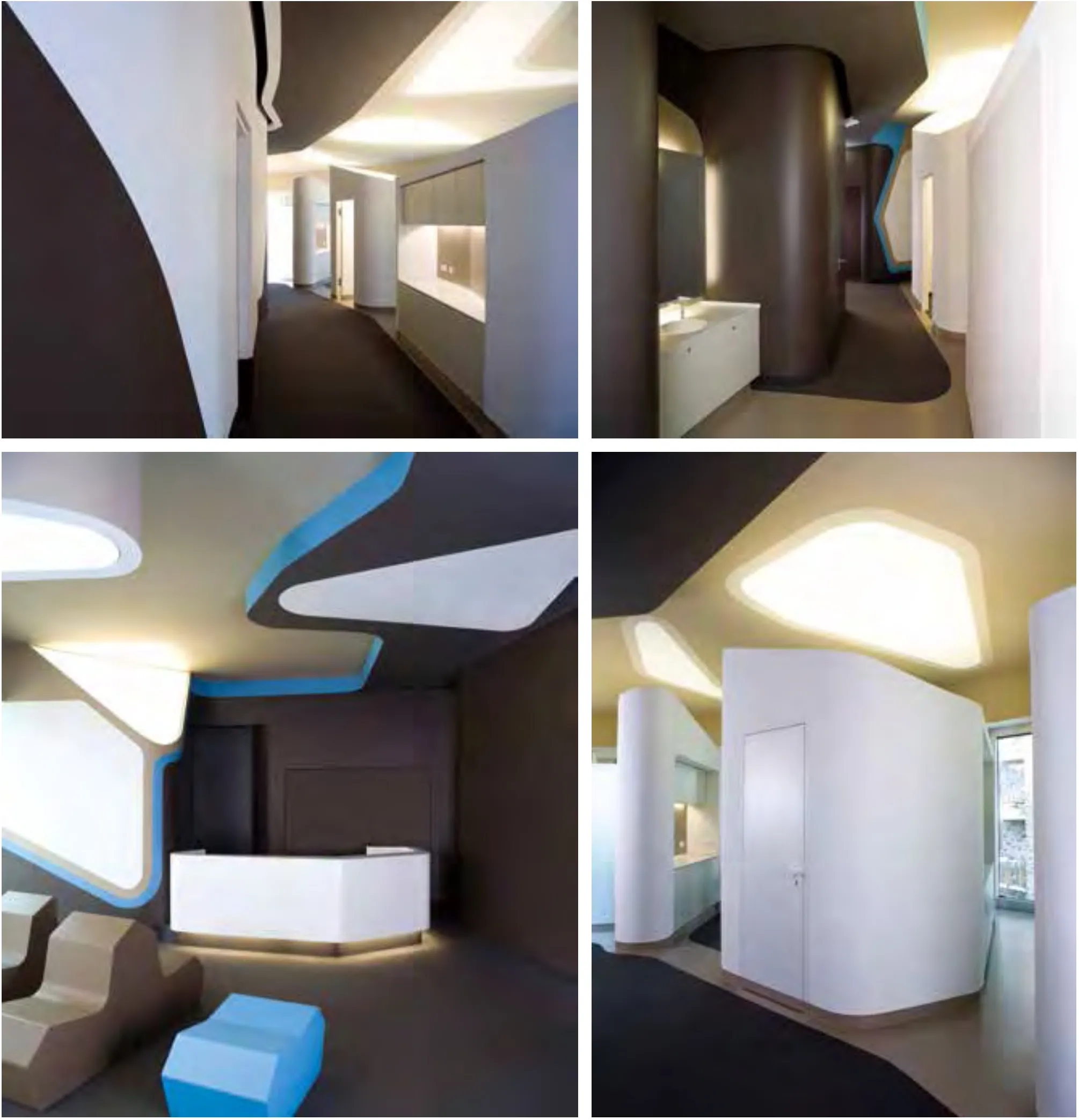
ZZ.SANKT.GEORG牙医诊所ZAHN MEDIZIN医疗中心2008-2009德国汉堡摄影: Ludger Paffrath

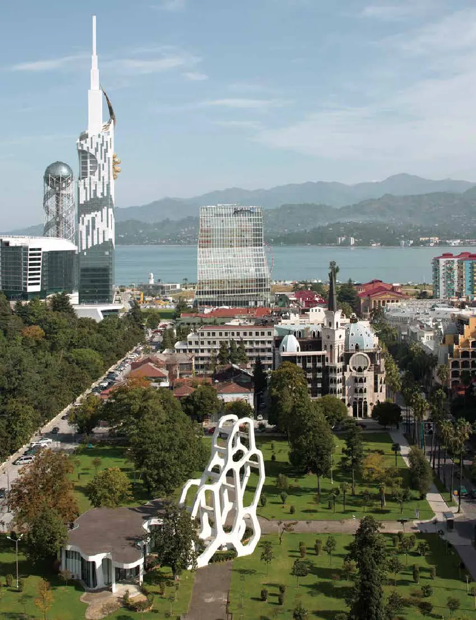
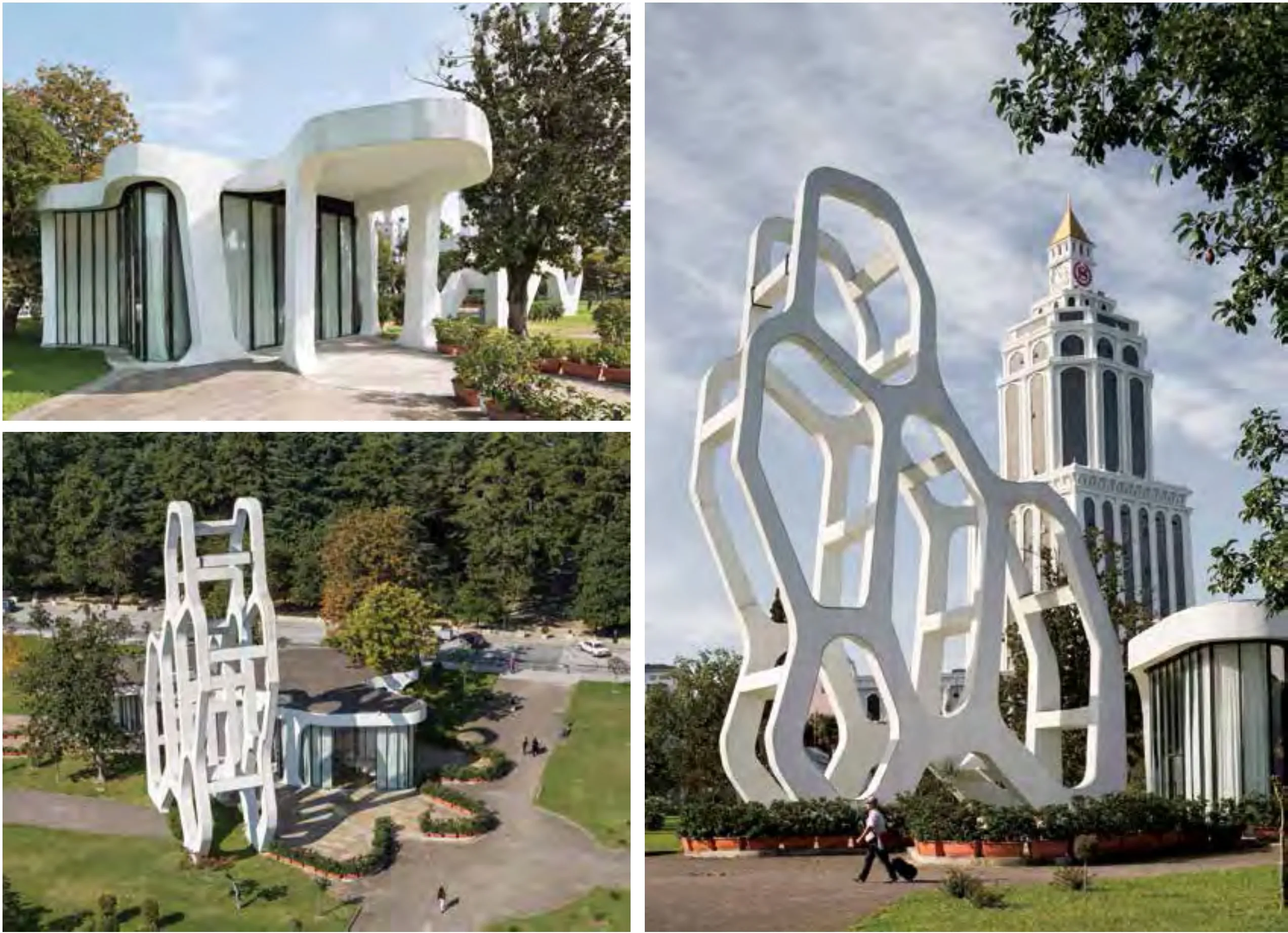
公园咖啡屋摄影: Marcus Buck, Munich;www.marcusbuck.com

这无疑是尤尔根·马耶尔·H建筑师事务所常用建筑策略,尤其是在竞争激烈的格鲁吉亚系列项目:从中我们可以继续识别其图形起源的那些片段,或从钢筋混凝土的结构序列中突出(高速公路休息站, 2009-2012年),或多方位凝固(梅斯蒂亚的“塔玛皇后机场”小楼,2010年),或圆润、面向黑海滨,呈现起始于波纹形状、建立超现实主义平衡的厚重悬臂梯田形式(萨尔皮边境检查站,2010-2011年),简直就是画家马格利特于1946年在《注重心智(Le regard mental)》中的超现实主义。边境建筑作品则处在介于二者之间的边缘地带。
但是植根于历史背景的建筑类型的举例也同样是超现实的,像梅斯蒂亚警察署(2010-2011年)建筑中对中世纪石塔的怀念(虽然那时在一种液化过程中它已化为乌有),实现了单户型住宅而言更全面的有机表达:下面我们又回到德国路德维希堡附近Dupli.Casa私人别墅(2005-2008年)或斯图加特附近OLS私人住宅(2009-2011年),这些都是客观反映景观的作品。 但是,尤尔根·马耶尔·H建筑师事务所全部建筑语言变得清澈、连续、光亮和动荡,显然已受凯斯勒《无尽的房子(Endless House of Kiesler)》诗学的影响,有一定的门德尔松表现主义,(正如费莉希蒂·斯科特和菲利普·乌尔施普龙所指出 )还受从激情年代如20世纪70年代起恢复的风格的影响:这些风格包括拐角取圆,边缘光滑,横向纵向面的连续性,尽管正是其作品中这个最明显和最直接的特点也是其刻意做作,也许也是其最无伤大雅而令人欣慰的方面。
不太放心的是这一切背后的前因,在1996年尤尔根·马耶尔·H工作室开张时有其历史和文化动因。对尽管还很不成熟,但无疑具有革命性的数维,他被吸引成为当时的迷恋者。然而,就一代人而言,他不是“天生的电脑高手”,因此他没有把这一切视为理所当然。尤尔根·马耶尔·H的“装饰论”(如果存在)已更新到电子层面,且其中倾注其诗情,关联到对当代数字文明中信息状态的某些全面批评讽喻,联系到其控制设施,牵扯到我们所经受的大数据及其有效清晰度之间问题不断的交流。因此,人体、空间、科技和通信之间的关系成为他工作的基本主题,例如:建筑师在通用的电子环境下、在基于稳定信息、客观转化的变更年代如何工作,如哲学家利奥塔关于在这种技术变更的影响下知识的性质所提前预见的那样:“知识可转变成以价值形式体现的大量信息, 知识的产生就是为了要出售,其消耗是为了在新的生产中进行增值:两种情况的目的都是为了交换。知识本身不再是目的,它失去了其使用价值”2。因此,它恰恰停止维持使用价值可以确保的彻底不可转移性(不可译性)。
尤尔根·马耶尔·H以其声望回应这一切,加一层不透明的面纱以阻挡我们与生俱来的感知力,转化信号成噪音,寻求某种形式的不可转移性(不可译性)。当然,他是在以相当赏心悦目、睿智、极具魅力、吸引力和美感的方式这么做,不过,因美学与政治之间无解的交替,使得他总是受此基本模糊性的困扰。但是,这也许是任何人都很难解决的问题。
本文最初发表的文章名为《跨界建筑师/ 尤尔根·马耶尔(JÜRGEN MAYER H.)》,Inventario 09,Corraini EDIZIONI出版社,2014年7月,www.inventario-bookzine.com
1.参见亨利·尔巴赫(Henry Urbach),克里斯蒂娜·斯坦格雷伯(Cristina Steingraber)(主编),尤尔根·马耶尔·H(JÜRGEN MAYER H.),Hatje Cantz出版社,Ostfildern(奥斯特菲尔德尔恩),2009年。
2.让 - 弗朗索瓦·利奥塔(Jean-François Lyotard),《后时代状况》:Rapport sur le savoir.巴黎:米纽伊特(Minuit)出版社, 1979年。 让 - 弗朗索瓦·利奥塔(Jean-François Lyotard),曼彻斯特大学出版社,曼彻斯特,1984年。

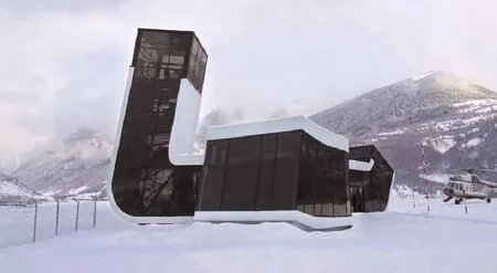
塔玛皇后机场2010格鲁吉亚,梅斯蒂亚摄影: J. MAYER H. Architects
It is objectively hard to talk about Jürgen Mayer H. without mentioning, from the start, those intertwining curves, lines, sinusoids, coagulations of symbols and characters printed on postal envelopes to protect personal content from possible prying gazes during their voyage to their destination. Jürgen Mayer H. has been collecting these minute arabesques since the mid-1990s and seems to have made them into a sort of visual (or anti-visual) obsession that settles on his projects in different ways. They represent the main iconographic and conceptual roots of his work (also on the large table Valerio Olgiati set up in 2012 at the Venice biennale,with “Pictographs – Statements of Contemporary Architects”), and Mayer H. has extracted a pervasive metaphor from them, with which to interpret – or more probably, to confuse – the forms and meanings of the objects and spaces with which we come into contact in everyday life. It matters little in his work whether this inventory of graphic textures finds its way onto architecture, design or art: in the form of his architectural enclosures or the performances of his first interactive works,this tangle of signs tends to produce a sort of ornamental saturation, a kind of graffiti that can settle with equal aplomb on any surface or material, much as Keith Haring envisioned for his metropolitan “writings,” like an Egyptian hieroglyph or a Mayan or Indio pictogram. As a whole, this approach might suggest a new idea of design as“universal cosmesis.” Certainly this cosmesis is different from the one Mendini theorized in 1981, when he embraced with disenchantment, but also a certain liberating euphoria, that “depth of the superficial” as the only possible terrain of communication between human beings. Mayer H. does not give up on the presence of a possible more or less underlying content, but he governs its access thanks to the power of intercession of a surface patina that embrangles things, blurring the boundaries between visible and invisible, and has to be dissolved, at least temporarily, to extract a meaning that is somehow communicable. And the first activating principle of this “unveiling” is the body. This was how his first interactive objects functioned, in fact, all sharing the use of thermosensitive pigments: “guest Book” (1996), where pages filled with dense graphic patterns concealed the eventual comments written in a guestbook, revealing them only for a short while under the pressure and warmth of the hands; “Lie” (1997), where the patterns decorated sheets on a bed and vanished with the warmth of the body lying there, leaving the phantom imprint of its posture (or imposture, playing with the pun of the title); “Heat.Seat” (2001), where thermosensitive furnishings recorded the silhouettes of seated users. In all these objects, the relationship between the body and technology generated surprise and, in practice, resolved its enigma by means of a performance. When Mayer H. shifts to the architectural scale, the larger and more complex variable of a space that is no longer directly subject to manipulation imposes another type of perceptive ambiguity with respect to his first works as an artist: that of a mimetic layer that wraps his architectural objects like a continuous skin, preventing conventional recognizability, which cannot be resolved only with the body. It is another, perhaps more formal quality that nevertheless calls functions, material, geometric balance, proportions into play. While his first constructed project, the Stadthaus Scharnhauser Park (1998-2001), was still a box building (though leaning slightly), enhanced by technological mischief to “augment” its reality by playing with devices that are also a bit disturbing (like the “Wind.Light” where surveillance cameras are used as entertainment), the subsequent projects seem almost to melt under a smoothed, elastic mantle, with almost oily forms, that make the architecture play hide-and-seek with itself. And here his original iconographic references, those data-Protection Patterns, return in the form of fragments,boundlessly enlarged details, supergraphic extrusions or transpositions into monumental three-dimensional objects. This is the case of the Metropol Parasol (2004-2011), now his best known project, a megastructure built in the center of Seville that could also be interpreted as a gigantic undulated pattern on an urban scale. It also applies, and maybe in a more explicit way, to the Moltke canteen of the University of Karlsruhe (2004-2007), a project from the same period, in the same material (wood covered with a polyurethane skin), and hence with the same soft, tactile appearance. The canteen seems to spring from the separation of two sheets of viscous material that generate a pattern of crossed filaments, at times only apparently structural (fake beams that bear no loads, for example, a bit like certain expedients applied by Eisenman in his Houses or in the Wexner Center), forming a protective forest that filters, selects and also blocks every linear communication between outside and inside, form and content. There is a clear challenge to the functionalist cult of transparency and to the tactical linearity of technique, and it is significant that this comes from a designer with a solid background in engineering,trained in Stuttgart – the city of the Weissenhof, showplace of the Modern – wherehe was born in 1965. but he also studied in the United states, first at Cooper Union and then at Princeton, absorbing a more indirect, literary and conceptual approach to design themes, steeped in noah's Arks and Towers of babel. Many of his projects can be interpreted in terms of this technological and symbolic combination:like AdA 1 (2005-2007) or schlump One (2010-2012), both in Hamburg, or the Hasselt Court of Justice (2005-2013), in Flemish belgium. In the first, a thick double facade with fluid horizontal bands contributes to a system of ventilation and energy storage that makes climate control unnecessary, while its recesses and protrusions bring a certain depth of utilization to the wrapper; in the second, a new ventilated skin envelopes and unifies an existing complex, from the 1950s, using a fluent, organic language that penetrates the interior spaces; in the last, which is part of a more extensive renewal of the area around the main railway station of the city of Hasselt, more contextual references to the local tradition of Art Nouveau architecture in iron, or even to the heraldic emblems of the city, give form to a steel structure that grows like a plant to produce a large tree-building, obtained a bit by extrusion of the two-dimensional branchings. This is undoubtedly a frequent stratagem of the architecture of Mayer H., especially in the intense series of projects in georgia:those fragments in which we can continue to recognize the graphic origin are now extruded in structural sequences of reinforced concrete (Highway Rest Stops, 2009-2012), become solids with multiple directions (the small building for the Queen Tamar Airport, 2010), take on thickness starting with an undulated profile that establishes a surreal balance (Border Checkpoint, 2010-2011), almost a Magritte –that of “Le regard mental” in 1946 – rounded and facing the shore of the Black Sea. Works of frontier architecture, in between, at the margins. But the references to typologies rooted in historical contexts are just as surreal, like the tribute to medieval stone towers in the building for the Police Station of Mestia (2010-2011), though it then melts the volume in a sort of liquefaction, which reaches a fuller organic expression in the single-family houses: we are back in germany, where the dupli. Casa villa (2005-2008) near Ludwigsburg or the Ols House (2009-2011), near Stuttgart, are objects literally poured onto the landscape. But it is an entire language, in Mayer H., that becomes liquid, continuous, polished and unstable, avowedly influenced by the poetics of the Endless House of Kiesler, by a certain expressionism of Mendelsohn, by stylemes – as pointed out by Felicity Scott and Philip Ursprung - recovered from warm decades like the 1970s: rounded corners,smoothed edges, horizontal-vertical continuity of surfaces, though precisely this characteristic, the most obvious and immediate in his work, is also its formal affectation and perhaps its most innocuous, reassuring aspect. What is less reassuring is the premise behind all this, which has its historical and cultural motives in the moment in which Mayer H. opened his studio, in 1996. He absorbed all the fascination of the time for a digital dimension that was still immature but undoubtedly revolutionary. Nevertheless, since in terms of generation he was not “born with the computer,” he did not take it all for granted. The cosmesis of Mayer H. (if it exists),updated to the electronic aspect in which his poetics is immersed, links up to something that is an overall critical allegory on the state of information in the contemporary digital civilization, to its devices of control, to the always problematic exchange between the big data to which we are subjected and their effective intelligibility. Thus the relationship between body, space, technology and communication becomes the underlying theme of his work, i.e. how architecture can operate in a generalized electronic environment, in a constant information-based transformation that literally translates what Lyotard had foreseen, well in advance, about the nature of knowledge under the impact of such technological transformations, and thus “knowledge translatable into quantities of information, [in] form of value. Knowledge is and will be produced in order to be sold, it is and will be consumed in order to be valorized in a new production: in both cases, the goal is exchange. Knowledge ceases to be an end in itself, it loses its ‘use-value'” . so it stops maintaining the radical untranslatability precisely that use-value could ensure. Mayer H., to his credit, responds to all this by imposing an opaque veil to block the perception of our artificial habitat, transforming signals into noise, seeking some form of untranslatability. Of course he does this in a rather pleasing, intelligently seductive and appealing aesthetic manner, and this keeps him in the basic ambiguity of a never resolved alternation between aesthetics and politics. But this, perhaps, is an issue that would be hard for anyone to resolve.

This text was originally published in the article "Crossover architects/ J. Mayer H.", Inventario 09, Corraini Edizioni, July 2014, www.inventario-bookzine.com
1) see Henry Urbach, Cristina steingraber (edited by), J. Mayer H., Hatje Cantz, Ostfildern 2009. 2) Jean-François lyotard, la Condition postmoderne: Rapport sur le savoir. Paris: Éditions de Minuit, 1979. Jean-François lyotard, Manchester University Press, Manchester, 1984.

