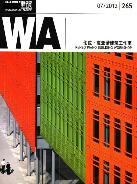
圣吉尔斯核心区商住混合开发项目,伦敦,英国
建筑设计:伦佐·皮亚诺建筑工作室
ARCHITECTS: Renzo Piano Building Workshop

1 鸟瞰/Aerial view(摄影/Photo: Michel Denance)
简介
自从规划申请提交了之后,我们已与伦敦卡姆登区的规划设计官员和“英国遗产”组织共同合作举办了若干次设计工作室项目。通过这些工作室的举办,我们在项目的方案设计方面取得了很大的进展,方案得到了加强和改善,并更成熟且完整地体现了那些我们早先提出的设计原则。
我们非常感谢参与设计的相关人员能够采取相当合作与开放的工作方法,这与我们的工作方式非常契合,使我们在场地条件十分困难和受限的情况下,依然能够不断地推动达成最佳的设计方案。
在修订设计方案的过程中,我们也试图将先前申报的方案中已有所体现的各种原则以更清晰的方式呈现出来,如空间的通透感、体量的细碎化、步行穿越建筑的便利程度、光的质感和场所的活力等。与此同时,我们也尽量不去破坏经过深思熟虑之后,在各种空间与功能之间已经取得的必要平衡。
加强体量的细化程度
建筑整体体量的细化程度得到了显著的增强。为了使建筑体量达到更为细碎分割的效果,我们减小了某些部分的建筑高度和宽度,也改变了一些已经确定了的平面角度,并在现有的冬季花园部分新引入了一些阳台要素,进一步完善了这部分的设计。
在巴克纳尔街一侧,各部分建筑物的高度各不相同,这种高度的变化帮助形成了建筑物的体量感。这些沿街部分的立面与建筑背立面在形态上的重叠部分也有所减少,这使它们看起来好像是彼此独立的要素,因此加强了建筑整体体量的细化程度。
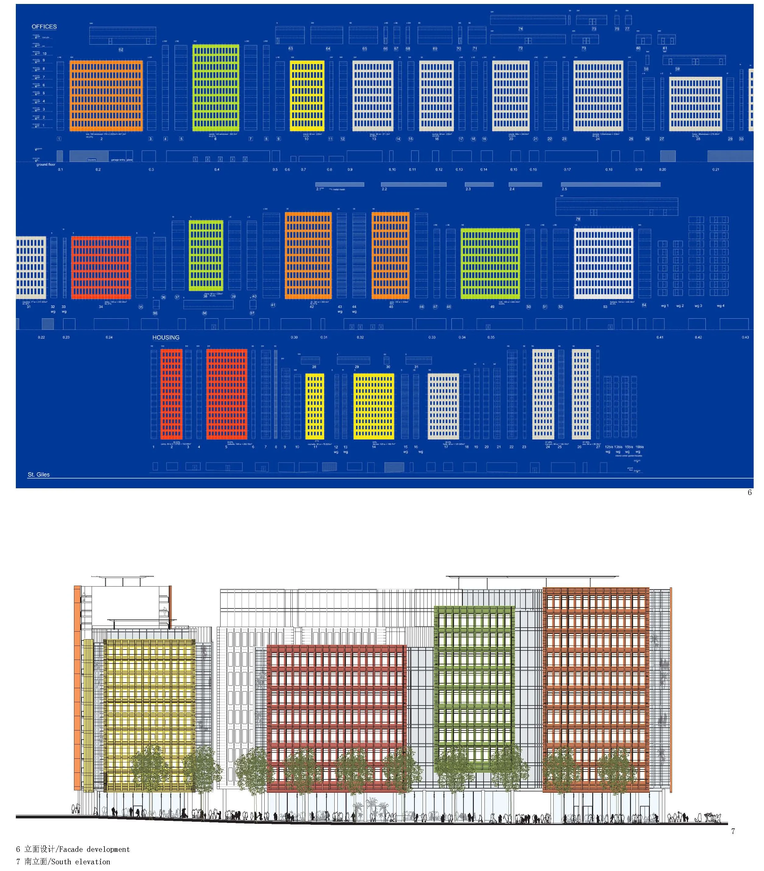
对于各个组成部分的立面本身,其细部也经过了更深入的推敲。我们设计了一种比先前更为精致和色彩鲜明的立面结构,其中每一个构成要素都能够得到清晰的辨识,就好像镶嵌在墙面中的一枚枚石块;立面所选的材质有不同的厚度,陶瓷片之间的节点尺寸也各不相同。
位于第9、10层楼及建筑背立面和冬季花园一侧的玻璃幕墙立面都采用了连续统一的金属框架,根据幕墙的不同位置配有不同尺度的遮阳百叶窗,其目的是为了削弱玻璃盒子的印象,并使建筑物能满足不同朝向对遮阳的要求。
增加空间的通透感
在底层或街道层,从地面至天花之间的净高大约增加了1m的距离,这显著地改善了贯穿整个建筑纵深的空间通透感,特别是在圣吉尔斯高街和巴克纳尔街之间往返的方向上。建筑底层保持空间通透的概念在周边地区尚属新鲜事物,这里大部分建筑的底层都是封闭式的店面。尤其是巴克纳尔街,目前看起来很不友好且密不透风;而在圣吉尔斯高街,我们则可感受到迥然不同的活跃气氛。白天,在建筑的内部和周边有各种现场活动,而在夜间,这里则又回归了平静与通透的感觉。
我们在底层立面的若干空间后退处引入了一些小规模的入口花园,通过玻璃将它们与公共的人行天桥分开。这些玻璃入口会在夜间关闭,由此既确保了店面一侧立面的延续性,又能够阻止任何形式的反社会行为。
增强步行穿越的便捷程度
我们在巴克纳尔街的东北角和庭院广场之间引入了第5条穿越整个建筑平面的步行通道,这样,使整个底层平面能够最大程度地满足人们对能够步行穿越建筑平面的渴望。
我们还把王子马戏团广场和庭院广场之间的步道拓宽到至少3.6m,由此进一步改善了对这条设计原则的体现;这些步行通道,加上所有附近立面空间的通透和敞开,将会对路人发出真正的邀请,邀请他们走进建筑内部的庭院,在其中停留,或继续步行穿过建筑的平面。
内部庭院的环境
建筑的内部庭院本身已通过楼上几层的背立面设计得到了改善,通过这种方法,围绕在庭院周边的建筑高度得到了明显的降低,也使中庭广场获得了更多采光。
庭院中的雨篷——“蜘蛛网”的尺度有所减小,它与更为低矮的连廊雨篷相结合,由此与餐厅的若干平台形成了更直接的联系——同时也会突出中庭明亮而轻松的特质。
此外,广场本身与那条由教堂墓园通往新牛津街的开放步道之间的区别也变得更为明显。由于广场上方的蜘蛛网雨棚减小了尺寸,因此,它为点缀中庭广场的枫树和银杏树提供了更好的生长空间。通往私人公寓住宅的入口现在变成了朝向内部庭院的方向,由此加强了这里商住混合使用的空间特征。
结论
所有这些改善设计的手段,作为我们充分探讨与思考的成果,都将使这座建筑物在空间和视觉上都更容易让人接近,而这一精神也正是我们在未来实现这座建筑物的过程中将继续秉承和坚持的原则。□(徐知兰 译)
Introduction
We have had a number of design workshops with Camden planning and design officers and English Heritage since the planning application was submitted. As a result of these workshops, we have proceeded in the design process, reinforcing and improving the scheme towards a more mature and finalised expression of the principles proposed.
We very much appreciate the collaborative and open approach adopted by those involved, which corresponds very much with our way of working,continuously progressing to come to the best scheme possible on this difficult and demanding site.
In undertaking revisions to the scheme, we have tried to implement with more clarity the principles of transparency, fragmentation, permeability,lightness and vibrancy, already present in the submitted scheme, without distorting the necessary,well contemplated, and duly obtained balance between the various occupations and functions.
Increased Fragmentation
The fragmentation of the building mass as a whole has been greatly improved. In order to achieve this greater fragmentation, we have reduced some of the facets in height and in width,we have altered the angles at which they are set and have introduced balconies to complement the already proposed wintergardens.
On Bucknall Street, the facets vary in height,which helps the composition of the mass. The facets themselves now show smaller overlaps in relation to the setback facades, making them appear as individual elements and so improving the fragmentation of the building as a whole.
The facet facades themselves have been studied in more detail. We are proposing a structure to the facade that is more filigrane and vibrant than was previously proposed, in which every constituent element is recognisable, like stones in a wall; with varying depths in the material, and varying sizes of the joints between the ceramic pieces.
The glass facades, on the 9th & 10th floors, and on the setback facades and wintergardens will have a continuous unitary metal framing, with sunshading louvres, which may vary in size in different situations, in order to reduce the glass-box effect,and allow the building to cope with the varying requirements for sunshading on different sides.
Increased Transparency
On the ground floor, or streetscape level, the floor to ceiling free height has been increased by approximately one metre, thus hugely improving the transparency through the whole depth of the building, especially from St. Giles High Street towards Bucknall Street and vice-versa. This concept of transparency on the ground floor is quite new to the surrounding area, mainly consisting of closed shopfronts. In particular, Bucknall Street,at the moment quite hostile looking and hermetic,and St. Giles High Street, will enjoy a very different and active atmosphere, defined by lively activities in and around the building in the daytime, and calm and reassuring transparency at night.
At various setbacks in the ground floor facade,small entrance gardens have been introduced,separated from the public highway pavement by glass screens. These screens will be closed at night,thus guaranteeing the continuity of the shopfront facade, and discouraging any type of antisocial behaviour.
Increased Permeability
A fifth passage through the scheme, between the northeastern end of Bucknall Street and the courtyard piazza has been introduced, maximising the desired permeability of the ground floor scheme.
A further improvement of this principle has been obtained by widening the passage between Princes Circus and the courtyard piazza to a minimum of 3.60 metres; with the transparency of all the adjacent facades these passages will truly invite passers by to enter and stay in or walk through the courtyard.
Courtyard Setting
The courtyard itself has been improved by the setback of the facades of the uppermost floors,thus reducing the apparent height of the building surrounding the courtyard and allowing more light into the piazza.
The courtyard canopy,Spider's Web, has been reduced in size, and combined with lower arcade canopies, more directly related to the terraces of the restaurants: this will enhance the light and airy character of the courtyard.
In addition, the distinction between the piazza itself and the open passage from the churchyard garden towards New Oxford Street has become clearer.The reduction of the higher spider’s web canopy provides better space for the Liquidamber and Gingko trees which will enrich the courtyard piazza.The entrance to the private residential apartments is now orientated towards the courtyard, thus enhancing the mixed use character of the place.
Conclusion
All these improvements, as a result of ample consultation and reflection, will help the building to be more accessible, physically and visually, and it is in this spirit that we will progress in the realisation of the building.□
业主/Client: Legal & General with Mitsubishi Estate Corporation, Stanhope PLC
合作者/Collaborator: Fletcher Priest Architects(London)
设计团队/Design Team: J.Moolhuijzen, M.van der Staay(partner and associate in charge),N.Mecattaf(associate)with L.Battaglia, S.Becchi, A.Belvedere,G.Carravieri, E.Chen, D.Colas, P.Colonna,W.Matthews, G.Mezzanotte, S.Mikou, Ph.Molter,Y.Pagès, M.Pare, L.Piazza, M.Reale, J.Rousseau,S.Singer Bayrle, R.Stampton and M.Aloisini,R.Biavati, M.Pierce, L.Voiland; O.Auber, C.Colson,Y.Kyrkos(models)
顾问/Consultants: Ove Arup & Partners(结构与设备/Structure and Services);Davis Langdon(价格顾问/Cost Consultant); Bovis Lend Lease(前期结构顾问/Pre-construction Advice); Emmer Pfenninger& Partners(立面/Facades); P.Castiglioni /G.Bianchi(照明/Lighting); Phippen Randall & Parkes(经济可承受的住宅装修/Fit-out for Affordable Residential);Charles Funke Associates(景观/Landscaping)
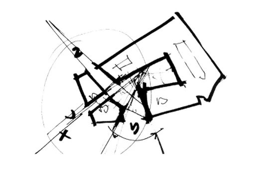
2 草图/Sketch
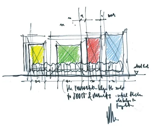
3 草图/Sketch
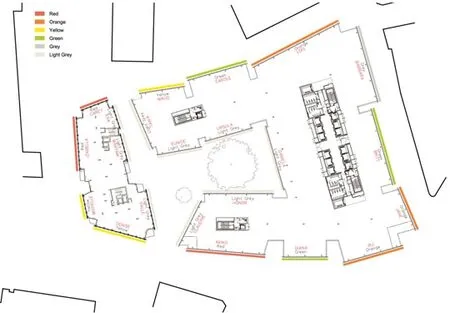
4 总平面/General plan
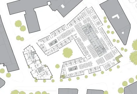
5 标准层平面/Typical floor plan

8 剖面/Section
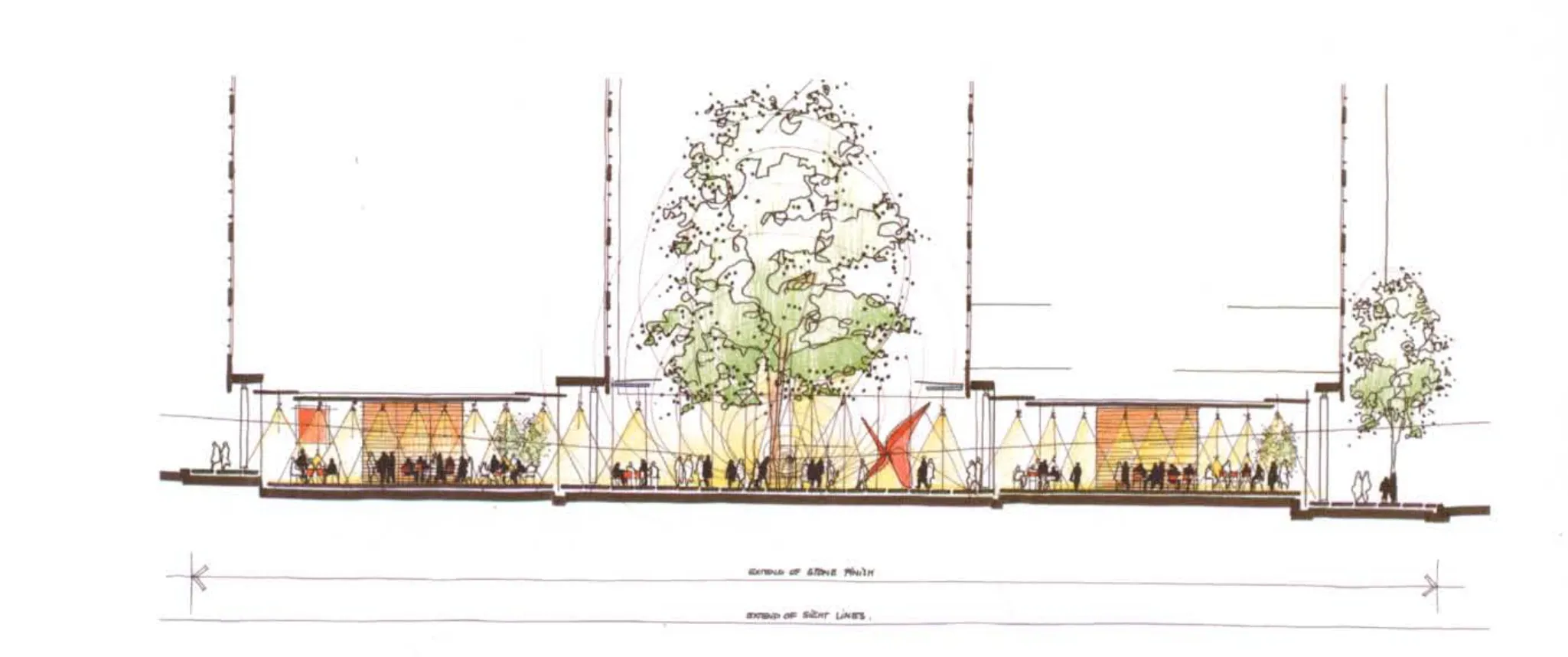
9 剖面/Section

10 办公室大堂立面/Office lobby elevation
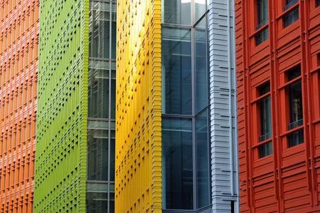
11 立面局部/Detail of facade(11,13摄影/Photos: Van der staay Maurits;12摄影/Photos: Hufton & Crow Courtesy Leg and Mec)
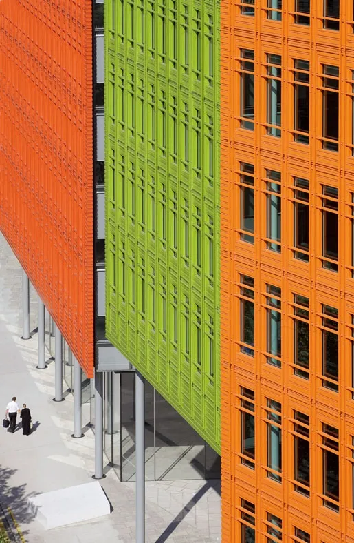
12 立面局部/Detail of facade(11,13摄影/Photos: Van der staay Maurits;12摄影/Photos: Hufton & Crow Courtesy Leg and Mec)

13 立面局部/Detail of facade(11,13摄影/Photos: Van der staay Maurits;12摄影/Photos: Hufton & Crow Courtesy Leg and Mec)
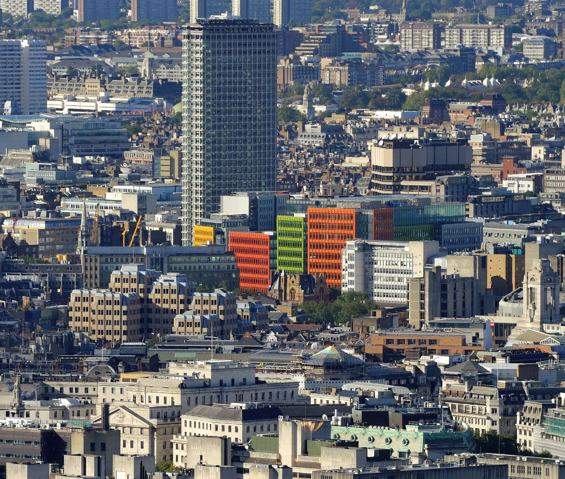
14 全景/Panorama(摄影/Photo: Van der staay Maurits)

