“感知空间:建筑之重新想象”展览装置
罗布·格雷戈里/Rob Gregory
司马蕾 译/Translated by SIMA Lei
“感知空间:建筑之重新想象”展览装置
The installations of Sensing Spaces: Architecture Reimagined
罗布·格雷戈里/Rob Gregory
司马蕾 译/Translated by SIMA Lei
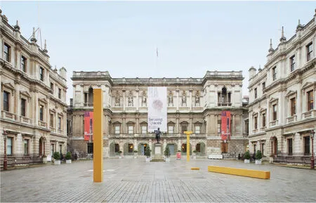
1 装置,阿尔瓦罗·西扎/Installation by Álvaro Siza(摄影/Photo: James Harris,图片来源/Image courtesy: Royal Academy of Arts)
阿尔瓦罗·西扎 | Álvaro Siza
在安纳伯格庭院中放置着葡萄牙建筑师阿尔瓦罗·西扎的展览装置。该装置是由3种元素构成的:一根倒下的柱子,旁边放置着它的头部,也就是“柱头”;一根竖立着的柱子;以及一根带有柱头的柱子。建筑师初次来到这一场地时,他发现从皮卡迪利大街一侧的柱廊看伯灵顿大厦外墙时,片段式的建筑元素能让人回想起原始柱子的形态,这让他深受启发。这些柱子标识着主要流线的起点和终点,形成笔直的中轴线,联系起街道和展厅:轴线穿越庭院、沙龙、楼梯、玄关和中央大厅,一直通往放有西扎的长期工作伙伴艾德瓦尔多·苏托·德·莫拉的两件装置展品的6号展厅。而作为两者间的联系,苏托·德·莫拉的展品中独自站立着的室内拱门,以及西扎的作品中4.8m高的柱子都使用了预制混凝土。但是,和苏托·德·莫拉的作品使用的常见的硅酸盐水泥的灰色不同,西扎在看到庭院柱廊前开过的黄色巴士时,受到巴士带来的一抹色彩的影响,在作品中加入了黄色的元素。
阿尔瓦罗·西扎认为,创造建筑开始于场地上既有的东西,而在描述他自己的作品时,这位葡萄牙建筑师常常回忆起他对既有的场地产生的强烈的情感反应,以及当地过去的历史和传统。在这次的作品中,他的这种与场地协调和个人情感反应的特质集中反映在皇家艺术学院和学院外的城市之间的空间关系上——安纳伯格庭院不仅充当了两者之间的过渡,也突显了这一关系的重要性。分成3块的展品同时也显示了对连贯性的考虑,这既体现在对建筑历史的理论连续性上,也体现在场地上实体的连续性上。因此,这些元素不仅遵从了柱子的原始形式,成为极具自我风格的抽象形象,同时也与现状空间混合在一起,形成广场上以雕塑形式存在的室外展厅。这些装置同时也成为了指引主要展厅位置的路标,而这也是西扎希望的——他希望展品能够激发参观者对场所的回想,而不仅仅是与苏托·德·莫拉的拱门形成对比而已。这些柱子也调和了人们离开展厅和庭院时的过程——通过建筑师在皇家艺术学院建筑附近加入的反应城市生活色彩的元素,来帮助参观者迅速地回到城市的领域中去。
Located outside in the Annenberg Courtyard,the installation by Portuguese architect Álvaro Siza consisted of three elements; a column lying down with its head or "capital" beside it,another standing upright,and a third with its capital in place Inspired by the architect's first response to the site,when he was struck by the presence of the Burlington House facade as seen through the archway from Piccadilly,these fragments refer back to the birth of the column They also mark the beginning and end of an important route that sets up a straight axis,linking street with gallery - via courtyard,salon,staircase,vestibule and Central Hall - and terminating in Gallery VI with the first of two installations by Siza's lifelong collaborator,Eduardo Souto de Moura Presented as a shared response,like Souto de Moura's freestanding internal door cases,Siza's 4.8-metre-tall columns were also made with precast concrete However,unlike the ordinary Portland cement grey of his colleague's sculptures,Siza chose to use an embedded pigment in yellow,inspired by a flash of colour seen as a yellow bus drove past the courtyard's archway.
Álvaro Siza states that to make architecture is to start with what is already there,and when describing his own work,the Portuguese architect often refers to what he recalls as being his deep emotional response to any given site,and its existing history and traditions In this case,that highly attuned and personal reaction focused on the relationship between the Royal Academy and the city beyond - a relationship that is celebrated and mediated by the presence of the Annenberg Courtyard The three-piece sculpture also reflected his interest in continuity,both in terms of the theoretical continuity of architectural history and the physical continuity of place As such,the elements not only became abstract figures in their own right - tracing the birth of the column and combining to create a sculptural entity that occupies the courtyard as a type of external gallery They also formed a series of signposts to what lay within the Main Galleries,which Siza hoped would activate visitors' memories rather than simply draw visual comparisons with Souto de Moura's door cases The columns also mediated the process of leaving the gallery and courtyard as visitors effectively re-entered the realm of the city,with the architect's choice of colour bringing elements of street life in closer proximity to the architecture of the Royal Academy
艾德瓦尔多·苏托·德·莫拉 | Eduardo Souto de Moura
在2号和6号展厅中,有两个与皇家艺术学院中原有的拱门一模一样的门,形成了原有物与复制物之间的张力感。这两个拱门独立地矗立着,与原有门廊呈45°相对,高3.5m,用超性能钢筋混凝土(UHPRC)筑造而成。由于使用了精密的预制模具,这一先端的混凝土制品可以精确复制正品的所有细节,连0.2mm的浅浮雕都能被完美地重现。尽管门框的组成和建造看似十分简单,实则使用了先进的采用有限元分析方法的电脑软件,来计算这一30mm厚的混凝土框架如何能在没有支撑墙体的情况下站立,以及在受到冲击的情况下的受力情况。
葡萄牙建筑师艾德瓦尔多·苏托·德·莫拉清楚地指出,他设计的装置本身并不是建筑。相反地,他认为这一作品是雕塑,是建筑的映射,是“建筑”这一词语字面上和实质上的意义的片段性反映。通过对这两个学院中既有拱门(两道大理石拱门都位于中轴线上,而木质方门位于次轴线上)的复制,苏托·德·莫拉不仅仅在形式上反映了展厅的建筑形式,也通过这两道新装置让参观者深刻地意识到微妙的空间感受——包括人们平时并不留意的尺度感、轴线、空间范围和过渡。建筑师没有选择其他展厅中最常见或是特别的建筑元素,这是因为在展厅的日常使用中,许多人都会穿梭于各个房间之间,却并不会留意走过的学院拱门上细微的空间细节。
为此,苏托·德·莫拉新设立的拱门脱离于墙体之外,让穿越门洞时感受到的材质和几何变化能形成更现实的体验。这也让参观者能更有意识地体会到行为和空间转变带来的情感变化,也帮助人们更能注意到无论是皇家艺术学院的展厅中,还是广义的建筑中构成空间的界限和范围的建筑元素。因为建筑师其实并不能真正地凭空创造空间,苏托·德·莫拉认为这些空间的限制、边界和范围是建筑师定义空间的主要手法。而在这些要素得到明确后,建筑师也就为我们的空间体验定义好了界限。
艾德瓦尔多·苏托·德·莫拉这样评论他的作品:“首先,我的门不是建筑,它们是雕塑。其次,我认为它们很优雅。此外,当你跨过这些门槛时,你也许会体会到一种感觉或是一丝情绪。第四,这一作品也很有理性。”
Situated in Galleries II and VI,these two replica door cases were precise facsimiles of those in the Royal Academy and played on the tensions that exist between original and copy Freestanding and set at a 45-degree angle to their predecessors,these 3.5-metre-high structures were made from ultra highperformance reinforced concrete (UHPRC) Cast in precision-made joinery moulds,this advanced concrete product allowed even the finest detail of the door cases to be replicated,with a relief as shallow as 0.2mm being perfectly formed Despite their apparently simple composition and construction,cutting-edge finite-element analysis was run using computer software to predict how the 30-mm-thick concrete frame,without the aid of a supporting wall,would perform structurally and react in the event of impact.
Portuguese architect Eduardo Souto de Moura states clearly that his installations were not in themselves works of architecture Instead,he describes them as sculptures,which he sees as reflections of architecture; an assertion that draws on both the literal and notional meaning of the word reflection By making copies of two of the Academy's existing door cases (both the marble arch that occupies the main axis and the timber square door frame which runs in the secondary axis),Souto de Moura was not only reflecting the gallery's architectural detail in physical form,but was perhaps more profoundly providing two new architectural devices that caused the visitor to become aware of and to reflect upon subtle spatial notions - of scale,axis,threshold and transitionthat may have been otherwise overlooked Despite forming the gallery's most consistent and prominent architectural element,in the day-to-day use of the galleries many people typically move through the enfilade of rooms apparently unaffected by the spatial nuances of passing through the Academy's door frames.
In response to this,Souto de Moura's new freestanding door cases,which were disembodied and independent of the walls,imposed a material and geometric shift that made passing through the apertures a more present experience This gave visitors the opportunity to more consciously focus on the sensations associated with movement and transition,and helped to make them more aware of the architectural elements that form the limits and thresholds both inside the Royal Academy galleries and in architecture generally Souto de Moura considers these limits,edges and thresholds to be the architect's principle medium for defining space,underlying the fact that it is impossible for architects or architecture to actually create space As these pieces made manifest,architecture defines the limits of our spatial experiences.
"First,my doors are not architecture,they are sculpture Second,I think they are elegant Third,when you cross these thresholds perhaps you experience a sensation,an emotion Fourth,they are logical." Eduardo Souto de Moura.
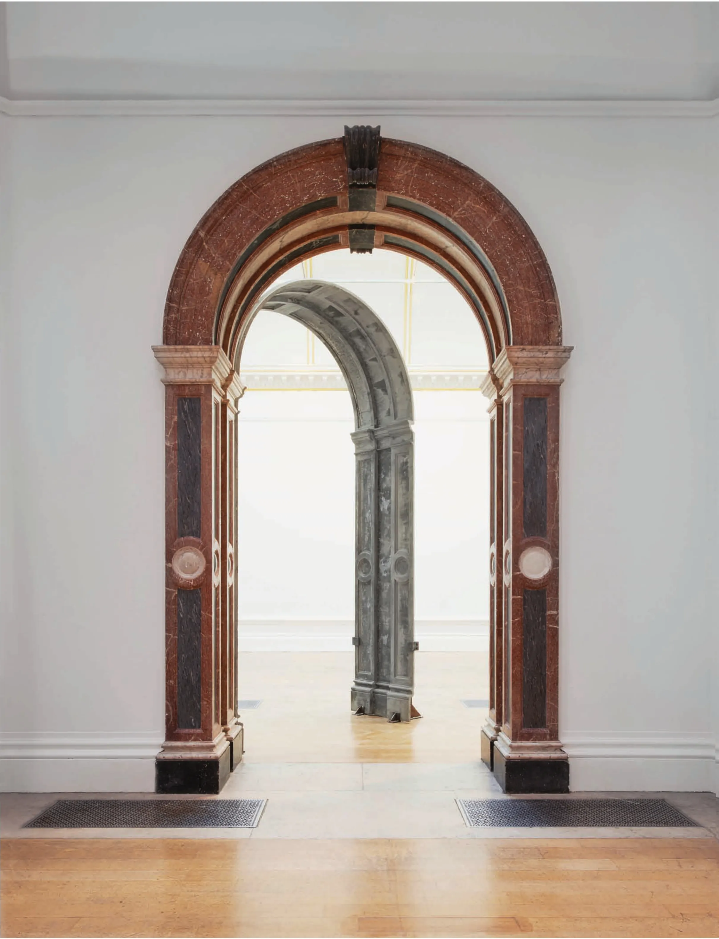
2 装置,艾德瓦尔多·苏托·德·莫拉/Installation by Eduardo Souto de Moura(摄影/Photo: James Harris,图片来源/Image courtesy: Royal Academy of Arts)
佩佐-冯·艾利赫夏森 | Pezo von Ellrichshausen
3 装置,佩佐-冯·艾利赫夏森/Installation by Pezo von Ellrichshausen(摄影/Photo: James Harris,图片来源/Image courtesy: Royal Academy of Arts)
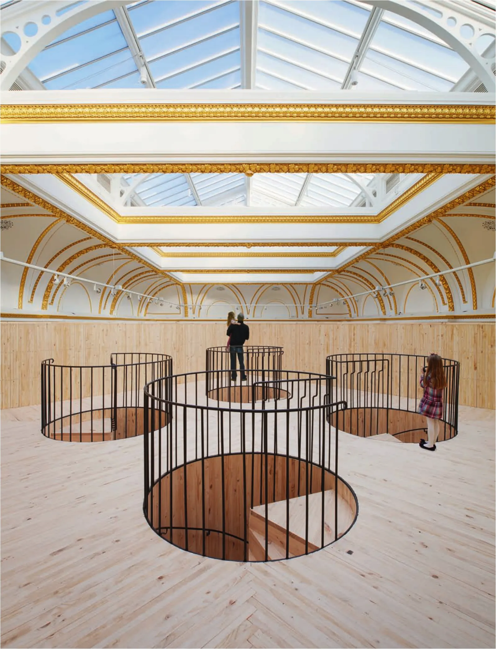
此装置由4个圆柱体和两个箱体构成,非常质朴,并且使用了相当原始的建筑语言。装置具有优美的沉静感,第一印象上让人感觉密不透风,但其实每个支撑结构的内部都能通往上层漂浮着的箱体——4个圆柱体内都设有的旋转楼梯,同时,竖向的箱体内也设有一个斜坡能通往上层。然而,装置结构的基本形式虽然简单,使用的木结构却干练而精准,这些部件都是在装船运往伦敦前由建筑承包商在智利预先制造好的。而展品本身则继承了建筑师对建筑艺术的标志性的态度,用非常有限的材料和最基本的形式在展厅中制造出独具纪念感的装置,但其在与参观者的互动中又显示出了亲切和可触摸的特质。
智利建筑师组合毛里西奥·佩佐和索菲亚·冯·艾利赫夏森把这一装置形容为架在4根巨大柱子上的小房间,并在设计中上体现了许多设计师长久以来的思考。在过去所有的作品中,两位设计师都拒绝追随流行的新时尚,而是选择他们认为普通和熟悉的方式来设计,并认为永恒的美是来自第一印象看上去非常简单而非复杂的建筑形式。这一包有木表皮的构造物就具有简单的形式和朴实的细节,其尺度和比例都和展厅非常相符。出于建筑师对几何形态的偏好,方盒子正好占据了展厅一半的空间,角点刚好对准学院拱顶和天花的装饰性结构。这一结构能给参观者带来3种完全不同的体验。首先是在平台下方的共同体验,在此处,人们聚在一起或是在巨大的圆柱形柱子之间走动。第二种是个人的感官体验——在斜坡或是楼梯上下时,参观者对距离和时间的感知都得到了延续。最后则是爬到展厅上方的平台上时的一种出乎意料的亲近体验,在这里,参观者和通常不能接触到的拱顶天花间建立起了一种新的关系。
这一装置让人们能更接近19世纪的装饰细节,并且建立起一种参观者与学院的大环境间的新的空间关系,同时也为展厅提供了新的被俯视的形象,并让空间通过从玻璃屋顶射入的光线与外面的世界联系在一起。
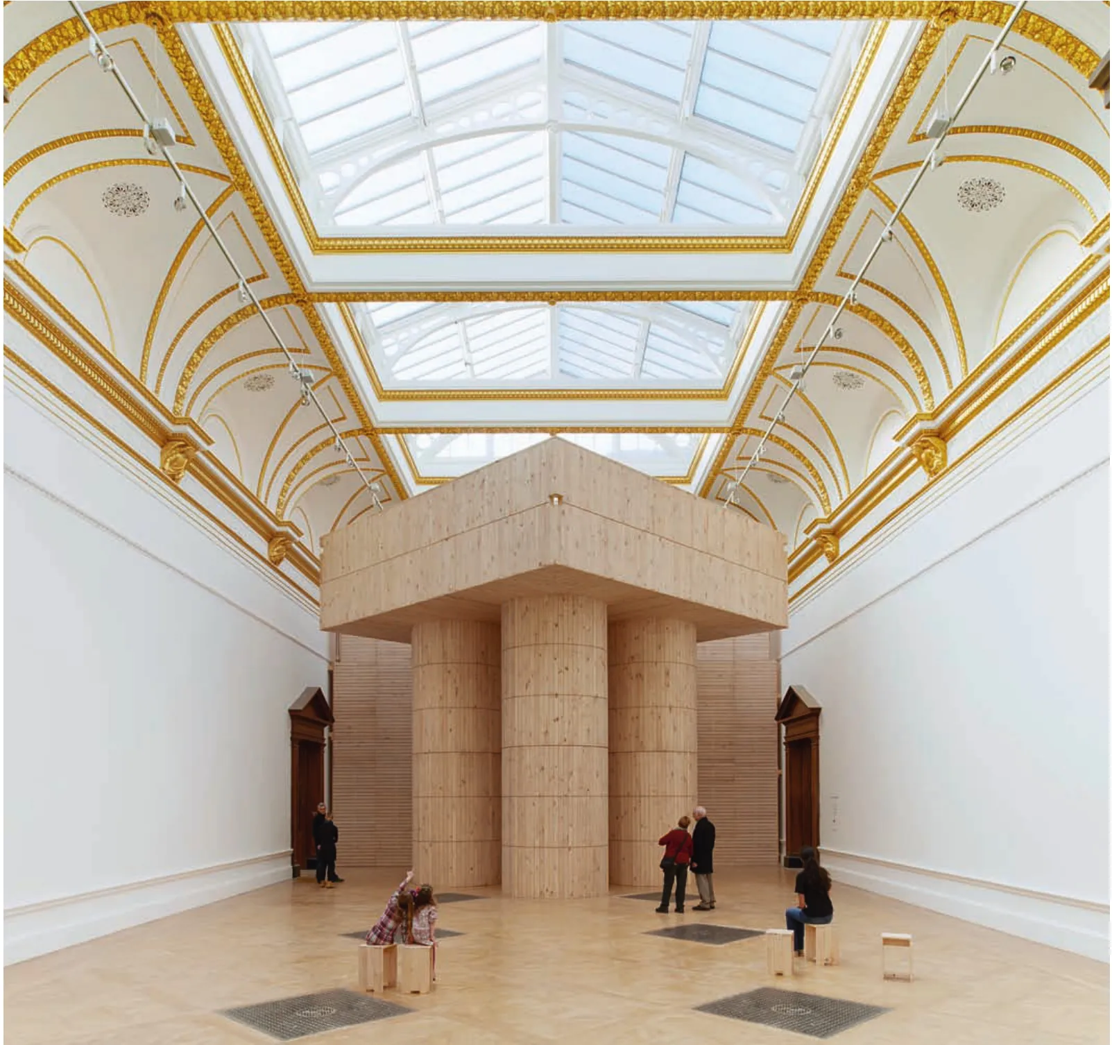
4 装置,佩佐-冯·艾利赫夏森/Installation by Pezo von Ellrichshausen(摄影/Photo: James Harris,图片来源/Image courtesy: Royal Academy of Arts)
Comprising four cylinders and two rectangular forms,this installation was unadorned and apparently primitive in its architectural language Decoratively mute and on first impression impenetrable,each of the supporting structures provided access to the elevated box above,via four spiral stairwells,one in each of the cylinders,and a ramp that rose inside the vertical box However,the basic form of construction belied the refinement and precision of its timber structure,which was prefabricated by the architects' contractors in Chile,before being shipped in modules to London As an object in itself,the installation also exhibited the architects' trademark attitude to the art of building,working with a limited palette of materials and the most basic modes of construction to produce an installation that is monumental in relation to the gallery,but intimate and tactile in its engagement with the visitor.
Described by the Chilean architectural duo Mauricio Pezo and Sofia von Ellrichshausen as a small room elevated on four massive columns,this installation extended many of the designers' enduring preoccupations As with all their work,the pair rejected the pursuit of fashionable invention,choosing instead to take inspiration from what they refer to as the ordinary and the familiar,based on the premise that timeless beauty exists in forms of architecture that on first impressions often seem too simple to be sophisticated Simple in form and unadorned in detail,the timber-clad structure was composed in response to the scale and proportions of the gallery Exploring the architects' interest in geometry,the square form occupies exactly half of the gallery,and its points align precisely with the decorative structure in the Academy's vaults and ceilings The structure provides three distinct experiences for the visitor The first is a shared experience below the platform,where people can collectively gather around or move between the massive cylindrical columns The second is an individual and sensual experience,when ascending or descending the ramp or stairwells,which expands the visitor's perception of distance and time Finally the third is an intimate and surprising experience when elevated above the gallery on a platform,where a new relationship is established between visitors and the hitherto inaccessible ceiling vault.
This installation both brought people into closer proximity with the late nineteenth-century decorative detail and established a new spatial relationship between the visitor and the broader context of the Academy itself,simultaneously providing a new aerial view of the gallery,and setting this in context with the outside world through the glass roof light
隈研吾 | Kengo Kuma
5 装置,隈研吾/Installation by Kengo Kuma(摄影/Photo: Benedict Johnson,图片来源/Image courtesy: Royal Academy of Arts)
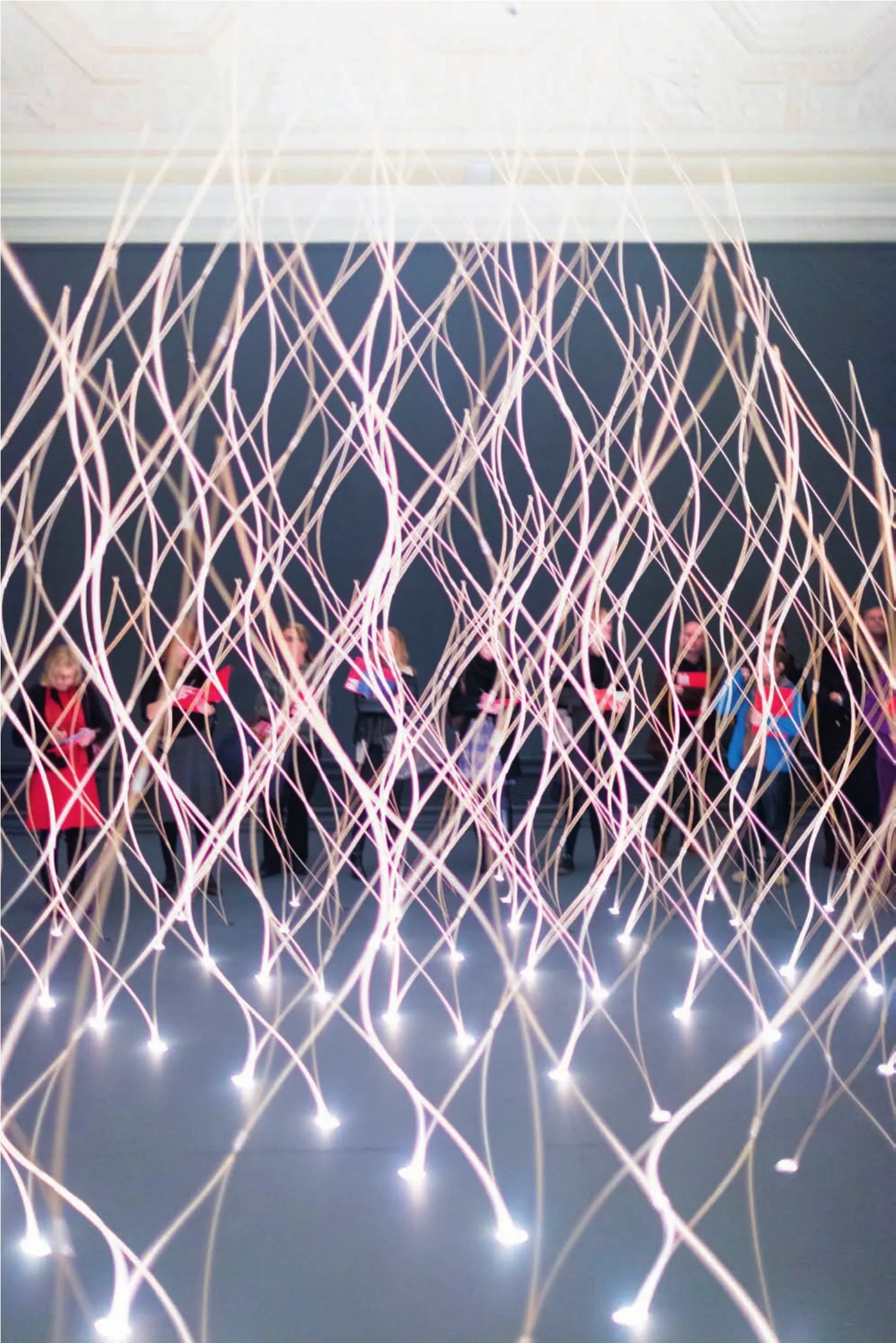
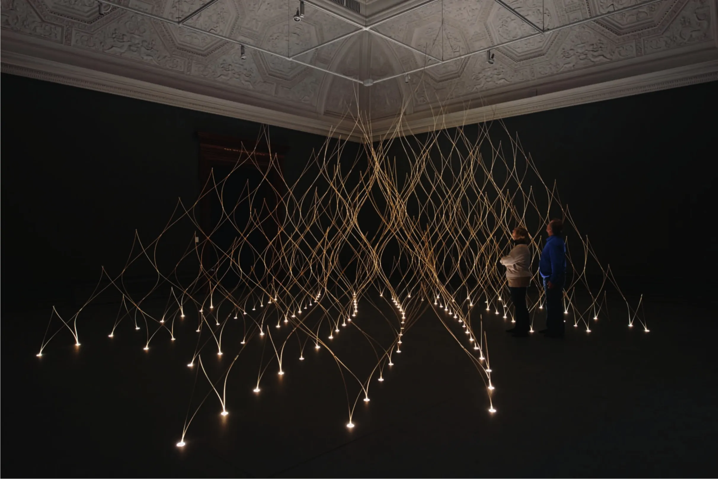
日本建筑师隈研吾设计的两组装置由一系列精美的构造物组成,位于皇家艺术学院西厅的大小两个展厅中。构造物轻触地面,由长度经过精心挑选的竹子制成,全部从京都进口而来。这些竹材由长至3~4年的竹子制成,并削成4mm直径的竹丝,建筑师通过这种方法来保证竹丝能被弯曲成型。选择竹材的原因同时也是因为竹子能吸收并缓慢散发出香味,在真空包装装船运往伦敦之前,每片竹子都经过带有桧木(日本扁柏)或是榻榻米香味的液体浸渍。每片构造物虽然脆弱,但相互构成结构上的平衡,形成重复的钻石型模块,每4组间成对地通过热缩塑料套筒联系在一起,并在相反方向上撑开。每个模块都与地面相接,竹子被夹在高出地面的胶合板隐形盒子里,盒子里同时也藏着一些嵌入式的LED灯具。
秉承建筑师过去作品的风格,这组装置中也延续了隈研吾招牌式的对小块木材的使用,并体现了他在运用传统和自然材料并使用新的营造模式方面的能力。这组展品同时也显示出他一贯的对于用最少的资源形成最复杂的效果的兴趣。为此,他使用规则几何形状的竹棒来搭建出两个完全不同、但又互相渗透的建筑形式,这一创意来自建筑师对小时候坐在蚊帐里的体验的回忆。然而,这里的构筑物并不是一张网,而是通过悬吊和栓接形成张力,让装置能够自承重站立,并通过菱形单元弯曲组成的蜿蜒矩阵,同时构成形式感和结构支撑。
两个装置中的一个被称为“亭子”,另一个被称为“洞穴”,进入西侧展厅的参观者会先看见其中一个,再进入另一个,与建筑的关系从旁观者转为参与者,对建筑的理解也从一个物品过渡为一个设置好的构造物。而在常规展厅的一端,洞穴形成了一个尽头,让空间显得更为深邃,感觉上也从动态空间过渡到了静态空间。当光线变暗时,人的眼睛会随之变化,难以聚焦,注意力从前景的细节转移至深邃的背景,而我们的嗅觉能力则开始提升,开始察觉出桧木和榻榻米的香味。
隈研吾这样谈他的作品: “我们在两个不同的空间内建造了两个不同的建筑。一个是‘真实的建筑’,或者说‘父亲的建筑’,而另一个是‘架空的建筑’,或者说是‘母亲的建筑’。父亲的建筑伫立在空间中央,充满了桧木的香味。母亲的建筑则像茧一样包裹你的身体,内部充满了榻榻米的味道。”
6 装置,隈研吾/Installation by Kengo Kuma(摄影/Photo: James Harris,图片来源/Image courtesy: Royal Academy of Arts)
The two installations by Japanese architect Kengo Kuma comprised a pair of delicate structures that occupied the Royal Academy's Large and Small Weston Rooms Touching the floor lightly,the structures are made from carefully selected lengths of bamboo,imported especially from Kyoto in Japan Matured for between three to four years and whittled to a diameter of 4mm,this material was chosen by the architect to exploit its capacity to be bent into shape It was also chosen for its ability to absorb and slowly release scent,each piece being impregnated with the liquid scent of Japanese Cyprus or Tatami,before being vacuum-packed and shipped to London Fragile,yet held in structural balance,each structure was made up from a repeated diamond-shaped module,formed by four lengths of bamboo bound together in pairs by sleeves of heat-shrinkable plastic and pulled apart in opposing directions Where each module touched the floor,the bamboo was clamped in hidden pockets set within a raised plywood floor,which also provided space for a number of recessed LED light fittings.
Consistent with much of his work,this installation extended Kuma's trademark use of small sections of timber,and his ability to combine traditional,natural materials with innovative modes of construction It also demonstrated his ongoing interest in how to achieve the maximum effect with the minimum use of resources To this end,he combined a regular geometry of bamboo rods to create two distinct permeable figures that are analogous with the architect's recollection of sitting inside a mosquito net as a child However,unlike a net,which finds its form when hung and tethered in tension,these freestanding structures were selfsupporting,and gained both formal and structural stability by being bent into a sinuous matrix of regular diamond-shaped cells.
With one assembly described as "pavilion" and the other as "cave",visitors to the Weston Rooms observed one before entering the other,shifting their relationship to the work from viewer to participant,and translating their understanding of the structure as an object to the structure as a setting Located at the end of the gallery's formal suite of rooms,the cave formed a dead-end and becomes a place of even deeper contemplation; a static space that is rendered dynamic to the senses As light levels drop,one's eyes are forced to shift in and out of focus,jumping from foreground detail to background abyss as our sense of smell heightened to detect the aromas of Japanese Cyprus and Tatami.
"We built two houses in two different spaces One is “architecture of reality",or "architecture of a father",whereas the other is "architecture of void" or "architecture of a mother" The father's construction stands alone in the space and is filled with the aroma of Hinoki (Japanese Cypress) The mother's structure is a cocoon that wraps your body and is full of Tatami smell.' Kengo Kuma.
迭贝多·弗朗西斯·凯雷 | Diébédo Francis Kéré
7 装置,叠贝多·弗朗西斯·凯雷/Installation by Diébédo Francis Kéré(摄影/Photo: James Harris,图片来源/Image courtesy: Royal Academy of Arts)
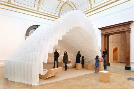
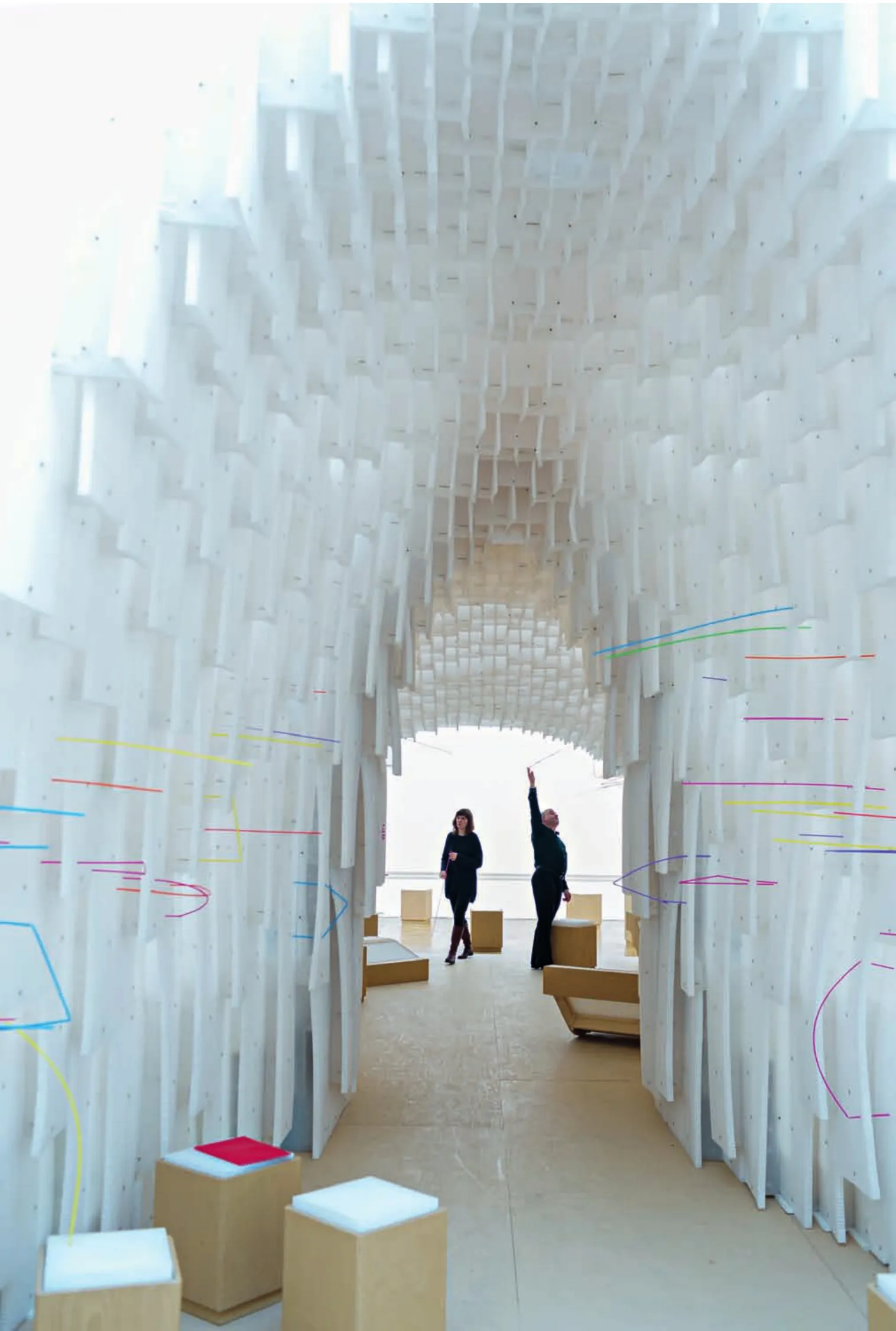
由非洲建筑师迭贝多·弗朗西斯·凯雷设计的这一装置被形容为房间中的房间,装置具有玻璃酒杯形的曲线结构,位于学院放射形的矩形房间之外,连接起两个展厅,让人们能汇聚到这一亲切的洞穴般的空间中来。凯雷设计的这一拱形结构由60mm厚的蜂窝塑料板建造,体现了建筑师对容易取得并具有高适应性的材料的兴趣。这种德国产的穿孔塑料板材料通常用于建筑结构,但仅仅是作为门和墙体后的垫层,而在这个设计中,建筑师发现了材料的新的可能性。凯雷采用了新方法来让这种材料提高其与人的互动性和适应性——参观者能将所提供的色彩明快的塑料吸管自由穿插在蜂窝结构的孔洞里,从而为本身单调的结构带来不断变化的彩色表皮。
作为一个常常将社区作为其设计的重点,同时将其工作职责延伸至社会活动家、募捐召集人和建造者的建筑师,凯雷的装置能让参观者参与互动其中并对其产生影响,这一点儿也不出乎意料。因为经常在有特殊问题的社区工作,凯雷坚信建筑具有真正的激发人们改变的潜力。也因为认识到了每个人都有通过建筑激发其创造力的需求,凯雷认为他的主旨是创造让人随意地聚集在一起的舒适的空间,并且帮助社区找到改变的方法。为此,他创造出了既是展品本身又构成周边环境的构造物。这一对象具有独立的形式,在展厅中形成新的焦点,并超越构造物自身形式成为展品所在的背景。构筑物的内部则形成了一个新的供人相遇和坐下停留的地点,而更关键的是能让人们与建筑互动和互相适应——每个参观者都受邀在展品中留下自己作为个人和集体的印记。
“当你改变一个建筑时,你也成为了它创造出的一部分。”建筑师这样说。
8 装置,叠贝多·弗朗西斯·凯雷/Installation by Diébédo Francis Kéré(摄影/Photo: Benedict Johnson,图片来源/Image courtesy: Royal Academy of Arts)
Described as a room within a room,this installation by African architect Diébédo Francis Kéré interrupted the Academy's enfilade of rectangular rooms with a curvaceous wineglassshaped form that linked two galleries and funnelled people together into a more intimate cave-like space Forming an arch made up of a matrix of 60mm thick honeycomb plastic panels,Kéré's construction extended his interest in working with ready to hand and adapted material In this instance,he found new potential in perforated plastic sheets from Germany,typically used in construction,but hidden within doors and walls as fillers Kéré's specification of this material provided a mechanism for interaction and adaptation,with visitors being offered brightly coloured plastic straws to thread through holes in the honeycomb structure and thereby adorn the otherwise monochromatic cocoon with an everchanging cloak of colour.
For an architect who places community at the heart of his work,and whose role often extends to that of activist,fundraiser and builder,it comes as little surprise that Kéré's installation relies on the engagement,interaction and contribution of the gallery visitor Often working with communities that have experienced particular hardship,Kéré adheres to the belief that architecture has the potential to genuinely inspire change Recognising the need that exists in everyone to have buildings that enhance their creativity,Kéré states that his main aim is to create comfortable spaces for informal gatherings,and to help communities build their own inspiration To this end,he created a structure that is both object and context; object in the sense that the structure is an autonomous form that creates a new focus within the gallery setting,and context in how that form does much more than serve its own end He created at its heart a new place to meet,to sit,and most crucially a place that became a focus of interaction and adaptation,as each visitor was invited to leave their mark both as an individual and collectively.
"When you change a building you become part of its creation." Diébédo Francis Kéré
李晓东 | LI Xiaodong
9 装置,李晓东/Installation by LI Xiaodong(摄影/Photo: James Harris,图片来源/Image courtesy: Royal Academy of Arts)

10 装置,李晓东/Installation by LI Xiaodong(摄影/Photo: Benedict Johnson,图片来源/Image courtesy: Royal Academy of Arts)
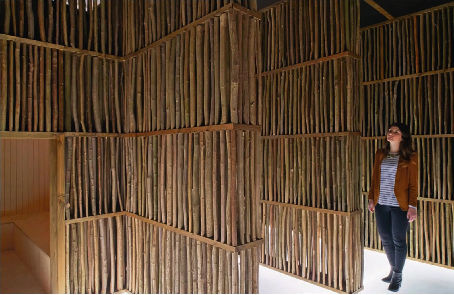
不同于本次展览中的其他装置,由中国建筑师李晓东设计的这件作品在视觉和体验上并不是空间中的物品。相反,它建立在经过庭院、宫殿、大阶梯和美术展厅的连续体验之上,同时,在熟悉的路线中加入了一个新的迷宫般的空间。木框架中填充了矮林的小树枝(矮林是一种不用重新种植就能有效地快速培育环保木材的方法)。丙烯酸的垫高地面中嵌入了LED灯, 沿途有着胶合板制成的壁龛点缀,而线路的终点是李晓东称为禅院的空间。庭院的地板上铺着鹅卵石,形成参观路线的最后一个场景,建筑师将其形容为“在雪夜穿越林海”。
中国的一些著名的建筑,例如紫禁城,都是通过创造一系列的空间体验而非建造一组互相独立的建筑来布局。李晓东在形容他的作品时也提到了中国的哲学,他认为,他的作品在塑造能让参观者发挥想象力的空间以及创造优质的物质体验上,采用的是无形、而非有形的手法。这就是他所指的与通常空间体验的不同之处:你被空间吸纳其中,目睹空间之象,却神游其外。在这个空间中,参观者们踏上了寻找和感知他们行走路线之外的另一个世界之旅,并与之互动。他们能够从窄窄的通道和近处的壁龛中体验到不同的空间,最后则到达宽阔的禅院。如同中国的画卷一般,这是一种通过慢慢的移动和时间的推移来缓缓展开故事的手法。建筑师希望能够藉此引起参观者的好奇心并对他们产生影响,让他们能在伦敦得到逃避现实的片刻,并在体验的最后通过禅院来感受到智慧和灵性。
李晓东说:“西方的建筑师从透视的角度设计建筑,认为建筑是被从外部看的物品,而中国的建筑师认为建筑应该是从内部体验的东西。”

11 装置,李晓东/Installation by LI Xiaodong(摄影/Photo: Benedict Johnson,图片来源/Image courtesy: Royal Academy of Arts)
Unlike the other installations in this exhibition,this piece by Chinese architect LI Xiaodong was not seen or experienced as an object in space Instead,it built upon the sequential experience of visiting the Academy-via courtyard,town-palace,grand staircase and Beaux-Arts gallery-by adding a new maze of spaces to an otherwise familiar route Experienced as a choreographed one-way route,the timber frame was in-filled with small sections of coppiced timber (coppicing is an effective method of growing sustainable timber fast,without the need to replant) An acrylic raised floor was illuminated by LEDs,and plywood-lined niches provided accents along the route,culminating in a space that LI Xiaodong describes as a Zen garden Complete with pebbles on the floor,this space was presented as the final scene on a route that the architect likens to "a walk through a forest in the snow at night".
There are well-known Chinese examples,such as the Forbidden City,which was laid out to be experienced as a sequence of spaces rather than a collection of individual buildings LI Xiaodong also draws on Chinese philosophy when describing how this work focuses on the intangible rather than the tangible,in order to allow room for the visitor's imagination to help create a satisfying physical experience This he states is "the fundamental difference between 'being present' in a space,where you are absorbed within it,and looking at images of a space,where the mind is detached." In this place,visitors are invited on a journey of discovery and to sense that alternative worlds run alongside their path and intersect with it They can experience the different spaces,from the narrow passageways and intimate niches,to the expansive Zen garden Likened to a Chinese hand scroll,this was an unfolding story that was best moved through slowly and appreciated over time The architect intends this to arouse curiosity and generate impact,to create a moment of escapism from London; an experience that ends in a Zen garden,which represents clearsightedness and inspiration.
"Western architecture develops from perspective,with the building as an object to be looked at from without,while Chinese architecture develops from the idea that the building is something to be experienced from within." LI Xiaodong
格拉夫顿建筑师事务所 | Grafton Architects
12 装置,格拉夫顿建筑师事务所/Installation by Grafton Architects(摄影/Photo: Benedict Johnson,图片来源/Image courtesy: Royal Academy of Arts)
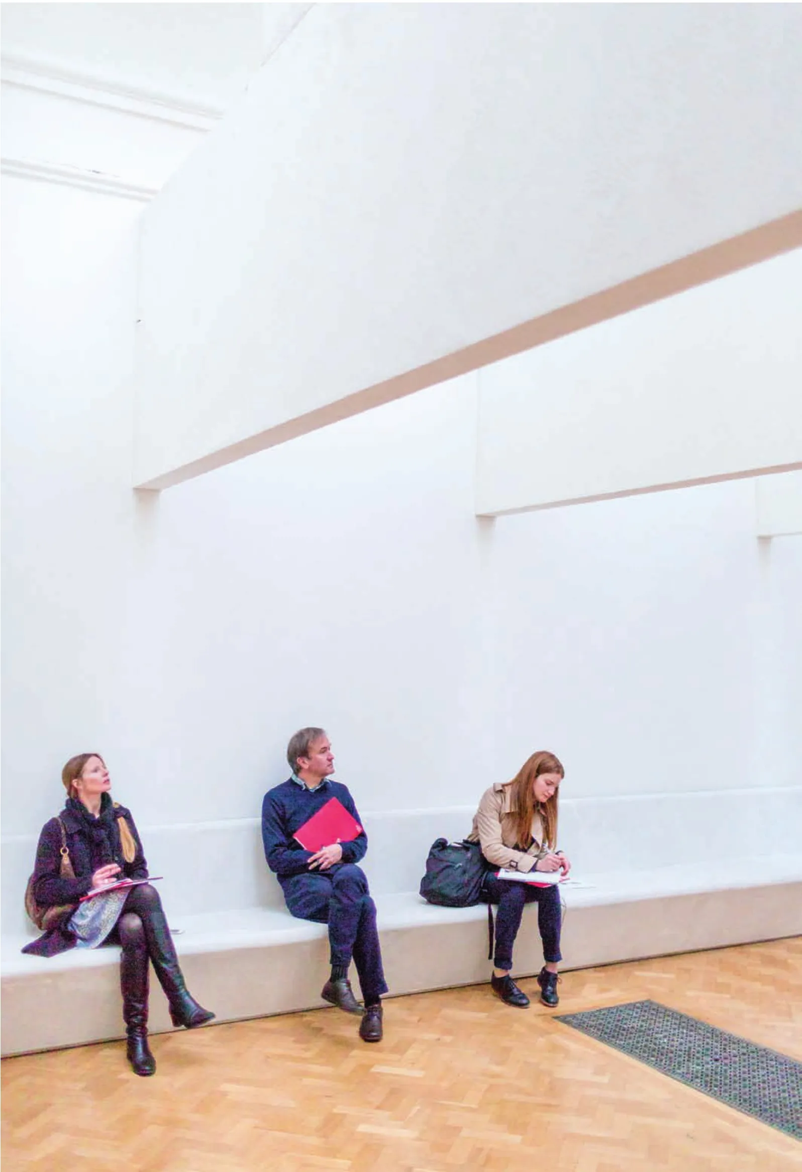
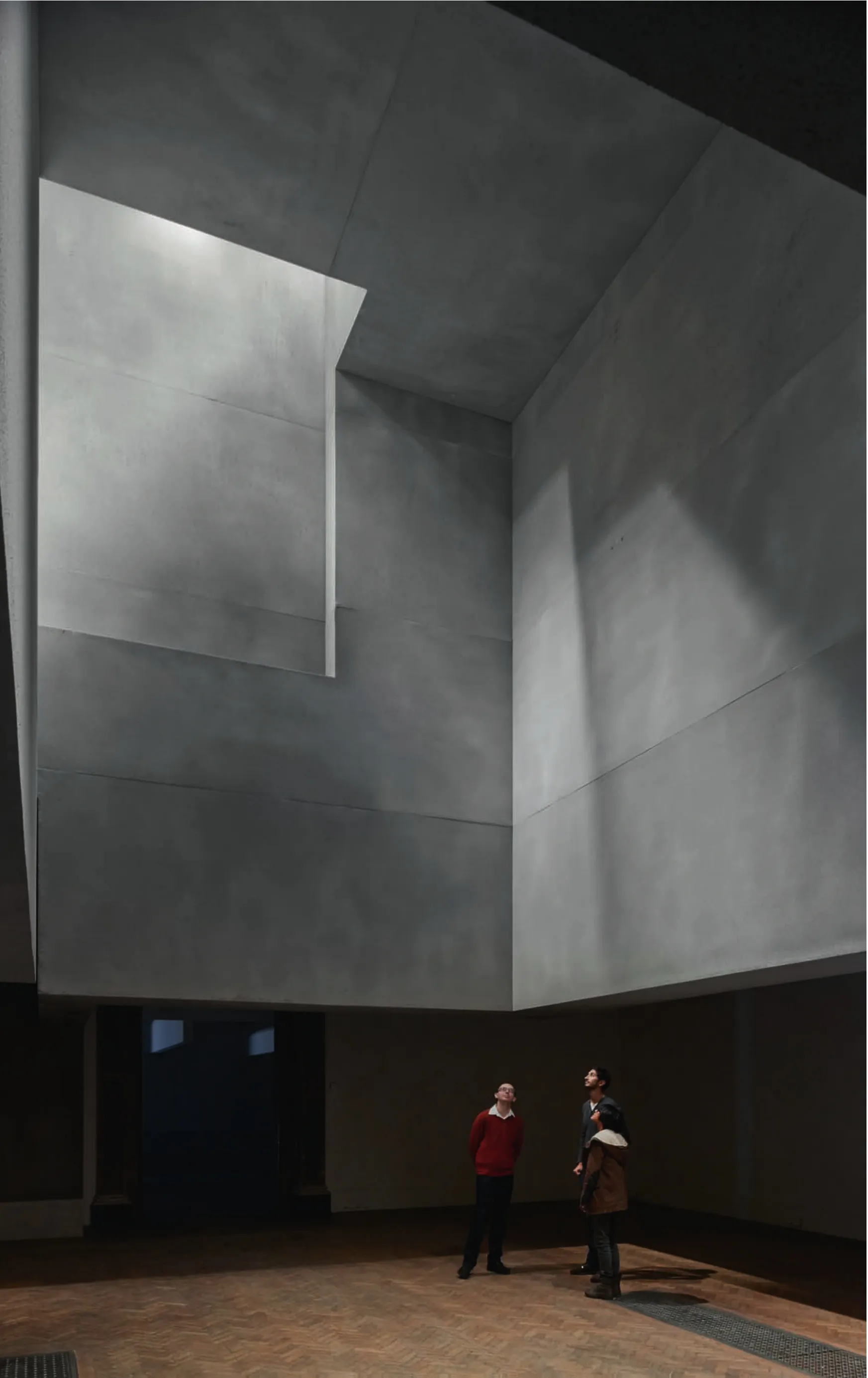
格拉夫顿建筑师事务所的这一展品,由谢利·麦克纳马拉和伊冯娜·法雷尔主持设计。装置漂浮在9号展厅和演讲厅之上,悬吊在顶灯之下。为了创造出相邻房间之间的强大的空间张力以及不同光线下的场景,建筑师设计了两组完全不同的装置。因为设计只针对屋顶灯光,装置包含了一系列悬吊着的用于操控灯光和重塑空间的表皮以及体块,以形成两种完全不同的风格:一种是对轻的探索,形成光线的瀑布;另一种则截然相反,是对重的探索,以及空间的容量和构成。在演讲厅中,一系列黑暗、内敛的巨大体块遮蔽起原来的天花和顶灯的大部分,只留下两个相对较小的高处的“孔洞”,或称为透光孔来透射出光线。与此相反,9号展厅中则设有9个片状装置,悬浮在展厅裸露的构架上,排成一列,形成对自然光线和经过过滤的顶部人工光线的平衡。两组装置都在8.5m高的展厅中形成净高2.5m的空间,但在地板和光线间建立起两种完全不同的关系。在演讲厅中,装置加强了地板和灯光间的距离感,而在9号展厅中,悬挂的片状装置则带来了接近感和统一感。
格拉夫顿建筑师事务所引用了美国建筑师路易斯·康的话“听到一种声音就等于看到一个空间”,以此显示他们在赋予空间形态时的一贯努力。按照他们的说法,他们力求“尽量留白”,并通过对空间中的光线运动的精巧设定来构筑空间。他们将皇家艺术学院主展厅形容为“无比宽阔的空间”,而他们的装置能从根本上改变让每个参观者对这片熟悉的场地的看法。为此,建筑师们在9号展厅和演讲厅之间创造了两个截然不同的场景,当从其中一边走过时,会体验到强大的空间二元性,而通过既有房间进入新空间时,张力感也让人对既有房间产生的感受得到了加强。
建筑师说:“你会通过地面和表皮间的空气、咫尺之外可见的蓝色天空和大海意识到空间的存在,而你自己则站在空间的支撑之上,从而加深了你身处于特定时刻的特定地点的存在感。”
13 装置,格拉夫顿建筑师事务所/Installation by Grafton Architects(摄影/Photo: James Harris,图片来源/Image courtesy: Royal Academy of Arts)
The structures by Grafton Architects,founded by Shelley McNamara and Yvonne Farrell,hovered above Gallery IX and the Lecture Room,suspended from the roof lights above In order to create a strong spatial tension between adjacent rooms and to set up different lighting scenarios,two dramatically different compositions were made Choosing only to work with the roof lights,both installations featured a series of suspended surfaces and forms that manipulate the light and reshape the space in two entirely different ways; one as an exploration of lightness,with what is referred to as a waterfall of light,and the other being the exact opposite,exploring weight,containment and the formation of carved-out space In the Lecture Room,a series of dark,brooding and apparently massive solid forms obscured most of the existing ceiling and roof light,articulated by two relatively small,high-level "apertures" or openings of light In contrast to this,Gallery IX featured nine blades,suspended in alignment with the gallery's exposed trusses to reflect a balance of natural and artificial light filtered through the exposed roof light While both installations dropped down within the galleries to create an implied headroom of 2.5 metres within the 8.5-metre-high spaces,two entirely different relationships were established between the floor and the light In the Lecture Room,the installation intensified the perception of distance between the floor and the light,while in Gallery IX the hanging blades brought proximity and unity.
By quoting American architect Louis I Kahn's statement that "to hear a sound is to see a space",Grafton Architects allude to a consistent ambition in their work to make space tangible As they put it,they seek to "make as much nothing as possible",and to structure space through the careful orchestration of the passage of light and movement through the void In response to what they refer to as an "amazing generosity of space" within the Main Galleries of the Royal Academy,their installations set out to radically transform each visitor's perception of the familiar As such,between Gallery IX and the Lecture Room the architects created two distinctly different scenarios which,when experienced side-by-side,set up a powerful spatial duality and tension that reinforced the qualities of the existing rooms while radically transforming them into something new.
"You become aware of the space,the trapped air between ground surface,blue sky and the ocean visible in the distance,and of yourself held by the containing forces of this space,in a way that heightens your sense of being alive in a particular place at a particular moment." Grafton Architects
英国皇家艺术学院学习部/ Learning Department,Royal Academy of Arts,UK
2014-07-15

